Extremes, Outliers, and GOATs#
Probably Overthinking It is available from Bookshop.org and Amazon (affiliate links).
Click here to run this notebook on Colab.
In Chapter 1 we saw that many measurements in the natural world follow a Gaussian distribution, and I posited an explanation: if we add up many random factors, the distribution of the sum tends to be Gaussian.
Gaussian distributions are so common that most people have an intuition for how they behave. Thinking about the distribution of height, for example, we expect to find about the same number of people above and below the mean, and we expect the distribution to extend the same distance in both directions. Also, we don’t expect the distribution to extend very far. For example, the average height in the United States is about 170 cm. The tallest person ever was 272 cm, which is certainly tall, but it is only 60% greater than the mean. And in all likelihood, no one will ever be substantially taller.
But not all distributions are Gaussian, and many of them defy this intuition. In this chapter, we will see that adult weights do not follow a Gaussian distribution, but their logarithms do, which means that the distribution is “lognormal”. As a result, the heaviest people are much heavier than we would expect in a Gaussian distribution. Unlike in the distribution of height, we find people in the distribution of weight who are twice the mean or more. The heaviest person ever reliably measured was almost eight times the current average in the United States.
Many other measurements from natural and engineered systems also follow lognormal distributions. I’ll present some of them, including running speeds and chess ratings. And I’ll posit an explanation: if we multiply many random factors together, the distribution of the product tends to be lognormal.
These distributions have implications for the way we think about extreme values and outliers. In a lognormal distribution, the heaviest people are heavier, the fastest runners are faster, and the best chess players are much better than they would be in a Gaussian distribution.
As an example, suppose we start with an absolute beginner at chess, named A. You could easily find a more experienced player – call them B – who would beat A 90% of the time. And it would not be hard to find a player C who could beat B 90% of the time; in fact, C would be pretty close to average.
Then you could find a player D who could beat C 90% of the time and a player E who could beat D about as often.
In a Gaussian distribution, that’s about all you would get. If A is a rank beginner and C is average, E would be one of the best, and it would be hard to find someone substantially better. But the distribution of chess skill is lognormal and it extends farther to the right than a Gaussian. In fact, we can find a player F who beats E, a player G who beats F, and a player H who beats G, at each step more than 90% of the time. And the world champion in this distribution would still beat H almost 90% of the time.
Later in the chapter we’ll see where these numbers come from, and we’ll get some insight into outliers and what it takes to be one. But let’s start with the distribution of weight.
a = np.arange(100, 3400, 400)
pd.Series(a, index=list("ABCDEFGHI"))
A     100
B     500
C     900
D    1300
E    1700
F    2100
G    2500
H    2900
I    3300
dtype: int64
def elo_prob(diff):
    return 1 - 1 / (1 + np.power(10, diff / 400))
elo_prob(400), elo_prob(300),
(0.9090909090909091, 0.8490204427886767)
The Exception#
In Chapter 1, I presented bodily measurements from the Anthropometric Survey of US Army Personnel (ANSUR) and showed that a Gaussian model fits almost all of them. In fact, if you take almost any measurement from almost any species, the distribution tends to be Gaussian.
But there is one exception: weight. To demonstrate the point, I’ll use data from the Behavioral Risk Factor Surveillance System (BRFSS), which is an annual survey run by the U.S. Centers for Disease Control and Prevention (CDC).
The 2020 dataset includes information about demographics, health, and health risks from a large, representative sample of adults in the United States: a total of 195,055 men and 205,903 women. Among the data are the self-reported weights of the respondents, recorded in kilograms.
brfss = pd.read_hdf("brfss_sample.hdf", "brfss")
male = brfss["_SEX"] == 1
female = brfss["_SEX"] == 2
male.sum(), female.sum()
(196055, 205903)
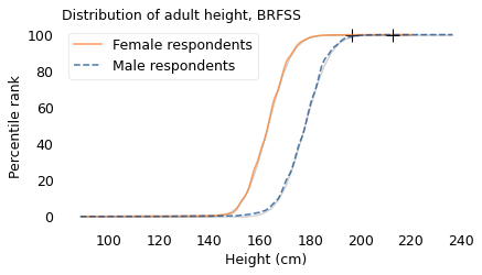
height = brfss["HTM4"] + np.random.normal(0, 1, size=len(brfss))
height.describe()
count    375271.000000
mean        170.163368
std          10.969334
min          88.584550
25%         162.565570
50%         169.693036
75%         178.381441
max         236.549924
Name: HTM4, dtype: float64
# plt.axvline(182.88, ls=':', color='gray', alpha=0.4)

make_plot(height[female], label="Female respondents", color="C1")
make_plot(height[male], label="Male respondents", style="--")

decorate(
    xlabel="Height (cm)",
    ylabel="Percentile rank",
    title="Distribution of adult height, BRFSS",
)
plt.savefig('lognormal1.png', dpi=300)
weight = brfss["WTKG3"] + np.random.normal(0, 1, size=len(brfss))
weight.describe()
count    365435.000000
mean         82.025593
std          21.154837
min          21.665500
25%          67.200620
50%          79.499946
75%          92.766653
max         290.230331
Name: WTKG3, dtype: float64
The following figure shows the distribution of these weights, represented using cumulative distribution functions (CDFs). The lighter lines show Gaussian models that best fit the data; the crosses at the top show the locations of the largest weights we expect to find in samples this size from a Gaussian distribution.
make_plot(weight[female], label="Female respondents", color="C1")
make_plot(weight[male], label="Male respondents", style="--")

decorate(
    xlabel="Weight (kg)",
    ylabel="Percentile rank",
    title="Distribution of adult weight, BRFSS",
)
plt.savefig('lognormal2.png', dpi=300)
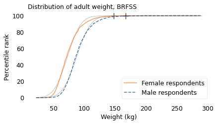
The Gaussian models don’t fit these measurements particularly well, and the extremes are more extreme. If these distributions were Gaussian, the heaviest woman in the sample would be about 150 kg, and the heaviest man would be 167 kg. In fact, the heaviest woman is 286 kg and the heaviest man is 290 kg. These discrepancies suggest that the distributions of weight are not Gaussian.
def upper_bound(series):
    """Compute the expected maximum value from a Gaussian model

    Use the sample to fit a Gaussian model and compute the largest
    value we expect from a sample that size.

    series: sample

    returns: float
    """
    dist = fit_normal(series)
    p = 1 - (1 / len(series))
    upper = dist.ppf(p)
    return upper
upper_bound(weight[female]), upper_bound(weight[male])
(147.91155018373783, 166.70579853541966)
np.max(weight[female]), np.max(weight[male])
(285.4587918400815, 290.2303311885769)
def log_xlabels(labels):
    """Place labels on the x-axis on a log scale.

    labels: sequence of numbers
    """
    ticks = np.log10(labels)
    plt.xticks(ticks, labels)
We can get a hint about what’s going on from Philip Gingerich, a now-retired professor of Ecology and Evolutionary Biology at the University of Michigan. In 2000, he wrote about two kinds of variation we see in measurements from biological systems.
On one hand, we find measurements like the ones in Chapter 1 that follow a Gaussian curve, which is symmetric; that is, the tail extends about the same distance to the left and to the right. On the other hand, we find measurements like weight that are skewed; that is, the tail extends farther to the right than to the left.
This observation goes back to the earliest history of statistics, and so does a remarkably simple remedy: if we compute the logarithms of the values and plot their distribution, the result is well modeled by – you guessed it – a Gaussian curve.
Depending on your academic and professional background, logarithms might be second nature to you or they might be something you remember vaguely from high school. For the second group, here’s a reminder.
If you raise 10 to some power, \(x\), and the result is \(y\), that means that \(x\) is the logarithm, base 10, of \(y\). For example 10 to the power of 2 is 100, so 2 is the logarithm, base 10, of 100 (I’ll drop the “base 10” from here on, and call a logarithm by its nickname, log). Similarly, 10 to the power of 3 is 1000, so 3 is the log of 1000, and 4 is the log of 10,000. You might notice a pattern: for numbers that are powers of 10, the log is the number of zeros.
For numbers that are not powers of 10, we can still compute logs, but the results are not integers. For example, the logarithm of 50 is 1.7, which is between the logs of 10 and 100, but not equidistant between them. And the log of 150 is about 2.2, between the logs of 100 and 1000.
The following figure shows the distributions of the logarithms of weight along with Gaussian models that best fit them.
At the top of the figure, the labels indicate the logarithms. At the bottom, the labels indicate the weights themselves. Notice that the logarithms are equally spaced, but the weights are not.
The vertical dotted lines show the correspondence between the weights and their logarithms for the three examples I just mentioned: 50 kg, 100 kg, and 150 kg.
np.log10(50), np.log10(150)
(1.6989700043360187, 2.1760912590556813)
def two_scale(sample1, sample2, label1, label2, xlabel1, xlabel2, labels):
    """Plot two distributions and label the top and bottom.

    The sequence of operations is a little tricky.
    """
    # find the range of qs to use for both distributions
    q_min = min(sample1.min(), sample2.min())
    q_max = max(sample1.max(), sample2.max())
    qs = np.linspace(q_min, q_max, 100)

    # plot the first distribution
    make_plot(sample1, qs=qs, label=label1, color="C1")
    h1, l1 = plt.gca().get_legend_handles_labels()
    plt.xlabel(xlabel1)
    plt.tick_params(axis='x', length=0)
    plt.title("Distribution of adult weight, log scale")
    log_xlabels(labels)

    # plot the second distribution
    plt.twiny()
    make_plot(sample2, qs=qs, label=label2, style="--")
    h2, l2 = plt.gca().get_legend_handles_labels()
    plt.legend(h1 + h2, l1 + l2)

    # label the axes
    plt.ylabel("Percentile rank")
    plt.xlabel(xlabel2)
    plt.tick_params(axis='x', length=0)
    plt.tight_layout()
for x in np.log10([50, 100, 150]):
    plt.axvline(x, color="gray", ls=":")

log_weight_male = np.log10(weight[male])
log_weight_female = np.log10(weight[female])
labels = [30, 50, 100, 150, 200, 250]

two_scale(
    log_weight_female,
    log_weight_male,
    "Female respondents",
    "Male respondents",
    "Weight (kg)",
    "Weight (log base 10 kg)",
    labels,
)
plt.savefig('lognormal3.png', dpi=300)
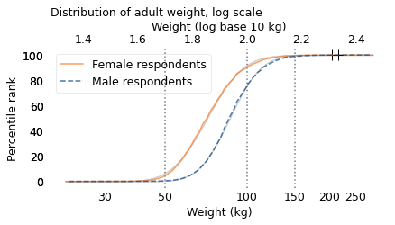
The Gaussian models fit the distributions so well that the lines representing them are barely visible. Values like this, whose logs follow a Gaussian model, are called “lognormal”.
Again, the crosses at the top show the largest values we expect from distributions with these sample sizes. They are a better match for the data than the crosses in the previous figure, although it looks like the heaviest people in this dataset are still heavier than we would expect from the lognormal model.
So, why is the distribution of weight lognormal? There are two possibilities: maybe we’re born this way, or maybe we grow into it. In the next section we’ll see that the distribution of birth weights follows a Gaussian model, which suggests that we’re born Gaussian and grow up to be lognormal. In the following sections I’ll try to explain why.
Birth Weights are Gaussian#
To explore the distribution of birth weight, I’ll use data from the National Survey of Family Growth (NSFG), which is run by the CDC, the same people we have to thank for the BRFSS.
Between 2015 and 2017, the NSFG collected data from a representative sample of women in the United States. Among other information, the survey records the birth weights of their children. Excluding babies who were born pre-term, I selected weights for 3430 male and 3379 female babies. The following figure shows the distributions of these birth weights along with Gaussian curves that best fit them.
nsfg = pd.read_hdf('nsfg_sample.hdf5', 'nsfg')
nsfg.shape
(9553, 13)
live = nsfg["outcome"] == 1
live.sum()
6810
single = nsfg["nbrnaliv"] == 1
single.sum()
6648
fullterm = (nsfg["prglngth"] >= 37) & (nsfg["prglngth"] < 42)
fullterm.sum()
5702
(live & fullterm).sum()
5676
pounds = nsfg["birthwgt_lb1"]
ounces = nsfg["birthwgt_oz1"]
pounds_clean = pounds.replace([98, 99], np.nan)
ounces_clean = ounces.replace([98, 99], np.nan)

birth_weight = (pounds_clean + ounces_clean / 16) * 454
male = nsfg["babysex1"] == 1
male.sum()
3430
female = nsfg["babysex1"] == 2
female.sum()
3379
birth_weight_male = birth_weight[fullterm & male] / 1000
birth_weight_male.describe()
count    2764.000000
mean        3.441670
std         0.505128
min         1.362000
25%         3.149625
50%         3.433375
75%         3.745500
max         5.448000
dtype: float64
birth_weight_female = birth_weight[fullterm & female] / 1000
birth_weight_female.describe()
count    2769.000000
mean        3.317344
std         0.484603
min         0.766125
25%         2.979375
50%         3.319875
75%         3.632000
max         5.419625
dtype: float64
make_plot(birth_weight_male, label="Male babies", style="--")
make_plot(birth_weight_female, label="Female babies", color="C1")

decorate(
    xlabel="Birth weight (kg)",
    ylabel="Percentile rank",
    title="Distribution of birth weight, NSFG",
)
plt.savefig('lognormal4.png', dpi=300)
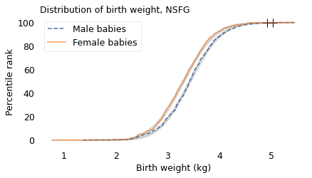
The Gaussian model fits the distribution of birth weights well. The heaviest babies are a little heavier than we would expect from a Gaussian distribution with this sample size, but the distributions are roughly symmetric, not skewed to the right like the distribution of adult weight.
So, if we are not born lognormal, that means we grow into it. In the next section, I’ll propose a model that might explain how.
Simulating Weight Gain#
As a simple model of human growth, suppose people gain several pounds per year from birth until they turn 40. And let’s suppose their annual weight gain is a random quantity; that is, some years they gain a lot, some years less. If we add up these random gains, we expect the total to follow a Gaussian distribution because, according to the Central Limit Theorem, when you add up a large number of random values, the sum tends to be Gaussian. So, if the distribution of adult weight were Gaussian, that would explain it.
But we’ve seen that it is not, so let’s try something else: what if annual weight gain is proportional to weight? In other words, instead of gaining a few pounds, what if you gained a few percent of your current weight? For example, if someone who weighs 50 kg gains 1 kg in a year; someone who weighs 100 kg might gain 2 kg. Let’s see what effect these proportional gains have on the results.
I wrote a simulation that starts with the birth weights we saw in the previous section and generates 40 random growth rates, one for each year from birth to age 40. The growth rates vary from about 20-40%; in other words, each simulated person gains 20-40% of their current weight each year. This is not a realistic model, but let’s see what we get. The following figure shows the results and a Gaussian model, both on a log scale.
from scipy.stats import norm
from scipy.optimize import least_squares


def simulate_weights(start, mu=1.3, sigma=0.03):
    """Simulate a simple model of annual weight gain.

    start: sequence of starting weights
    mu, sigma: parameters of the distributions of growth factors

    returns: simulated adult weights.
    """
    # don't try to hoist this, because the number of rows varies
    np.random.seed(18)
    rows = len(start)
    cols = 40
    rvs = np.random.uniform(-3, 3, size=(rows, cols))

    factors = rvs * sigma + mu
    product = factors.prod(axis=1)
    sim_weight = product * start
    return sim_weight
start = birth_weight_male / 1000 # convert grams to kilograms
mu, sigma = 1.3, 0.03
sim_weight = simulate_weights(start, mu, sigma)
sim_weight.describe()
count    2764.000000
mean      124.106176
std        37.610535
min        37.526516
25%        97.827188
50%       118.558147
75%       144.844003
max       354.605442
dtype: float64
make_plot(
    np.log10(sim_weight),
    model_label="Gaussian model",
    label="Simulated weights",
    color="C4",
    ls="--",
)

decorate(
    xlabel="Adult weight (kg)",
    ylabel="Percentile Rank",
    title="Distribution of weight compared to simulation",
)
log_xlabels(labels)
plt.savefig('lognormal5.png', dpi=300)
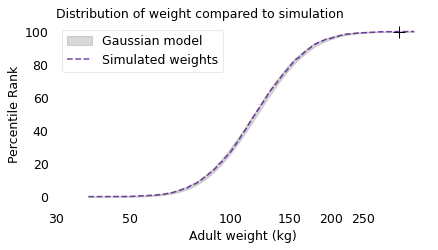
The Gaussian model fits the logarithms of the simulated weights, which means that the distribution is lognormal. This outcome is explained by a corollary of the Central Limit Theorem: if you multiply together a large number of random quantities, the distribution of the product tends to be lognormal.
It might not be obvious that the simulation multiplies random quantities, but that’s what happens when we apply successive growth rates. For example, suppose someone weighs 50 kg at the beginning of a simulated year. If they gain 20%, their weight at the end of the year would be 50 kg times 120%, which is 60 kg. If they gain 30% during the next year, their weight at the end would be 60 kg times 130%, which is 78 kg.
In two years, they gained a total of 28 kg, which is 56% of their starting weight. Where did 56% come from? It’s not the sum of 20% and 30%; rather, it comes from the product of 120% and 130%, which is 156%.
So their weight at the end of the simulation is the product of their starting weight and 40 random growth rates. As a result, the distribution of simulated weights is approximately lognormal.
28 / 50, 1.2 * 1.3
(0.56, 1.56)
By adjusting the range of growth rates, we can tune the simulation to match the data. The following figure shows the actual distributions from the BRFSS along with the simulation results.
def error_func_sim_weight(params, start, log_weight):
    """Simulate weights with given parameters and compute differences
    between the results and the actual weights.

    params: mu and sigma for the dist of growth rates
    start: sequence of starting weights
    log_weight: sequence of adult weights, log scale

    returns: sequence of differences
    """
    print(params)
    sim_weight = simulate_weights(start, *params)
    log_sim_weight = np.log10(sim_weight)

    diff_mean = log_sim_weight.mean() - log_weight.mean()
    diff_std = log_sim_weight.std() - log_weight.std()
    error = diff_mean, diff_std
    return error
Search for the parameters that yield simulated weights that best fit the adult male weights.
params = 1.1, 0.03

error_func_sim_weight(params, start, log_weight_male)
(1.1, 0.03)
(-2.773398875220521, 0.052202712871066245)
data = start, log_weight_male
res = least_squares(error_func_sim_weight, x0=params, args=data, xtol=1e-3)
res.x
[1.1  0.03]
[1.10000002 0.03      ]
[1.1        0.03000001]
[1.27449155 0.02147475]
[1.27449157 0.02147475]
[1.27449155 0.02147477]
[1.28922143 0.01840272]
[1.28922144 0.01840272]
[1.28922143 0.01840274]
[1.2893143  0.01823911]
[1.28931432 0.01823911]
[1.2893143  0.01823912]
array([1.2893143 , 0.01823911])
from utils import make_cdf

sim_weight_male = simulate_weights(start, *res.x)
log_sim_weight_male = np.log10(sim_weight_male)
cdf_log_sim_weight_male = make_cdf(log_sim_weight_male)
# Search for the parameters that yield simulated weights that
# best fit the adult female weights.

start = birth_weight_female / 1000
data = start, log_weight_female
res = least_squares(error_func_sim_weight, x0=params, args=data, xtol=1e-3)
[1.1  0.03]
[1.10000002 0.03      ]
[1.1        0.03000001]
[1.27059185 0.02364117]
[1.27059187 0.02364117]
[1.27059185 0.02364118]
[1.28460421 0.02150041]
[1.28460423 0.02150041]
[1.28460421 0.02150043]
[1.28468625 0.02142891]
[1.28468627 0.02142891]
[1.28468625 0.02142893]
sim_weight_female = simulate_weights(start, *res.x)
log_sim_weight_female = np.log10(sim_weight_female)
cdf_log_sim_weight_female = make_cdf(log_sim_weight_female)
cdf_log_weight_male = make_cdf(log_weight_male)
cdf_log_weight_female = make_cdf(log_weight_female)
cdf_log_sim_weight_female.plot(
    label="Simulated female weights", color="gray", alpha=0.4
)
cdf_log_weight_female.plot(label="Actual female weights", color="C1")

cdf_log_sim_weight_male.plot(label="Simulated male weights", color="C0", alpha=0.4)
cdf_log_weight_male.plot(label="Actual male weights", color="C0", ls="--")

decorate(xlabel="Adult weight (kg)", ylabel="Percentile Rank",    title="Distributions of weight compared to simulation",
)
log_xlabels(labels)
plt.savefig('lognormal6.png', dpi=300)
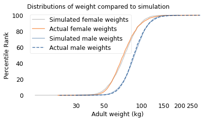
The results from the simulation are a good match for the actual distributions.
Of course, the simulation is not a realistic model of how people grow from birth to adulthood. We could make the model more realistic by generating higher growth rates for the first 15 years and then lower growth rates thereafter. But these details don’t change the shape of the distribution; it’s lognormal either way.
These simulations demonstrate one of the mechanisms that can produce lognormal distributions: proportional growth. If each person’s annual weight gain is proportional to their current weight, the distribution of their weights will tend toward lognormal.
Now, if height is Gaussian and weight is lognormal, what difference does it make? Qualitatively, the biggest difference is that the Gaussian distribution is symmetric, so the tallest people and the shortest are about the same distance from the mean. In the BRFSS dataset, the average height is 170 cm. The 99th percentile is about 23 cm above the mean and the 1st percentile is about 20 cm below, so that’s roughly symmetric.
Taking it to the extremes, the tallest person ever reliably measured was Robert Wadlow, who was 272 cm, which is 102 cm from the mean. And the shortest adult was Chandra Bahadur Dangi, who was 55 cm, which is 115 cm from the mean. That’s pretty close to symmetric, too.
def test_symmetry(series):
    """See how far the percentiles are from the mean in each direction.

    series: sequence of values
    """
    mean = series.mean()
    percentiles = series.quantile([0.01, 0.99])
    print("mean", mean)
    print("percentiles", percentiles.values)
    print("diffs", percentiles.values - mean)
height = brfss["HTM4"]
height.describe()
count    375271.000000
mean        170.162448
std          10.921335
min          91.000000
25%         163.000000
50%         170.000000
75%         178.000000
max         234.000000
Name: HTM4, dtype: float64
test_symmetry(height)
mean 170.16244793762374
percentiles [150. 193.]
diffs [-20.16244794  22.83755206]
272 - 170, 55 - 170
(102, -115)
On the other hand, the distribution of weights is not symmetric: the heaviest people are substantially farther from the mean than the lightest. In the United States, the average weight is about 82 kg. The heaviest person in the BRFSS dataset is 64 kg above average, but the lightest is only 36 kg below.
Taking it to the extremes, the heaviest person ever reliably measured was, regrettably, 553 kg heavier than the average. In order to be the same distance below the mean, the weight of the lightest person would be 471 kg lighter than zero, which is impossible. So the Gaussian model of weight is not just a bad fit for the data, it produces absurdities.
test_symmetry(weight)
mean 82.02559264202706
percentiles [ 46.21059501 145.67141413]
diffs [-35.81499763  63.64582149]
average = 82
146 - average, 635 - average, average - 553
(64, 553, -471)
In contrast, on a log scale the distribution of weight is close to symmetric. In the adult weights from the BRFSS, the 99th percentile of the logarithms is 0.26 above the mean and the 1st percentile is 0.24 below the mean. At the extremes, the log of the heaviest weight is 0.9 above the mean. In order for the lightest person to be the same distance below the mean, they would have to weigh 10 kg, which might sound impossible, but the lightest adult, according to Guinness World Records, was 2.1 kg at age 17. I’m not sure how reliable that measurement is, but it is at least close to the minimum we expect based on symmetry of the logarithms.
test_symmetry(np.log10(weight))
mean 1.9004278151719123
percentiles [1.66474156 2.16337434]
diffs [-0.23568625  0.26294652]
mean = np.log10(weight).mean()
mean
1.9004278151719123
np.log10(635) - mean
0.9023459101200633
log_min = mean - (np.log10(635) - mean)
log_min, 10**log_min
(0.998081905051849, 9.955931618983454)
np.log10(2.1) - mean
-1.578208520437993
Running Speeds#
If you are a fan of the Atlanta Braves, a Major League Baseball team, or if you watch enough videos on the internet, you have probably seen one of the most popular forms of between-inning entertainment: a foot race between one of the fans and a spandex-suit-wearing mascot called the Freeze.
The route of the race is the dirt track that runs across the outfield, a distance of about 160 meters, which the Freeze runs in less than 20 seconds. To keep things interesting, the fan gets a head start of about 5 seconds. That might not seem like a lot, but if you watch one of these races, this lead seems insurmountable. However, when the Freeze starts running, you immediately see the difference between a pretty good runner and a very good runner. With few exceptions, the Freeze runs down the fan, overtakes them, and coasts to the finish line with seconds to spare.
But as fast as he is, the Freeze is not even a professional runner; he is a member of the Braves’ ground crew named Nigel Talton. In college, he ran 200 meters in 21.66 seconds, which is very good. But the 200 meter collegiate record is 20.1 seconds, set by Wallace Spearmon in 2005, and the current world record is 19.19 seconds, set by Usain Bolt in 2009.
To put all that in perspective, let’s start with me. For a middle-aged man, I am a decent runner. When I was 42 years old, I ran my best-ever 10 kilometer race in 42:44, which was faster than 94% of the other runners who showed up for a local 10K. Around that time, I could run 200 meters in about 30 seconds (with wind assistance).
But a good high school runner is faster than me. At a recent meet, the fastest girl at a nearby high school ran 200 meters in about 27 seconds, and the fastest boy ran under 24 seconds.
So, in terms of speed, a fast high school girl is 11% faster than me, a fast high school boy is 12% faster than her; Nigel Talton, in his prime, was 11% faster than him, Wallace Spearmon was about 8% faster than Talton, and Usain Bolt is about 5% faster than Spearmon.
Unless you are Usain Bolt, there is always someone faster than you, and not just a little bit faster; they are much faster. The reason, as you might suspect by now, is that the distribution of running speed is not Gaussian. It is more like lognormal.
index = [
    "Downey",
    "High School Girl",
    "High School Boy",
    "Talton",
    "Spearmon",
    "Bolt",
]
times = [30, 27, 24, 21.66, 20.1, 19.19]
run_frame = pd.DataFrame(dict(time=times), index=index)
run_frame["speed"] = 200 / run_frame["time"]
run_frame["% change"] = run_frame["speed"].pct_change()
run_frame
| time | speed | % change | |
|---|---|---|---|
| Downey | 30.00 | 6.666667 | NaN |
| High School Girl | 27.00 | 7.407407 | 0.111111 |
| High School Boy | 24.00 | 8.333333 | 0.125000 |
| Talton | 21.66 | 9.233610 | 0.108033 |
| Spearmon | 20.10 | 9.950249 | 0.077612 |
| Bolt | 19.19 | 10.422095 | 0.047421 |
To demonstrate, I’ll use data from the James Joyce Ramble, which is the 10 kilometer race where I ran my previously-mentioned personal record time. I downloaded the times for the 1,592 finishers and converted them to speeds in kilometers per hour. The following figure shows the distribution of these speeds on a logarithmic scale, along with a Gaussian model I fit to the data.
from bs4 import BeautifulSoup

soup = BeautifulSoup(open("Apr25_27thAn_set1.shtml"), "html.parser")
speeds = pd.Series([], dtype=float)

table = soup.find("pre")
for line in table.text.split("\n"):
    t = line.split()
    if len(t) in [13, 14]:
        place, place_in_div, div, gun, net, pace = t[0:6]
        place = int(place)
        m, s = [int(x) for x in pace.split(":")]
        secs = m * 60 + s
        kph = 1.61 / secs * 60 * 60
        speeds[place] = kph

len(speeds)
1591
make_plot(speeds)
log_speeds = np.log10(speeds)
make_plot(log_speeds)
cdf = make_cdf(log_speeds)
cdf.plot(ls="--", label="Data")

h1, l1 = plt.gca().get_legend_handles_labels()
plt.xlabel("Running speed (kph)")

labels = [6, 8, 10, 12, 14, 16]
log_xlabels(labels)
plt.twiny()

dist = fit_normal(log_speeds)
n = len(log_speeds)
qs = np.linspace(cdf.qs.min(), cdf.qs.max())
low, high = normal_error_bounds(dist, n, qs)
plt.fill_between(
    qs, low * 100, high * 100, lw=0, color="gray", alpha=0.3, label="lognormal model"
)
h2, l2 = plt.gca().get_legend_handles_labels()
plt.legend(h1 + h2, l1 + l2, loc="lower right")

plt.ylabel("Percentile Rank")

ticks = [0.7, 0.8, 0.9, 1.0, 1.1, 1.2]
plt.xticks(ticks)
plt.title("Distribution of running speed, log scale")
plt.savefig('running1.png', dpi=150)
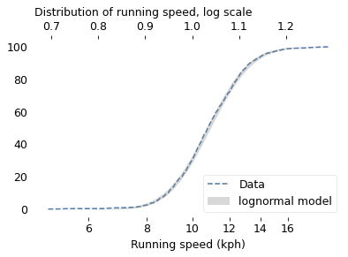
The logarithms follow a Gaussian distribution, which means the speeds themselves are lognormal. You might wonder why. Well, I have a theory, based on the following assumptions:
First, everyone has a maximum speed they are capable of running, assuming that they train effectively.
Second, these speed limits can depend on many factors, including height and weight, fast- and slow-twitch muscle mass, cardiovascular conditioning, flexibility and elasticity, and probably more.
Finally, the way these factors interact tends to be multiplicative; that is, each person’s speed limit depends on the product of multiple factors.
Here’s why I think speed depends on a product rather than a sum of factors. If all of your factors are good, you are fast; if any of them are bad, you are slow. Mathematically, the operation that has this property is multiplication.
For example, suppose there are only two factors, measured on a scale from 0 to 1, and each person’s speed limit is determined by their product. Let’s consider three hypothetical people:
The first person scores high on both factors, let’s say 0.9. The product of these factors is 0.81, so they would be fast.
The second person scores relatively low on both factors, let’s say 0.3. The product is 0.09, so they would be quite slow.
So far, this is not surprising: if you are good in every way, you are fast; if you are bad in every way, you are slow. But what if you are good in some ways and bad in others?
The third person scores 0.9 on one factor and 0.3 on the other. The product is 0.27, so they are a little bit faster than someone who scores low on both factors, but much slower than someone who scores high on both.
That’s a property of multiplication: the product depends most strongly on the smallest factor. And as the number of factors increases, the effect becomes more dramatic.
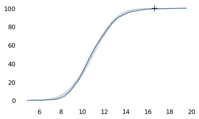
To simulate this mechanism, I generated five random factors from a Gaussian distribution and multiplied them together. I adjusted the mean and standard deviation of the Gaussians so that the resulting distribution fit the data; the following figure shows the results.
rows = len(speeds)
cols = 5

np.random.seed(17)
rvs = np.random.normal(size=(rows, cols))
def simulate_speeds(mu, sigma):
    """Generate a sample of running speeds by multiplying factors.

    Using the same set of rvs, scale them to the given mean and std.

    mu, sigma: parameters of a normal distribution
    """
    factors = rvs * sigma + mu
    performance = pd.Series(factors.prod(axis=1))
    return performance
def error_func_running(params, log_speeds):
    """Run simulation with given params and compute
    differences from the mean and standard deviation of the data.

    params: passed to simulation
    log_speeds: data to match

    returns: tuple of two errors
    """
    sim_speeds = simulate_speeds(*params)
    log_sim_speeds = np.log10(sim_speeds)

    diff_mean = log_sim_speeds.mean() - log_speeds.mean()
    diff_std = log_sim_speeds.std() - log_speeds.std()
    error = diff_mean, diff_std
    return error
params = 1.1, 0.06
error_func_running(params, log_speeds)
(-0.8328797969155824, -0.018541752148148696)
data = (log_speeds,)
res = least_squares(error_func_running, x0=params, diff_step=0.01, args=data, xtol=1e-3)
assert res.success
res.x
array([1.61636345, 0.11794023])
from empiricaldist import Cdf

sim_speeds = simulate_speeds(*res.x)

Cdf.from_seq(np.log10(sim_speeds)).plot(
    color="gray", alpha=0.3, label="Simulated running speeds"
)
Cdf.from_seq(np.log10(speeds)).plot(ls="--", label="Actual running speeds")

labels = [6, 8, 10, 12, 14, 16]
log_xlabels(labels)
decorate(xlabel="Running speed (log10 kph)", ylabel="Percentile Rank",
         title="Distribution of running speed compared to simulation",
)
plt.savefig('running2.png', dpi=150)
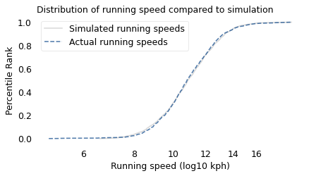
The simulation results fit the data well. So this example demonstrates a second mechanism that can produce lognormal distributions: the limiting power of the weakest link. If at least five factors affect running speed, and each person’s limit depends on their worst factor, that would explain why the distribution of running speed is lognormal.
I suspect that distributions of many other skills are also lognormal, for similar reasons. Unfortunately, most abilities are not as easy to measure as running speed, but some are. For example, chess-playing skill can be quantified using the Elo rating system, which we’ll explore in the next section.
Chess Rankings#
In the Elo chess rating system, every player is assigned a score that reflects their ability. These scores are updated after every game. If you win, your score goes up; if you lose, it goes down. The size of the increase or decrease depends on your opponent’s score. If you beat a player with a higher score, your score might go up a lot; if you beat a player with a lower score, it might barely change. Most scores are in the range from 100 to about 3000, although in theory there is no lower or upper bound.
By themselves, the scores don’t mean very much; what matters is the difference in scores between two players, which can be used to compute the probability that one beats the other. For example, if the difference in scores is 400, we expect the higher-rated player to win about 90% of the time.
If the distribution of chess skill is lognormal, and if Elo scores quantify this skill, we expect the distribution of Elo scores to be lognormal. To find out, I collected data from Chess.com, which is a popular internet chess server that hosts individual games and tournaments for players from all over the world. Their leader board shows the distribution of Elo ratings for almost six million players who have used their service. The following figure shows the distribution of these scores on a log scale, along with a lognormal model.
chess = pd.read_csv("chess_elo_ratings.csv")
chess.head()
| ELO | # PLAYERS | |
|---|---|---|
| 0 | 100 | 106342 |
| 1 | 200 | 219973 |
| 2 | 300 | 356353 |
| 3 | 400 | 487607 |
| 4 | 500 | 570153 |
chess.tail()
| ELO | # PLAYERS | |
|---|---|---|
| 27 | 2800 | 523 |
| 28 | 2900 | 241 |
| 29 | 3000 | 86 |
| 30 | 3100 | 16 |
| 31 | 3200 | 3 |
def fit_model_to_cdf(cdf, x0):
    """Find the model that minimizes the errors in percentiles."""

    def error_func(params):
        print(params)
        mu, sigma = params
        ps = np.linspace(0.01, 0.99)
        qs = cdf.inverse(ps)
        error = cdf(qs) - norm.cdf(qs, mu, sigma)
        return error

    res = least_squares(error_func, x0=x0, xtol=1e3)
    assert res.success
    return res.x
def plot_normal_model(dist, n, q_min, q_max):
    """Plot the error bounds based on a Gaussian model.

    dist: norm object
    n: sample size
    q_min, q_max: range of quantities to plot over
    """
    qs = np.linspace(q_min, q_max)
    low, high = normal_error_bounds(dist, n, qs)
    plt.fill_between(qs, low * 100, high * 100, lw=0, color="gray", alpha=0.3)
from empiricaldist import Pmf, Cdf

pmf_chess = Pmf(chess["# PLAYERS"].values, chess["ELO"].values)
N = pmf_chess.normalize()
N
5987898
pmf_chess.mean(), pmf_chess.median()
(814.9840227739351, array(800.))
pmf_log_chess = pmf_chess.transform(np.log10)
cdf_log_chess = pmf_log_chess.make_cdf()
x0 = pmf_log_chess.mean(), pmf_log_chess.std()
x0
(2.8464761577835587, 0.25442825374680383)
mu, sigma = fit_model_to_cdf(cdf_log_chess, x0)
[2.84647616 0.25442825]
[2.8464762  0.25442825]
[2.84647616 0.25442827]
[2.83678398 0.24883847]
[2.83678403 0.24883847]
[2.83678398 0.24883848]
def plot_chess(pmf, mu, sigma):
    q_min, q_max = pmf.qs.min(), pmf.qs.max()
    qs = np.linspace(q_min, q_max)
    ps = norm.cdf(qs, mu, sigma) * 100
    Cdf(ps, qs).plot(color="gray", alpha=0.4, label="Model")
    (pmf.make_cdf() * 100).plot(ls="--", label="Data")

    decorate(xlabel="Elo rating", ylabel="Percentile rank")
plot_chess(pmf_log_chess, mu, sigma)
plt.title("Distribution of chess scores")
labels = [100, 200, 500, 1000, 2000, 3000]
log_xlabels(labels)
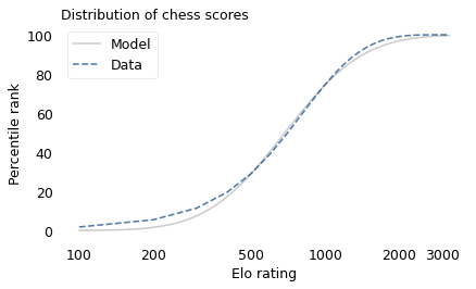
The lognormal model does not fit the data particularly well. But that might be misleading, because unlike running speeds, Elo scores have no natural zero point. The conventional zero point was chosen arbitrarily, which means we can shift it up or down without changing what the scores mean relative to each other.
With that in mind, suppose we shift the entire scale so that the lowest point is 550 rather than 100. The following figure shows the distribution of these shifted scores on a log scale, along with a lognormal model.
pmf_chess2 = Pmf(pmf_chess.ps, pmf_chess.qs + 450)
pmf_log_chess2 = pmf_chess2.transform(np.log10)
cdf_log_chess2 = pmf_log_chess2.make_cdf()
x0 = pmf_log_chess2.mean(), pmf_log_chess2.std()
x0
(3.0789722328987064, 0.1422676157538474)
mu, sigma = fit_model_to_cdf(cdf_log_chess2, x0)
[3.07897223 0.14226762]
[3.07897228 0.14226762]
[3.07897223 0.14226763]
[3.06208626 0.15169365]
[3.06208631 0.15169365]
[3.06208626 0.15169366]
# TODO: Fix this plot

plot_chess(pmf_log_chess2, mu, sigma)
plt.title("Distribution of shifted chess scores")
labels = [500, 1000, 2000, 3000]
log_xlabels(labels)
plt.tight_layout()
plt.savefig('lognormal7.png', dpi=300)
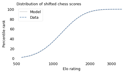
With this adjustment, the lognormal model fits the data well.
Now, we’ve seen two explanations for lognormal distributions: proportional growth and weakest links. Which one determines the distribution of abilities like chess? I think both mechanisms are plausible.
As you get better at chess, you have opportunities to play against better opponents and learn from the experience. You also gain the ability to learn from others; books and articles that are inscrutable to beginners become invaluable to experts. As you understand more, you are able to learn faster, so the growth rate of your skill might be proportional to your current level.
At the same time, lifetime achievement in chess can be limited by many factors. Success requires some combination of natural abilities, opportunity, passion, and discipline. If you are good at all of them, you might become a world-class player. If you lack any of them, you will not. The way these factors interact is like multiplication, where the outcome is most strongly affected by the weakest link.
These mechanisms shape the distribution of ability in other fields, even the ones that are harder to measure, like musical ability. As you gain musical experience, you play with better musicians and work with better teachers. As in chess, you can benefit from more advanced resources. And, as in almost any endeavor, you learn how to learn.
At the same time, there are many factors that can limit musical achievement. One person might have a bad ear or poor dexterity. Another might find that they don’t love music enough, or they love something else more. One might not have the resources and opportunity to pursue music; another might lack the discipline and tenacity to stick with it. If you have the necessary aptitude, opportunity, and personal attributes, you could be a world-class musician; if you lack any of them, you probably can’t.
If you have read Malcolm Gladwell’s book, Outliers, this conclusion might be disappointing. Based on examples and research on expert performance, Gladwell suggests that it takes 10,000 hours of effective practice to achieve world-class mastery in almost any field.
Referring to a study of violinists led by the psychologist K. Anders Ericsson, Gladwell writes:
The striking thing […] is that he and his colleagues couldn’t find any ‘naturals,’ musicians who floated effortlessly to the top while practicing a fraction of the time their peers did. Nor could they find any ‘grinds,’ people who worked harder than everyone else, yet just didn’t have what it takes to break the top ranks.”
The key to success, Gladwell concludes, is many hours of practice. The source of the number 10,000 seems to be neurologist Daniel Levitin, quoted by Gladwell:
“In study after study, of composers, basketball players, fiction writers, ice skaters, concert pianists, chess players, master criminals, and what have you, this number comes up again and again. […] No one has yet found a case in which true world-class expertise was accomplished in less time.”
The core claim of the rule is that 10,000 hours of practice is necessary to achieve expertise. Of course, as Ericsson wrote in a commentary, “There is nothing magical about exactly 10,000 hours”. But it is probably true that no world-class musician has practiced substantially less.
However, some people have taken the rule to mean that 10,000 hours is sufficient to achieve expertise. In this interpretation, anyone can master any field; all they have to do is practice! Well, in running and many other athletic areas, that is obviously not true. And I doubt it is true in chess, music, or many other fields.
Natural talent is not enough to achieve world-level performance without practice, but that doesn’t mean it is irrelevant. For most people in most fields, natural attributes and circumstances impose an upper limit on performance.
In his commentary, Ericsson summarizes research showing the importance of “motivation and the original enjoyment of the activities in the domain and, even more important, […] inevitable differences in the capacity to engage in hard work (deliberate practice).” In other words, the thing that distinguishes a world-class violinist from everyone else is not 10,000 hours of practice, but the passion, opportunity, and discipline it takes to spend 10,000 hours doing anything.
The Greatest of All Time#
Lognormal distributions of ability might explain an otherwise surprising phenomenon: in many fields of endeavor, there is one person widely regarded as the Greatest of All Time or the G.O.A.T.
For example, in hockey, Wayne Gretzky is the G.O.A.T. and it would be hard to find someone who knows hockey and disagrees. In basketball, it’s Michael Jordan; in women’s tennis, Serena Williams, and so on for most sports. Some cases are more controversial than others, but even when there are a few contenders for the title, there are only a few.
And more often than not, these top performers are not just a little better than the rest, they are a lot better. For example, in his career in the National Hockey League, Wayne Gretzky scored 2,857 points (the total of goals and assists). The player in second place scored 1,921. The magnitude of this difference is surprising, in part, because it is not what we would get from a Gaussian distribution.
To demonstrate this point, I generated a random sample of 100,000 people from a lognormal distribution loosely based on chess ratings. Then I generated a sample from a Gaussian distribution with the same mean and variance. The following figure shows the results.
def top_three(n, dist):
    """Compute the expected values of the top 3 in a given distribution.

    n: sample size
    dist: SciPy stats distribution object

    returns: array of three quantities
    """
    ps = 1 - np.array([3, 2, 1]) / n
    return dist.ppf(ps)
np.random.seed(19)
rvs = norm.rvs(2.1, 0.295, size=100000)
lognormal = np.power(10, rvs) + 500
mu, sigma = lognormal.mean(), lognormal.std()
mu, sigma
(658.7170292835305, 122.27837304897953)
lognormal.sort()
lognormal_top3 = lognormal[-3:].round().astype(int)
lognormal_top3
array([2913, 3066, 3155])
normal = norm.rvs(mu, sigma, size=100000)
normal.mean(), normal.std()
(658.2820476691168, 122.91277471624949)
normal.sort()
normal_top3 = normal[-3:].round().astype(int)
normal_top3
array([1123, 1146, 1161])
cdf_lognormal = Cdf.from_seq(lognormal) * 100
cdf_normal = Cdf.from_seq(normal) * 100
cdf_lognormal.plot(ls="--", label="Lognormal")
cdf_normal.plot(label="Gaussian")

for x in lognormal[-3:]:
    plot_cross(x, 100.3, color="C0")

for x in normal[-3:]:
    plot_cross(x, 100.3, color="C1")

decorate(
    xlabel="Skill level",
    ylabel="Percentile Rank",
    title="Distribution of random scores from Gaussian and lognormal models",
)
plt.savefig('lognormal8.png', dpi=300)
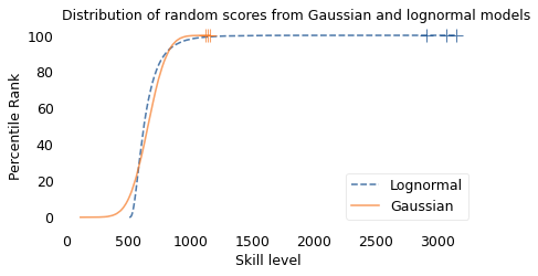
The mean and variance of these distributions is about the same, but the shapes are different: the Gaussian distribution extends a little farther to the left, and the lognormal distribution extends much farther to the right.
The crosses indicate the top three scorers in each sample. In the Gaussian distribution, the top three scores are 1123, 1146, and 1161. They are barely distinguishable in the figure, and if we think of them as Elo scores, there is not much difference between them. According to the Elo formula, we expect the top player to beat the #3 player about 55% of the time.
In the lognormal distribution, the top three scores are 2913, 3066, and 3155. They are clearly distinct in the figure and substantially different in practice. In this example, we expect the top player to beat #3 about 80% of the time.
diff = normal_top3[2] - normal_top3[0]
diff, elo_prob(diff)
(38, 0.5544693740216761)
diff = lognormal_top3[2] - lognormal_top3[0]
diff, elo_prob(diff)
(242, 0.8010809398289456)
In reality, the top-rated chess players in the world are more tightly clustered than my simulated players, so this example is not entirely realistic. Even so, Garry Kasparov is widely considered to be the greatest chess player of all time. The current world champion, Magnus Carlsen, might overtake him in another decade, but even he acknowledges that he is not there yet.
Less well known, but more dominant, is Marion Tinsley, who was the checkers (aka draughts) world champion from 1955 to 1958, withdrew from competition for almost 20 years – partly for lack of competition – and then reigned uninterrupted from 1975 to 1991. Between 1950 and his death in 1995, he lost only seven games, two of them to a computer. The man who programmed the computer thought Tinsley was “an aberration of nature”.
Marion Tinsley might have been the greatest G.O.A.T. of all time, but I’m not sure that makes him an aberration. Rather, he is an example of the natural behavior of lognormal distributions:
In a lognormal distribution, the outliers are farther from average than in a Gaussian distribution, which is why ordinary runners can’t beat the Freeze, even with a head start.
And the margin between the top performer and the runner-up is wider than it would be in a Gaussian distribution, which is why the greatest of all time is, in many fields, an outlier among outliers.
What Should You Do?#
If you are not sure what to do with your life, the lognormal distribution can help. Suppose you have the good fortune to be offered three jobs and you are trying to decide which one to take. One of the companies is working a problem you think is important, but you are not sure whether they will have much impact on it. The second is also working on an important problem, and you think they will have impact, but you are not sure how long that impact will last. The third company is likely to have long-lasting impact, in your estimation, but they are working on a problem you think is less important. If your goal is to maximize the positive impact of your work, which job should you take?
What I have just outlined is called the significance-persistence-contingency framework, or SPC for short. In this framework, the total future impact of the effort you allocate to a problem is the product of these three factors: significance is the positive effect during each unit of time where the problem is solved, persistence is length of time the solution is applicable, and contingency is how much the outcome depends on the effort we allocate to it.
If a project scores high on all three of these factors, it can have a large effect on the future; if it scores low on any of them, its impact will be limited.
In an extension of this framework, we can decompose contingency into two additional factors, tractability and neglectedness. If a problem is not tractable, it is not contingent because it will not get solved regardless of effort. And if it is tractable and not neglected, it is not contingent because it will get solved whether you work on it or not.
So there are at least five factors that might limit a project’s impact in the world; there are probably five more that affect your ability to impact the project, including your skills, personal attributes, and circumstances.
In general, the way these factors interact is like multiplication: if any of them are low, the product is low; the only way for the product to be high is if all of the factors are high.
As a result, we have reason to think that the distribution of impact, across a population of all the projects you might work on, is lognormal. Most projects have modest potential for impact, but a few can change the world.
So what does that mean for your job search? It implies that – if you want to maximize your impact – you should not take the first job you find, but spend time looking. And it suggests that you should not stay in one job for your entire career; you should continue to look for opportunities and change jobs when you find something better.
These are some of the principles that underlie the 80,000 Hours project, which is a collection of online resources intended to help people think about how to best spend the approximately 80,000 hours of their working lives.