Jumping to Conclusions#
Probably Overthinking It is available from Bookshop.org and Amazon (affiliate links).
Click here to run this notebook on Colab.
In 1986, Michael Anthony Jerome “Spud” Webb was the shortest player in the National Basketball Association (NBA); he was 5 feet 6 inches (168 cm). Nevertheless, that year he won the NBA Slam Dunk Contest after successfully executing the elevator two-handed double pump dunk and the reverse two-handed strawberry jam.
This performance was possible because Webb’s vertical leap was at least 42 inches (107 cm), bringing the top of his head to 9 feet (275 cm) and his outstretched hand well above the basketball rim at 10 feet (305 cm).
During the same year, I played intercollegiate volleyball at the Massachusetts Institute of Technology (MIT). Although the other players and I were less elite athletes than Spud Webb, I noticed a similar relationship between height and vertical leap. Consistently, the shorter players on the team jumped higher than the taller players.
At the time, I wondered if there might be a biokinetic reason for the relationship: maybe shorter legs provide some kind of mechanical advantage. It turns out that there is no such reason; according to a 2003 paper on physical characteristics that predict jumping ability, there is “no significant relationship” between body height and vertical leap.
By now, you have probably figured out the error in my thinking. In order to play competitive volleyball, it helps to be tall. If you are not tall, it helps if you can jump. If you are not tall and can’t jump, you probably don’t play competitive volleyball, you don’t play in the NBA, and you definitely don’t win a slam dunk contest.
In the general population, there is no correlation between height and jumping ability, but intercollegiate athletes are not a representative sample of the population, and elite athletes even less so. They have been selected based on their height and jumping ability, and the selection process creates the relationship between these traits.
This phenomenon is called Berkson’s paradox after a researcher who wrote about it in 1946. I’ll present his findings later, but first let’s look at another example from college.
Math and Verbal Skills#
Among students at a given college or university, do you think math and verbal skills are correlated, anti-correlated, or uncorrelated? In other words, if someone is above average at one of these skills, would you expect them to be above average on the other, or below average, or do you think they are unrelated?
To answer this question, I will use data from the National Longitudinal Survey of Youth 1997 (NLSY97), which “follows the lives of a sample of 8,984 American youth born between 1980-84”. The public data set includes the participants’ scores on several standardized tests, including the tests most often used in college admissions, the SAT and ACT.
I used the NLS Investigator to create an excerpt that contains the variables I’ll use for this analysis. With their permission, I can redistribute this excerpt. The following cell downloads the data.
nlsy = pd.read_csv("stand_test_corr.csv.gz")
nlsy.shape
(8984, 29)
nlsy.head()
| R0000100 | R0536300 | R0536401 | R0536402 | R1235800 | R1482600 | R5473600 | R5473700 | R7237300 | R7237400 | ... | R9794001 | R9829600 | S1552600 | S1552700 | Z9033700 | Z9033800 | Z9033900 | Z9034000 | Z9034100 | Z9034200 | |
|---|---|---|---|---|---|---|---|---|---|---|---|---|---|---|---|---|---|---|---|---|---|
| 0 | 1 | 2 | 9 | 1981 | 1 | 4 | -4 | -4 | -4 | -4 | ... | 1998 | 45070 | -4 | -4 | 4 | 3 | 3 | 2 | -4 | -4 |
| 1 | 2 | 1 | 7 | 1982 | 1 | 2 | -4 | -4 | -4 | -4 | ... | 1998 | 58483 | -4 | -4 | 4 | 5 | 4 | 5 | -4 | -4 |
| 2 | 3 | 2 | 9 | 1983 | 1 | 2 | -4 | -4 | -4 | -4 | ... | -4 | 27978 | -4 | -4 | 2 | 4 | 2 | 4 | -4 | -4 |
| 3 | 4 | 2 | 2 | 1981 | 1 | 2 | -4 | -4 | -4 | -4 | ... | -4 | 37012 | -4 | -4 | -4 | -4 | -4 | -4 | -4 | -4 |
| 4 | 5 | 1 | 10 | 1982 | 1 | 2 | -4 | -4 | -4 | -4 | ... | -4 | -4 | -4 | -4 | 2 | 3 | 6 | 3 | -4 | -4 |
5 rows × 29 columns
The columns are documented in the codebook. The following dictionary maps the current column names to more memorable names.
d = {
    "R9793200": "psat_math",
    "R9793300": "psat_verbal",
    "R9793400": "act_comp",
    "R9793500": "act_eng",
    "R9793600": "act_math",
    "R9793700": "act_read",
    "R9793800": "sat_verbal",
    "R9793900": "sat_math",
    # 'B0004600': 'college_gpa',
}

nlsy = nlsy.rename(columns=d)
For this analysis I’ll use only the SAT math and verbal scores. If you are curious, you could do something similar with ACT scores.
varnames = ["sat_verbal", "sat_math"]

for varname in varnames:
    invalid = nlsy[varname] < 200
    nlsy.loc[invalid, varname] = np.nan
In this cohort, about 1400 participants took the SAT. Their average scores were 502 on the verbal section and 503 on the math section, both close to the national average, which is calibrated to be 500.
The standard deviation of their scores was 108 on the verbal section and 110 on the math section, both a little higher than the overall standard deviation, which is calibrated to be 100.
nlsy["sat_verbal"].describe()
count    1400.000000
mean      501.678571
std       108.343678
min       200.000000
25%       430.000000
50%       500.000000
75%       570.000000
max       800.000000
Name: sat_verbal, dtype: float64
nlsy["sat_math"].describe()
count    1399.000000
mean      503.213009
std       109.901382
min       200.000000
25%       430.000000
50%       500.000000
75%       580.000000
max       800.000000
Name: sat_math, dtype: float64
nlsy[varnames].corr()
| sat_verbal | sat_math | |
|---|---|---|
| sat_verbal | 1.000000 | 0.734739 |
| sat_math | 0.734739 | 1.000000 |
To show how the scores are related, here’s a scatter plot showing a data point for each participant, with verbal scores on the horizontal axis and math scores on the vertical.
plt.plot(nlsy["sat_verbal"], nlsy["sat_math"], ".", ms=5, alpha=0.1)

decorate(xlabel="SAT Verbal", ylabel="SAT Math", title="SAT scores, NLSY97")
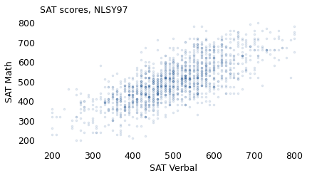
People who do well on one section tend to do well on the other. The correlation between scores is 0.73, so someone who is one standard deviation above the mean on the verbal test is expected to be 0.73 standard deviations above the mean on the math test. For example, if you select people whose verbal score is near 600, which is 100 points above the mean, the average of their math scores is 570, about 70 points above the mean.
near600 = (nlsy["sat_verbal"] >= 550) & (nlsy["sat_verbal"] <= 650)
nlsy.loc[near600, "sat_math"].mean()
572.4468085106383
This is what we would see in a random sample of people who took the SAT: a strong correlation between verbal and mathematical ability. But colleges don’t select their students at random, so the ones we find on any particular campus are not a representative sample. To see what effect the selection process has, let’s think about a few kinds of colleges.
Elite University#
First, consider an imaginary institution of higher learning called Elite University. To be admitted to E.U., let’s suppose, your total SAT score (sum of the verbal and math scores) has to be 1320 or higher.
sat_total = nlsy["sat_verbal"] + nlsy["sat_math"]
sat_total.describe()
count    1398.000000
mean     1004.892704
std       203.214916
min       430.000000
25%       860.000000
50%      1000.000000
75%      1140.000000
max      1580.000000
dtype: float64
admitted = nlsy.loc[sat_total >= 1320]
rejected = nlsy.loc[sat_total < 1320]
admitted[varnames].describe()
| sat_verbal | sat_math | |
|---|---|---|
| count | 95.000000 | 95.000000 |
| mean | 699.894737 | 698.947368 |
| std | 53.703178 | 46.206606 |
| min | 550.000000 | 580.000000 |
| 25% | 660.000000 | 660.000000 |
| 50% | 700.000000 | 710.000000 |
| 75% | 735.000000 | 730.000000 |
| max | 800.000000 | 800.000000 |
If we select participants from the NLSY who meet this requirement, their average score on both sections is about 700, the standard deviation is about 50, and the correlation of the two scores is -0.33. So if someone is one standard deviation above the E.U. mean on one test, we expect them to be one third of a standard deviation below the mean on the other, on average. For example, if you meet an E.U. student who got a 760 on the verbal section (60 points above the E.U. mean), you would expect them to get a 680 on the math section (20 points below the mean).
In the population of test takers, the correlation between scores is positive. But in the population of E.U. students, the correlation is negative. The following figure shows how this happens.
admitted[["sat_verbal", "sat_math"]].corr()
| sat_verbal | sat_math | |
|---|---|---|
| sat_verbal | 1.0000 | -0.3353 |
| sat_math | -0.3353 | 1.0000 |
res = linregress(admitted["sat_verbal"], admitted["sat_math"])
xs = np.linspace(600, 800)
ys = res.intercept + res.slope * xs
plt.plot(xs, ys, "--", color="gray")

plt.plot(
    admitted["sat_verbal"], admitted["sat_math"], ".", label="admitted", ms=5, alpha=0.3
)
plt.plot(
    rejected["sat_verbal"], rejected["sat_math"], "x", label="rejected", ms=3, alpha=0.2
)

decorate(xlabel="SAT Verbal", ylabel="SAT Math", title="SAT scores, Elite University")
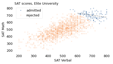
The circles in the upper right show students who meet the requirement for admission to Elite University. The dashed line shows the average math score for students at each level of verbal score. If you meet someone at E.U. with a relatively low verbal score, you expect them to have a high math score. Why? Because otherwise, they would not be at Elite University. And conversely, if you meet someone with a relatively low math score, they must have a high verbal score.
I suspect that this effect colors the perception of students at actual elite universities. Among the students they meet, they are likely to encounter some who are unusually good at math, some whose verbal skills are exceptional, and only a few who excel at both.
These interactions might partly explain a phenomenon described by C.P. Snow in his famous lecture, The Two Cultures:
A good many times I have been present at gatherings of people who, by the standards of the traditional culture, are thought highly educated and who have with considerable gusto been expressing their incredulity at the illiteracy of scientists. Once or twice I have been provoked and have asked the company how many of them could describe the Second Law of Thermodynamics. The response was cold: it was also negative. Yet I was asking something which is about the scientific equivalent of “Have you read a work of Shakespeare’s?”
I now believe that if I had asked an even simpler question – such as, What do you mean by mass, or acceleration, which is the scientific equivalent of saying, “Can you read?” – not more than one in ten of the highly educated would have felt that I was speaking the same language.
In the general population, math and verbal abilities are highly correlated, but as people become “highly educated”, they are also highly selected. And as we’ll see in the next section, the more stringently they are selected, the more these abilities will seem to be anti-correlated.
Less Elite, More Correlated#
Of course, not all colleges require a total SAT score of 1320. Most are less selective, and some don’t consider standardized test scores at all.
So let’s see what happens to the correlation between math and verbal scores as we vary admission requirements. As in the previous example, I’ll use a model of the selection process that will annoy anyone who works in college admission:
Suppose that every college has a simple threshold for the total SAT score. Any applicant who exceeds that threshold will be offered admission.
And suppose that the students who accept the offer are a random sample from the ones who are admitted.
The following figure shows a range of thresholds on the horizontal axis, from a total score of 700 up to 1400. On the vertical axis, it shows the correlation between math and verbal scores among the students whose scores exceed the threshold, based on the NLSY data.
totals = np.arange(700, 1450, 50)
results = {}
for thresh in totals:
    admitted = nlsy.loc[sat_total >= thresh]
    corr = admitted[["sat_verbal", "sat_math"]].corr()
    results[thresh] = corr.iloc[0, 1]

corr_series = pd.Series(results, dtype=float)
corr_series
700     0.685154
750     0.661058
800     0.620211
850     0.576750
900     0.519278
950     0.452663
1000    0.392761
1050    0.301356
1100    0.193192
1150    0.087910
1200   -0.019167
1250   -0.102005
1300   -0.245565
1350   -0.323388
1400   -0.413395
dtype: float64
plt.axhline(0, color="0.7", lw=0.5)
corr_series.plot(label="")
# plt.plot(1320, -0.33, '^', color='C0')

decorate(
    xlabel="Minimum total SAT score",
    ylabel="Correlation of scores",
    title="Correlation vs admission requirement",
)
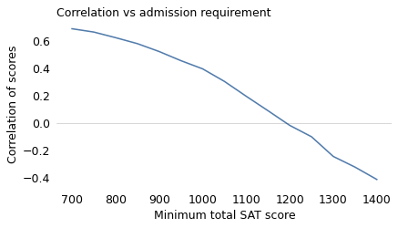
At a college that requires a total score of 700, math and verbal scores are positively correlated. At a selective college where the threshold is around 1200, the correlation is close to 0. And at an elite school where the threshold is over 1300, the correlation is negative.
The examples so far are based on an unrealistic model of the college admission process. We can make it slightly more realistic by adding one more factor.
Secondtier College#
Suppose at Secondtier College (it’s pronounced “se-con-tee-ay”), a student with a total score of 1200 or more is admitted, but a student with 1300 or more is likely to go somewhere else.
Using data from the NLSY again, the following figure shows the verbal and math score for applicants in three groups: rejected, enrolled, and the ones who were accepted but went somewhere else.
rejected = nlsy.loc[sat_total < 1200]
rejected.shape
(1138, 29)
elsewhere = nlsy.loc[sat_total >= 1300]
elsewhere.shape
(118, 29)
enrolled = nlsy.loc[(sat_total >= 1200) & (sat_total < 1300)]
enrolled.shape
(142, 29)
res = linregress(enrolled["sat_verbal"], enrolled["sat_math"])
xs = np.linspace(500, 730)
ys = res.intercept + res.slope * xs
plt.plot(xs, ys, "--", color="gray")

plt.plot(
    rejected["sat_verbal"],
    rejected["sat_math"],
    "x",
    label="rejected",
    ms=3,
    alpha=0.2,
    color="C1",
)
plt.plot(
    enrolled["sat_verbal"],
    enrolled["sat_math"],
    ".",
    label="enrolled",
    ms=5,
    alpha=0.2,
    color="C0",
)
plt.plot(
    elsewhere["sat_verbal"],
    elsewhere["sat_math"],
    "x",
    label="elsewhere",
    ms=3,
    alpha=0.2,
    color="C2",
)

decorate(xlabel="SAT Verbal", ylabel="SAT Math", title="SAT scores, Secondtier College")
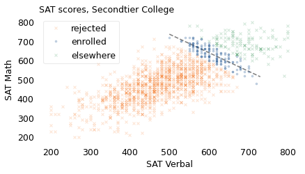
Among the students who enrolled, the correlation between math and verbal scores is strongly negative, about -0.84.
enrolled[varnames].corr()
| sat_verbal | sat_math | |
|---|---|---|
| sat_verbal | 1.000000 | -0.843266 |
| sat_math | -0.843266 | 1.000000 |
enrolled[varnames].describe()
| sat_verbal | sat_math | |
|---|---|---|
| count | 142.000000 | 142.000000 |
| mean | 608.661972 | 631.267606 |
| std | 42.846069 | 49.045632 |
| min | 500.000000 | 480.000000 |
| 25% | 572.500000 | 600.000000 |
| 50% | 600.000000 | 630.000000 |
| 75% | 640.000000 | 670.000000 |
| max | 720.000000 | 720.000000 |
near650 = (enrolled["sat_verbal"] > 630) & (nlsy["sat_verbal"] < 680)
nlsy.loc[near650, "sat_verbal"].mean()
651.25
nlsy.loc[near650, "sat_math"].mean()
590.0
At Secondtier, if you meet a student who got 650 on the verbal section, about 50 points above the mean, you should expect them to get 590 on the math section, about 40 points below the mean.
So we have the answer to the question I posed: depending on how colleges select students, math and verbal scores might be correlated, unrelated, or anti-correlated.
Berkson’s Paradox in Hospital Data#
The examples we’ve seen so far are interesting, I hope, but they might not be important. If you are wrong about the relationship between height and jumping ability, or between math and verbal skills, the consequences of your mistake are limited. But Berkson’s paradox is not limited to sports and standardized tests. It appears in many domains where the consequences of being wrong are more serious, including the field where it was first widely recognized: medicine.
Berkson’s paradox is named for Joseph Berkson, who led the Division of Biometry and Medical Statistics at the Mayo Clinic in Rochester, Minnesota. In 1946, he wrote a paper pointing out the danger of using patients in a clinic or hospital as a sample.
As an example, he uses the relationship between cholecystic disease (inflammation of the gall bladder) and diabetes. At the time, these conditions were thought to be related so that, “in certain medical circles, the gall bladder was being removed as a treatment for diabetes.” His tone suggests what he thinks of these “medical circles”.
Berkson showed that the apparent relationship between the two conditions might be the result of using hospital patients as a sample. To demonstrate the point, he generated a simulated population where 1% have diabetes, 3% have cholecystitis, and the conditions are unrelated; that is, having one condition does not, in fact, change the probability of having the other.
Then he simulated what happens if we use hospital patients as a sample. He assumes that people with either condition are more likely to go to the hospital, and therefore more likely to appear in the hospital sample, compared to people with neither condition.
In the hospital sample, he finds that there is a negative correlation between the conditions; that is, people with cholecystitis are less likely to have diabetes.
I’ll demonstrate with a simplified version of Berkson’s experiment. Consider a population of one million people where 1% have diabetes, 3% have cholecystitis, and the conditions are unrelated. We’ll assume that someone with either condition has a 5% chance of appearing in the hospital sample, and someone with neither condition has a 1% chance.
Here are the proportions as specified in the example.
p_d = 0.01
p_c = 0.03
To make the table, it is helpful to define the complementary proportions, too.
q_d = 1 - p_d
q_c = 1 - p_c
Now here are the fraction of people in each quadrant of the “four-fold table”.
table = (
    pd.DataFrame(
        data=[[p_c * p_d, p_c * q_d], [q_c * p_d, q_c * q_d]],
        index=["C", "No C"],
        columns=["D", "No D"],
    )
    * 1_000_000
)

table = table.transpose()
table
| C | No C | |
|---|---|---|
| D | 300.0 | 9700.0 |
| No D | 29700.0 | 960300.0 |
table["C"] / table.sum(axis=1)
D       0.03
No D    0.03
dtype: float64
Here are the probabilities that a patient appears in the hospital sample, given that they have one of the conditions.
s_d = 0.05
s_c = 0.05
table.stack()
D     C          300.0
      No C      9700.0
No D  C        29700.0
      No C    960300.0
dtype: float64
So here are the probabilities for each of the four quadrants.
f = [1 - (1 - s_d) * (1 - s_c), s_c, s_d, 0.01]
f
[0.09750000000000003, 0.05, 0.05, 0.01]
Now we can compute the number of people from each quadrant we expect to see in the hospital sample.
enum = pd.DataFrame(dict(number=table.stack(), f=f))
enum["expected"] = enum["number"] * enum["f"]
enum
| number | f | expected | ||
|---|---|---|---|---|
| D | C | 300.0 | 0.0975 | 29.25 |
| No C | 9700.0 | 0.0500 | 485.00 | |
| No D | C | 29700.0 | 0.0500 | 1485.00 |
| No C | 960300.0 | 0.0100 | 9603.00 |
hospital = enum["expected"].unstack()
hospital
| C | No C | |
|---|---|---|
| D | 29.25 | 485.0 |
| No D | 1485.00 | 9603.0 |
If we simulate this sampling process, we can compute the number of people in the hospital sample with and without cholecystitis, and with and without diabetes. The following table shows the results in the form of what Berkson calls a “fourfold table”.
hospital["Total"] = hospital.sum(axis=1)
hospital.round().astype(int)
| C | No C | Total | |
|---|---|---|---|
| D | 29 | 485 | 514 |
| No D | 1485 | 9603 | 11088 |
The columns labeled “C” and “No C” represent hospital patients with and without cholecystitis; the rows labeled “D” and “No D” represent patients with and without diabetes. The results indicate that, from a population of one million people:
We expect a total 514 people with diabetes (top row) to appear in a sample of hospital patients; of them, we expect 29 to also have cholecystitis, and
We expect 11,088 people without diabetes (bottom row) to appear in the sample; of them, we expect 1485 to have cholecystitis.
hospital["C"] / hospital["Total"]
D       0.056879
No D    0.133929
dtype: float64
If we compute the rate in each row, we find:
In the group with diabetes, about 5.6% have cholecystitis, and
In the group without diabetes, about 13% have cholecystitis.
So in the sample, the correlation between the conditions is negative: if you have diabetes, you are substantially less likely to have cholecystitis. But we know that there is no such relationship in the simulated population, because we designed it that way. So why does this relationship appear in the hospital sample?
Here are the pieces of the explanation:
People with either condition are more likely to go to the hospital, compared to people with neither condition.
If you find someone at the hospital who has cholecystitis, that’s likely to be the reason they are in the hospital.
If they don’t have cholecystitis, they are probably there for another reason, so they are more likely to have diabetes.
Berkson showed that it can also work the other way; under different assumptions, a hospital sample can show a positive correlation between conditions, even if we know there is no such relationship in the general population.
He concludes that “there does not appear to be any ready way of correcting the spurious correlation existing in the hospital population”, which is “the result merely of the ordinary compounding of independent probabilities”. In other words, even if you know that an observed correlation might be caused by Berkson’s paradox, the only way to correct it, in general, is to collect a better sample.
Berkson and COVID-19#
This problem has not gone away. A 2020 paper argues, right in the title, that Berkson’s paradox “undermines our understanding of COVID-19 disease risk and severity”. The authors, who include researchers from the University of Bristol in the United Kingdom and the Norwegian University of Science and Technology, point out the problem with using samples from hospital patients, as Berkson did, and also “people tested for active infection, or people who volunteered”. Patterns we observe in these groups are not always consistent with patterns in the general population.
As an example, they consider the hypothesis that health care workers might be at higher risk for severe COVID disease. That could be the case if COVID exposures in hospitals and clinics involve higher viral loads, compared to exposures in other environments.
To test this hypothesis, we might start with a sample of people who have tested positive for COVID and compare the frequency of severe disease among health care workers and others.
But there’s a problem with this approach: not everyone was equally likely to get tested. In many places, health care workers were tested regularly whether they had symptoms or not, while people in lower risk groups were tested only if they had symptoms.
As a result, the sample of people who test positive includes health care workers in the entire range from severe disease to mild symptoms to no symptoms at all; but for other people it includes only cases that were severe enough to warrant testing. In the sample, COVID disease might seem milder for health care workers than others, even if, in the general population, it is more severe on average.
This scenario is hypothetical, but the authors go on to explore data from the UK BioBank, which is “a large-scale biomedical database and research resource, containing in-depth genetic and health information from half a million UK participants.”
To see how pervasive Berkson’s paradox might be, the authors selected 486,967 BioBank participants from April 2020. For each participant, the dataset reports 2556 traits, including demographic information like age, sex, and socioeconomic status; medical history and risk factors; physical and psychological measurements; and behavior and nutrition.
Of these traits, they found 811 that were statistically associated with the probability of being tested for COVID, and many of these associations were strong enough to induce Berkson’s paradox. The traits they identified included occupation (like the example of the health care workers), ethnicity and race, general health, and place of residence, as well as less obvious factors like internet access and scientific interest.
As a result, it might be impossible to estimate accurately the effect of any of these traits on disease severity, using only a sample of people who tested positive for COVID.
The authors conclude, “It is difficult to know the extent of sample selection, and even if that were known it cannot be proven that it has been fully accounted for by any method. … Results from samples that are likely not representative of the target population should be treated with caution by scientists and policy makers.”
Berkson and Psychology#
Berkson’s paradox also affects the diagnosis of some psychological conditions. For example, the Hamilton Rating Scale for Depression (HRSD) is a survey used to diagnose depression and characterize its severity. It includes 17 questions, some on a 3-point scale and some on a 5-point scale. The interpretation of the results depends on the sum of the points from each question. On one version of the questionnaire, a total between 14 and 18 indicates a diagnosis of mild depression; a total above 18 indicates severe depression.
Although rating scales like this are useful for diagnosis and evaluation of treatment, they are vulnerable to Berkson’s paradox. In a 2019 paper, researchers from The University of Amsterdam and Leiden University in the Netherlands explain why. As an example, they consider the first two questions on the HRSD, which ask about feelings of sadness and feelings of guilt. In the general population, responses to these questions might be positively correlated, negatively correlated, or not correlated at all.
But if we select people whose total score indicates depression, the scores on these items are likely to be negatively correlated, especially at the intermediate levels of severity. For example, someone with mild depression who reports high levels of sadness is likely to have low levels of guilt, because if they had low levels of both, they would probably not be depressed, and if they had high levels of both, it would probably not be mild.
This example considers two of the 17 questions, but the same problem affects the correlation between any two items. The authors conclude that “Berkson’s bias is a considerable and under-appreciated problem” in clinical psychology.
Berkson and You#
Now that you know about Berkson’s paradox, you might start to notice it in your everyday life.
Does it seem like restaurants in bad locations have really good food? Well, maybe they do, compared to restaurants in good locations, because they have to. When a restaurant opens, the quality of the food might be unrelated to the location. But if a bad restaurant opens in a bad location, it probably doesn’t last very long. If it survives long enough for you to try it, it’s likely to be good.
When you get there, you should order the least appetizing thing on the menu, according to Tyler Cowen, a professor of economics at George Mason University. Why? If it sounds good, people will order it, so it doesn’t have to be good. If it sounds bad, and it is bad, it wouldn’t be on the menu. So if it sounds bad, it has to be good.
Or here’s an example from Jordan Ellenberg’s book, How Not To Be Wrong: Among people you have dated, does it seem like the attractive ones were meaner, and the nice ones were less attractive? That might not be true in the general population, but the people you’ve dated are not a random sample of the general population, we assume. If someone is unattractive and mean, you would not choose to date them. And if someone is attractive and nice, they are less likely to be available. So, among what’s left, you are more likely to get one or the other, and it’s not easy to find both.
Does it seem like when a movie is based on a book, the movie is not as good? In reality, there might be a positive correlation between the quality of a movie and the quality of the book it is based on. But if someone makes a bad movie from a bad book, you’ve probably never heard of it. And if someone makes a bad movie from a book you love, it’s the first example that comes to mind. So in the population of movies you are aware of, it might seem like there’s a negative correlation between the qualities of the book and the movie.
In summary, for a perfect date, find someone unattractive, take them to a restaurant in a strip mall, order something that sounds awful, and go to a movie based on a bad book.