Implementing CDFs#
This notebook outlines the API for Cdf objects in the empiricaldist library, showing the implementations of many methods.
Click here to run this notebook on Colab.
try:
    import empiricaldist
except ImportError:
    !pip install empiricaldist
import numpy as np
import pandas as pd
import matplotlib.pyplot as plt
import inspect

def psource(obj):
    """Prints the source code for a given object.

    obj: function or method object
    """
    print(inspect.getsource(obj))
Constructor#
For comments or questions about this section, see this issue.
The Cdf class inherits its constructor from pd.Series.
You can create an empty Cdf and then add elements.
Here’s a Cdf that representat a four-sided die.
from empiricaldist import Cdf

d4 = Cdf()
d4[1] = 1
d4[2] = 2
d4[3] = 3
d4[4] = 4
d4
| probs | |
|---|---|
| 1 | 1 |
| 2 | 2 |
| 3 | 3 |
| 4 | 4 |
In a normalized Cdf, the last probability is 1.
normalize makes that true. The return value is the total probability before normalizing.
psource(Cdf.normalize)
    def normalize(self):
        """Make the probabilities add up to 1 (modifies self).

        Returns: normalizing constant
        """
        total = self.ps[-1]
        self /= total
        return total
d4.normalize()
4
Now the Cdf is normalized.
d4
| probs | |
|---|---|
| 1 | 0.25 |
| 2 | 0.50 |
| 3 | 0.75 |
| 4 | 1.00 |
Properties#
For comments or questions about this section, see this issue.
In a Cdf the index contains the quantities (qs) and the values contain the probabilities (ps).
These attributes are available as properties that return arrays (same semantics as the Pandas values property)
d4.qs
array([1, 2, 3, 4])
d4.ps
array([0.25, 0.5 , 0.75, 1. ])
Displaying CDFs#
For comments or questions about this section, see this issue.
Cdf provides _repr_html_, so it looks good when displayed in a notebook.
psource(Cdf._repr_html_)
    def _repr_html_(self):
        """Returns an HTML representation of the series.

        Mostly used for Jupyter notebooks.
        """
        df = pd.DataFrame(dict(probs=self))
        return df._repr_html_()
Cdf provides plot, which plots the Cdf as a line.
psource(Cdf.plot)
class PlotAccessor(PandasObject):
"""
Make plots of Series or DataFrame.
Uses the backend specified by the
option ``plotting.backend``. By default, matplotlib is used.
Parameters
----------
data : Series or DataFrame
The object for which the method is called.
x : label or position, default None
Only used if data is a DataFrame.
y : label, position or list of label, positions, default None
Allows plotting of one column versus another. Only used if data is a
DataFrame.
kind : str
The kind of plot to produce:
- 'line' : line plot (default)
- 'bar' : vertical bar plot
- 'barh' : horizontal bar plot
- 'hist' : histogram
- 'box' : boxplot
- 'kde' : Kernel Density Estimation plot
- 'density' : same as 'kde'
- 'area' : area plot
- 'pie' : pie plot
- 'scatter' : scatter plot (DataFrame only)
- 'hexbin' : hexbin plot (DataFrame only)
ax : matplotlib axes object, default None
An axes of the current figure.
subplots : bool or sequence of iterables, default False
Whether to group columns into subplots:
- ``False`` : No subplots will be used
- ``True`` : Make separate subplots for each column.
- sequence of iterables of column labels: Create a subplot for each
group of columns. For example `[('a', 'c'), ('b', 'd')]` will
create 2 subplots: one with columns 'a' and 'c', and one
with columns 'b' and 'd'. Remaining columns that aren't specified
will be plotted in additional subplots (one per column).
.. versionadded:: 1.5.0
sharex : bool, default True if ax is None else False
In case ``subplots=True``, share x axis and set some x axis labels
to invisible; defaults to True if ax is None otherwise False if
an ax is passed in; Be aware, that passing in both an ax and
``sharex=True`` will alter all x axis labels for all axis in a figure.
sharey : bool, default False
In case ``subplots=True``, share y axis and set some y axis labels to invisible.
layout : tuple, optional
(rows, columns) for the layout of subplots.
figsize : a tuple (width, height) in inches
Size of a figure object.
use_index : bool, default True
Use index as ticks for x axis.
title : str or list
Title to use for the plot. If a string is passed, print the string
at the top of the figure. If a list is passed and `subplots` is
True, print each item in the list above the corresponding subplot.
grid : bool, default None (matlab style default)
Axis grid lines.
legend : bool or {'reverse'}
Place legend on axis subplots.
style : list or dict
The matplotlib line style per column.
logx : bool or 'sym', default False
Use log scaling or symlog scaling on x axis.
logy : bool or 'sym' default False
Use log scaling or symlog scaling on y axis.
loglog : bool or 'sym', default False
Use log scaling or symlog scaling on both x and y axes.
xticks : sequence
Values to use for the xticks.
yticks : sequence
Values to use for the yticks.
xlim : 2-tuple/list
Set the x limits of the current axes.
ylim : 2-tuple/list
Set the y limits of the current axes.
xlabel : label, optional
Name to use for the xlabel on x-axis. Default uses index name as xlabel, or the
x-column name for planar plots.
.. versionchanged:: 1.2.0
Now applicable to planar plots (`scatter`, `hexbin`).
.. versionchanged:: 2.0.0
Now applicable to histograms.
ylabel : label, optional
Name to use for the ylabel on y-axis. Default will show no ylabel, or the
y-column name for planar plots.
.. versionchanged:: 1.2.0
Now applicable to planar plots (`scatter`, `hexbin`).
.. versionchanged:: 2.0.0
Now applicable to histograms.
rot : float, default None
Rotation for ticks (xticks for vertical, yticks for horizontal
plots).
fontsize : float, default None
Font size for xticks and yticks.
colormap : str or matplotlib colormap object, default None
Colormap to select colors from. If string, load colormap with that
name from matplotlib.
colorbar : bool, optional
If True, plot colorbar (only relevant for 'scatter' and 'hexbin'
plots).
position : float
Specify relative alignments for bar plot layout.
From 0 (left/bottom-end) to 1 (right/top-end). Default is 0.5
(center).
table : bool, Series or DataFrame, default False
If True, draw a table using the data in the DataFrame and the data
will be transposed to meet matplotlib's default layout.
If a Series or DataFrame is passed, use passed data to draw a
table.
yerr : DataFrame, Series, array-like, dict and str
See :ref:`Plotting with Error Bars <visualization.errorbars>` for
detail.
xerr : DataFrame, Series, array-like, dict and str
Equivalent to yerr.
stacked : bool, default False in line and bar plots, and True in area plot
If True, create stacked plot.
secondary_y : bool or sequence, default False
Whether to plot on the secondary y-axis if a list/tuple, which
columns to plot on secondary y-axis.
mark_right : bool, default True
When using a secondary_y axis, automatically mark the column
labels with "(right)" in the legend.
include_bool : bool, default is False
If True, boolean values can be plotted.
backend : str, default None
Backend to use instead of the backend specified in the option
``plotting.backend``. For instance, 'matplotlib'. Alternatively, to
specify the ``plotting.backend`` for the whole session, set
``pd.options.plotting.backend``.
**kwargs
Options to pass to matplotlib plotting method.
Returns
-------
:class:`matplotlib.axes.Axes` or numpy.ndarray of them
If the backend is not the default matplotlib one, the return value
will be the object returned by the backend.
Notes
-----
- See matplotlib documentation online for more on this subject
- If `kind` = 'bar' or 'barh', you can specify relative alignments
for bar plot layout by `position` keyword.
From 0 (left/bottom-end) to 1 (right/top-end). Default is 0.5
(center)
Examples
--------
For Series:
.. plot::
:context: close-figs
>>> ser = pd.Series([1, 2, 3, 3])
>>> plot = ser.plot(kind='hist', title="My plot")
For DataFrame:
.. plot::
:context: close-figs
>>> df = pd.DataFrame({'length': [1.5, 0.5, 1.2, 0.9, 3],
... 'width': [0.7, 0.2, 0.15, 0.2, 1.1]},
... index=['pig', 'rabbit', 'duck', 'chicken', 'horse'])
>>> plot = df.plot(title="DataFrame Plot")
For SeriesGroupBy:
.. plot::
:context: close-figs
>>> lst = [-1, -2, -3, 1, 2, 3]
>>> ser = pd.Series([1, 2, 2, 4, 6, 6], index=lst)
>>> plot = ser.groupby(lambda x: x > 0).plot(title="SeriesGroupBy Plot")
For DataFrameGroupBy:
.. plot::
:context: close-figs
>>> df = pd.DataFrame({"col1" : [1, 2, 3, 4],
... "col2" : ["A", "B", "A", "B"]})
>>> plot = df.groupby("col2").plot(kind="bar", title="DataFrameGroupBy Plot")
"""
_common_kinds = ("line", "bar", "barh", "kde", "density", "area", "hist", "box")
_series_kinds = ("pie",)
_dataframe_kinds = ("scatter", "hexbin")
_kind_aliases = {"density": "kde"}
_all_kinds = _common_kinds + _series_kinds + _dataframe_kinds
def __init__(self, data) -> None:
self._parent = data
@staticmethod
def _get_call_args(backend_name: str, data, args, kwargs):
"""
This function makes calls to this accessor `__call__` method compatible
with the previous `SeriesPlotMethods.__call__` and
`DataFramePlotMethods.__call__`. Those had slightly different
signatures, since `DataFramePlotMethods` accepted `x` and `y`
parameters.
"""
if isinstance(data, ABCSeries):
arg_def = [
("kind", "line"),
("ax", None),
("figsize", None),
("use_index", True),
("title", None),
("grid", None),
("legend", False),
("style", None),
("logx", False),
("logy", False),
("loglog", False),
("xticks", None),
("yticks", None),
("xlim", None),
("ylim", None),
("rot", None),
("fontsize", None),
("colormap", None),
("table", False),
("yerr", None),
("xerr", None),
("label", None),
("secondary_y", False),
("xlabel", None),
("ylabel", None),
]
elif isinstance(data, ABCDataFrame):
arg_def = [
("x", None),
("y", None),
("kind", "line"),
("ax", None),
("subplots", False),
("sharex", None),
("sharey", False),
("layout", None),
("figsize", None),
("use_index", True),
("title", None),
("grid", None),
("legend", True),
("style", None),
("logx", False),
("logy", False),
("loglog", False),
("xticks", None),
("yticks", None),
("xlim", None),
("ylim", None),
("rot", None),
("fontsize", None),
("colormap", None),
("table", False),
("yerr", None),
("xerr", None),
("secondary_y", False),
("xlabel", None),
("ylabel", None),
]
else:
raise TypeError(
f"Called plot accessor for type {type(data).__name__}, "
"expected Series or DataFrame"
)
if args and isinstance(data, ABCSeries):
positional_args = str(args)[1:-1]
keyword_args = ", ".join(
[f"{name}={repr(value)}" for (name, _), value in zip(arg_def, args)]
)
msg = (
"`Series.plot()` should not be called with positional "
"arguments, only keyword arguments. The order of "
"positional arguments will change in the future. "
f"Use `Series.plot({keyword_args})` instead of "
f"`Series.plot({positional_args})`."
)
raise TypeError(msg)
pos_args = {name: value for (name, _), value in zip(arg_def, args)}
if backend_name == "pandas.plotting._matplotlib":
kwargs = dict(arg_def, **pos_args, **kwargs)
else:
kwargs = dict(pos_args, **kwargs)
x = kwargs.pop("x", None)
y = kwargs.pop("y", None)
kind = kwargs.pop("kind", "line")
return x, y, kind, kwargs
def __call__(self, *args, **kwargs):
plot_backend = _get_plot_backend(kwargs.pop("backend", None))
x, y, kind, kwargs = self._get_call_args(
plot_backend.__name__, self._parent, args, kwargs
)
kind = self._kind_aliases.get(kind, kind)
# when using another backend, get out of the way
if plot_backend.__name__ != "pandas.plotting._matplotlib":
return plot_backend.plot(self._parent, x=x, y=y, kind=kind, **kwargs)
if kind not in self._all_kinds:
raise ValueError(f"{kind} is not a valid plot kind")
# The original data structured can be transformed before passed to the
# backend. For example, for DataFrame is common to set the index as the
# `x` parameter, and return a Series with the parameter `y` as values.
data = self._parent.copy()
if isinstance(data, ABCSeries):
kwargs["reuse_plot"] = True
if kind in self._dataframe_kinds:
if isinstance(data, ABCDataFrame):
return plot_backend.plot(data, x=x, y=y, kind=kind, **kwargs)
else:
raise ValueError(f"plot kind {kind} can only be used for data frames")
elif kind in self._series_kinds:
if isinstance(data, ABCDataFrame):
if y is None and kwargs.get("subplots") is False:
raise ValueError(
f"{kind} requires either y column or 'subplots=True'"
)
if y is not None:
if is_integer(y) and not data.columns._holds_integer():
y = data.columns[y]
# converted to series actually. copy to not modify
data = data[y].copy()
data.index.name = y
elif isinstance(data, ABCDataFrame):
data_cols = data.columns
if x is not None:
if is_integer(x) and not data.columns._holds_integer():
x = data_cols[x]
elif not isinstance(data[x], ABCSeries):
raise ValueError("x must be a label or position")
data = data.set_index(x)
if y is not None:
# check if we have y as int or list of ints
int_ylist = is_list_like(y) and all(is_integer(c) for c in y)
int_y_arg = is_integer(y) or int_ylist
if int_y_arg and not data.columns._holds_integer():
y = data_cols[y]
label_kw = kwargs["label"] if "label" in kwargs else False
for kw in ["xerr", "yerr"]:
if kw in kwargs and (
isinstance(kwargs[kw], str) or is_integer(kwargs[kw])
):
try:
kwargs[kw] = data[kwargs[kw]]
except (IndexError, KeyError, TypeError):
pass
# don't overwrite
data = data[y].copy()
if isinstance(data, ABCSeries):
label_name = label_kw or y
data.name = label_name
else:
match = is_list_like(label_kw) and len(label_kw) == len(y)
if label_kw and not match:
raise ValueError(
"label should be list-like and same length as y"
)
label_name = label_kw or data.columns
data.columns = label_name
return plot_backend.plot(data, kind=kind, **kwargs)
__call__.__doc__ = __doc__
@Appender(
"""
See Also
--------
matplotlib.pyplot.plot : Plot y versus x as lines and/or markers.
Examples
--------
.. plot::
:context: close-figs
>>> s = pd.Series([1, 3, 2])
>>> s.plot.line() # doctest: +SKIP
.. plot::
:context: close-figs
The following example shows the populations for some animals
over the years.
>>> df = pd.DataFrame({
... 'pig': [20, 18, 489, 675, 1776],
... 'horse': [4, 25, 281, 600, 1900]
... }, index=[1990, 1997, 2003, 2009, 2014])
>>> lines = df.plot.line()
.. plot::
:context: close-figs
An example with subplots, so an array of axes is returned.
>>> axes = df.plot.line(subplots=True)
>>> type(axes)
<class 'numpy.ndarray'>
.. plot::
:context: close-figs
Let's repeat the same example, but specifying colors for
each column (in this case, for each animal).
>>> axes = df.plot.line(
... subplots=True, color={"pig": "pink", "horse": "#742802"}
... )
.. plot::
:context: close-figs
The following example shows the relationship between both
populations.
>>> lines = df.plot.line(x='pig', y='horse')
"""
)
@Substitution(kind="line")
@Appender(_bar_or_line_doc)
def line(
self, x: Hashable | None = None, y: Hashable | None = None, **kwargs
) -> PlotAccessor:
"""
Plot Series or DataFrame as lines.
This function is useful to plot lines using DataFrame's values
as coordinates.
"""
return self(kind="line", x=x, y=y, **kwargs)
@Appender(
"""
See Also
--------
DataFrame.plot.barh : Horizontal bar plot.
DataFrame.plot : Make plots of a DataFrame.
matplotlib.pyplot.bar : Make a bar plot with matplotlib.
Examples
--------
Basic plot.
.. plot::
:context: close-figs
>>> df = pd.DataFrame({'lab':['A', 'B', 'C'], 'val':[10, 30, 20]})
>>> ax = df.plot.bar(x='lab', y='val', rot=0)
Plot a whole dataframe to a bar plot. Each column is assigned a
distinct color, and each row is nested in a group along the
horizontal axis.
.. plot::
:context: close-figs
>>> speed = [0.1, 17.5, 40, 48, 52, 69, 88]
>>> lifespan = [2, 8, 70, 1.5, 25, 12, 28]
>>> index = ['snail', 'pig', 'elephant',
... 'rabbit', 'giraffe', 'coyote', 'horse']
>>> df = pd.DataFrame({'speed': speed,
... 'lifespan': lifespan}, index=index)
>>> ax = df.plot.bar(rot=0)
Plot stacked bar charts for the DataFrame
.. plot::
:context: close-figs
>>> ax = df.plot.bar(stacked=True)
Instead of nesting, the figure can be split by column with
``subplots=True``. In this case, a :class:`numpy.ndarray` of
:class:`matplotlib.axes.Axes` are returned.
.. plot::
:context: close-figs
>>> axes = df.plot.bar(rot=0, subplots=True)
>>> axes[1].legend(loc=2) # doctest: +SKIP
If you don't like the default colours, you can specify how you'd
like each column to be colored.
.. plot::
:context: close-figs
>>> axes = df.plot.bar(
... rot=0, subplots=True, color={"speed": "red", "lifespan": "green"}
... )
>>> axes[1].legend(loc=2) # doctest: +SKIP
Plot a single column.
.. plot::
:context: close-figs
>>> ax = df.plot.bar(y='speed', rot=0)
Plot only selected categories for the DataFrame.
.. plot::
:context: close-figs
>>> ax = df.plot.bar(x='lifespan', rot=0)
"""
)
@Substitution(kind="bar")
@Appender(_bar_or_line_doc)
def bar( # pylint: disable=disallowed-name
self, x: Hashable | None = None, y: Hashable | None = None, **kwargs
) -> PlotAccessor:
"""
Vertical bar plot.
A bar plot is a plot that presents categorical data with
rectangular bars with lengths proportional to the values that they
represent. A bar plot shows comparisons among discrete categories. One
axis of the plot shows the specific categories being compared, and the
other axis represents a measured value.
"""
return self(kind="bar", x=x, y=y, **kwargs)
@Appender(
"""
See Also
--------
DataFrame.plot.bar: Vertical bar plot.
DataFrame.plot : Make plots of DataFrame using matplotlib.
matplotlib.axes.Axes.bar : Plot a vertical bar plot using matplotlib.
Examples
--------
Basic example
.. plot::
:context: close-figs
>>> df = pd.DataFrame({'lab': ['A', 'B', 'C'], 'val': [10, 30, 20]})
>>> ax = df.plot.barh(x='lab', y='val')
Plot a whole DataFrame to a horizontal bar plot
.. plot::
:context: close-figs
>>> speed = [0.1, 17.5, 40, 48, 52, 69, 88]
>>> lifespan = [2, 8, 70, 1.5, 25, 12, 28]
>>> index = ['snail', 'pig', 'elephant',
... 'rabbit', 'giraffe', 'coyote', 'horse']
>>> df = pd.DataFrame({'speed': speed,
... 'lifespan': lifespan}, index=index)
>>> ax = df.plot.barh()
Plot stacked barh charts for the DataFrame
.. plot::
:context: close-figs
>>> ax = df.plot.barh(stacked=True)
We can specify colors for each column
.. plot::
:context: close-figs
>>> ax = df.plot.barh(color={"speed": "red", "lifespan": "green"})
Plot a column of the DataFrame to a horizontal bar plot
.. plot::
:context: close-figs
>>> speed = [0.1, 17.5, 40, 48, 52, 69, 88]
>>> lifespan = [2, 8, 70, 1.5, 25, 12, 28]
>>> index = ['snail', 'pig', 'elephant',
... 'rabbit', 'giraffe', 'coyote', 'horse']
>>> df = pd.DataFrame({'speed': speed,
... 'lifespan': lifespan}, index=index)
>>> ax = df.plot.barh(y='speed')
Plot DataFrame versus the desired column
.. plot::
:context: close-figs
>>> speed = [0.1, 17.5, 40, 48, 52, 69, 88]
>>> lifespan = [2, 8, 70, 1.5, 25, 12, 28]
>>> index = ['snail', 'pig', 'elephant',
... 'rabbit', 'giraffe', 'coyote', 'horse']
>>> df = pd.DataFrame({'speed': speed,
... 'lifespan': lifespan}, index=index)
>>> ax = df.plot.barh(x='lifespan')
"""
)
@Substitution(kind="bar")
@Appender(_bar_or_line_doc)
def barh(
self, x: Hashable | None = None, y: Hashable | None = None, **kwargs
) -> PlotAccessor:
"""
Make a horizontal bar plot.
A horizontal bar plot is a plot that presents quantitative data with
rectangular bars with lengths proportional to the values that they
represent. A bar plot shows comparisons among discrete categories. One
axis of the plot shows the specific categories being compared, and the
other axis represents a measured value.
"""
return self(kind="barh", x=x, y=y, **kwargs)
def box(self, by: IndexLabel | None = None, **kwargs) -> PlotAccessor:
r"""
Make a box plot of the DataFrame columns.
A box plot is a method for graphically depicting groups of numerical
data through their quartiles.
The box extends from the Q1 to Q3 quartile values of the data,
with a line at the median (Q2). The whiskers extend from the edges
of box to show the range of the data. The position of the whiskers
is set by default to 1.5*IQR (IQR = Q3 - Q1) from the edges of the
box. Outlier points are those past the end of the whiskers.
For further details see Wikipedia's
entry for `boxplot <https://en.wikipedia.org/wiki/Box_plot>`__.
A consideration when using this chart is that the box and the whiskers
can overlap, which is very common when plotting small sets of data.
Parameters
----------
by : str or sequence
Column in the DataFrame to group by.
.. versionchanged:: 1.4.0
Previously, `by` is silently ignore and makes no groupings
**kwargs
Additional keywords are documented in
:meth:`DataFrame.plot`.
Returns
-------
:class:`matplotlib.axes.Axes` or numpy.ndarray of them
See Also
--------
DataFrame.boxplot: Another method to draw a box plot.
Series.plot.box: Draw a box plot from a Series object.
matplotlib.pyplot.boxplot: Draw a box plot in matplotlib.
Examples
--------
Draw a box plot from a DataFrame with four columns of randomly
generated data.
.. plot::
:context: close-figs
>>> data = np.random.randn(25, 4)
>>> df = pd.DataFrame(data, columns=list('ABCD'))
>>> ax = df.plot.box()
You can also generate groupings if you specify the `by` parameter (which
can take a column name, or a list or tuple of column names):
.. versionchanged:: 1.4.0
.. plot::
:context: close-figs
>>> age_list = [8, 10, 12, 14, 72, 74, 76, 78, 20, 25, 30, 35, 60, 85]
>>> df = pd.DataFrame({"gender": list("MMMMMMMMFFFFFF"), "age": age_list})
>>> ax = df.plot.box(column="age", by="gender", figsize=(10, 8))
"""
return self(kind="box", by=by, **kwargs)
def hist(
self, by: IndexLabel | None = None, bins: int = 10, **kwargs
) -> PlotAccessor:
"""
Draw one histogram of the DataFrame's columns.
A histogram is a representation of the distribution of data.
This function groups the values of all given Series in the DataFrame
into bins and draws all bins in one :class:`matplotlib.axes.Axes`.
This is useful when the DataFrame's Series are in a similar scale.
Parameters
----------
by : str or sequence, optional
Column in the DataFrame to group by.
.. versionchanged:: 1.4.0
Previously, `by` is silently ignore and makes no groupings
bins : int, default 10
Number of histogram bins to be used.
**kwargs
Additional keyword arguments are documented in
:meth:`DataFrame.plot`.
Returns
-------
class:`matplotlib.AxesSubplot`
Return a histogram plot.
See Also
--------
DataFrame.hist : Draw histograms per DataFrame's Series.
Series.hist : Draw a histogram with Series' data.
Examples
--------
When we roll a die 6000 times, we expect to get each value around 1000
times. But when we roll two dice and sum the result, the distribution
is going to be quite different. A histogram illustrates those
distributions.
.. plot::
:context: close-figs
>>> df = pd.DataFrame(
... np.random.randint(1, 7, 6000),
... columns = ['one'])
>>> df['two'] = df['one'] + np.random.randint(1, 7, 6000)
>>> ax = df.plot.hist(bins=12, alpha=0.5)
A grouped histogram can be generated by providing the parameter `by` (which
can be a column name, or a list of column names):
.. plot::
:context: close-figs
>>> age_list = [8, 10, 12, 14, 72, 74, 76, 78, 20, 25, 30, 35, 60, 85]
>>> df = pd.DataFrame({"gender": list("MMMMMMMMFFFFFF"), "age": age_list})
>>> ax = df.plot.hist(column=["age"], by="gender", figsize=(10, 8))
"""
return self(kind="hist", by=by, bins=bins, **kwargs)
def kde(
self,
bw_method: Literal["scott", "silverman"] | float | Callable | None = None,
ind: np.ndarray | int | None = None,
**kwargs,
) -> PlotAccessor:
"""
Generate Kernel Density Estimate plot using Gaussian kernels.
In statistics, `kernel density estimation`_ (KDE) is a non-parametric
way to estimate the probability density function (PDF) of a random
variable. This function uses Gaussian kernels and includes automatic
bandwidth determination.
.. _kernel density estimation:
https://en.wikipedia.org/wiki/Kernel_density_estimation
Parameters
----------
bw_method : str, scalar or callable, optional
The method used to calculate the estimator bandwidth. This can be
'scott', 'silverman', a scalar constant or a callable.
If None (default), 'scott' is used.
See :class:`scipy.stats.gaussian_kde` for more information.
ind : NumPy array or int, optional
Evaluation points for the estimated PDF. If None (default),
1000 equally spaced points are used. If `ind` is a NumPy array, the
KDE is evaluated at the points passed. If `ind` is an integer,
`ind` number of equally spaced points are used.
**kwargs
Additional keyword arguments are documented in
:meth:`DataFrame.plot`.
Returns
-------
matplotlib.axes.Axes or numpy.ndarray of them
See Also
--------
scipy.stats.gaussian_kde : Representation of a kernel-density
estimate using Gaussian kernels. This is the function used
internally to estimate the PDF.
Examples
--------
Given a Series of points randomly sampled from an unknown
distribution, estimate its PDF using KDE with automatic
bandwidth determination and plot the results, evaluating them at
1000 equally spaced points (default):
.. plot::
:context: close-figs
>>> s = pd.Series([1, 2, 2.5, 3, 3.5, 4, 5])
>>> ax = s.plot.kde()
A scalar bandwidth can be specified. Using a small bandwidth value can
lead to over-fitting, while using a large bandwidth value may result
in under-fitting:
.. plot::
:context: close-figs
>>> ax = s.plot.kde(bw_method=0.3)
.. plot::
:context: close-figs
>>> ax = s.plot.kde(bw_method=3)
Finally, the `ind` parameter determines the evaluation points for the
plot of the estimated PDF:
.. plot::
:context: close-figs
>>> ax = s.plot.kde(ind=[1, 2, 3, 4, 5])
For DataFrame, it works in the same way:
.. plot::
:context: close-figs
>>> df = pd.DataFrame({
... 'x': [1, 2, 2.5, 3, 3.5, 4, 5],
... 'y': [4, 4, 4.5, 5, 5.5, 6, 6],
... })
>>> ax = df.plot.kde()
A scalar bandwidth can be specified. Using a small bandwidth value can
lead to over-fitting, while using a large bandwidth value may result
in under-fitting:
.. plot::
:context: close-figs
>>> ax = df.plot.kde(bw_method=0.3)
.. plot::
:context: close-figs
>>> ax = df.plot.kde(bw_method=3)
Finally, the `ind` parameter determines the evaluation points for the
plot of the estimated PDF:
.. plot::
:context: close-figs
>>> ax = df.plot.kde(ind=[1, 2, 3, 4, 5, 6])
"""
return self(kind="kde", bw_method=bw_method, ind=ind, **kwargs)
density = kde
def area(
self,
x: Hashable | None = None,
y: Hashable | None = None,
stacked: bool = True,
**kwargs,
) -> PlotAccessor:
"""
Draw a stacked area plot.
An area plot displays quantitative data visually.
This function wraps the matplotlib area function.
Parameters
----------
x : label or position, optional
Coordinates for the X axis. By default uses the index.
y : label or position, optional
Column to plot. By default uses all columns.
stacked : bool, default True
Area plots are stacked by default. Set to False to create a
unstacked plot.
**kwargs
Additional keyword arguments are documented in
:meth:`DataFrame.plot`.
Returns
-------
matplotlib.axes.Axes or numpy.ndarray
Area plot, or array of area plots if subplots is True.
See Also
--------
DataFrame.plot : Make plots of DataFrame using matplotlib / pylab.
Examples
--------
Draw an area plot based on basic business metrics:
.. plot::
:context: close-figs
>>> df = pd.DataFrame({
... 'sales': [3, 2, 3, 9, 10, 6],
... 'signups': [5, 5, 6, 12, 14, 13],
... 'visits': [20, 42, 28, 62, 81, 50],
... }, index=pd.date_range(start='2018/01/01', end='2018/07/01',
... freq='M'))
>>> ax = df.plot.area()
Area plots are stacked by default. To produce an unstacked plot,
pass ``stacked=False``:
.. plot::
:context: close-figs
>>> ax = df.plot.area(stacked=False)
Draw an area plot for a single column:
.. plot::
:context: close-figs
>>> ax = df.plot.area(y='sales')
Draw with a different `x`:
.. plot::
:context: close-figs
>>> df = pd.DataFrame({
... 'sales': [3, 2, 3],
... 'visits': [20, 42, 28],
... 'day': [1, 2, 3],
... })
>>> ax = df.plot.area(x='day')
"""
return self(kind="area", x=x, y=y, stacked=stacked, **kwargs)
def pie(self, **kwargs) -> PlotAccessor:
"""
Generate a pie plot.
A pie plot is a proportional representation of the numerical data in a
column. This function wraps :meth:`matplotlib.pyplot.pie` for the
specified column. If no column reference is passed and
``subplots=True`` a pie plot is drawn for each numerical column
independently.
Parameters
----------
y : int or label, optional
Label or position of the column to plot.
If not provided, ``subplots=True`` argument must be passed.
**kwargs
Keyword arguments to pass on to :meth:`DataFrame.plot`.
Returns
-------
matplotlib.axes.Axes or np.ndarray of them
A NumPy array is returned when `subplots` is True.
See Also
--------
Series.plot.pie : Generate a pie plot for a Series.
DataFrame.plot : Make plots of a DataFrame.
Examples
--------
In the example below we have a DataFrame with the information about
planet's mass and radius. We pass the 'mass' column to the
pie function to get a pie plot.
.. plot::
:context: close-figs
>>> df = pd.DataFrame({'mass': [0.330, 4.87 , 5.97],
... 'radius': [2439.7, 6051.8, 6378.1]},
... index=['Mercury', 'Venus', 'Earth'])
>>> plot = df.plot.pie(y='mass', figsize=(5, 5))
.. plot::
:context: close-figs
>>> plot = df.plot.pie(subplots=True, figsize=(11, 6))
"""
if (
isinstance(self._parent, ABCDataFrame)
and kwargs.get("y", None) is None
and not kwargs.get("subplots", False)
):
raise ValueError("pie requires either y column or 'subplots=True'")
return self(kind="pie", **kwargs)
def scatter(
self,
x: Hashable,
y: Hashable,
s: Hashable | Sequence[Hashable] | None = None,
c: Hashable | Sequence[Hashable] | None = None,
**kwargs,
) -> PlotAccessor:
"""
Create a scatter plot with varying marker point size and color.
The coordinates of each point are defined by two dataframe columns and
filled circles are used to represent each point. This kind of plot is
useful to see complex correlations between two variables. Points could
be for instance natural 2D coordinates like longitude and latitude in
a map or, in general, any pair of metrics that can be plotted against
each other.
Parameters
----------
x : int or str
The column name or column position to be used as horizontal
coordinates for each point.
y : int or str
The column name or column position to be used as vertical
coordinates for each point.
s : str, scalar or array-like, optional
The size of each point. Possible values are:
- A string with the name of the column to be used for marker's size.
- A single scalar so all points have the same size.
- A sequence of scalars, which will be used for each point's size
recursively. For instance, when passing [2,14] all points size
will be either 2 or 14, alternatively.
c : str, int or array-like, optional
The color of each point. Possible values are:
- A single color string referred to by name, RGB or RGBA code,
for instance 'red' or '#a98d19'.
- A sequence of color strings referred to by name, RGB or RGBA
code, which will be used for each point's color recursively. For
instance ['green','yellow'] all points will be filled in green or
yellow, alternatively.
- A column name or position whose values will be used to color the
marker points according to a colormap.
**kwargs
Keyword arguments to pass on to :meth:`DataFrame.plot`.
Returns
-------
:class:`matplotlib.axes.Axes` or numpy.ndarray of them
See Also
--------
matplotlib.pyplot.scatter : Scatter plot using multiple input data
formats.
Examples
--------
Let's see how to draw a scatter plot using coordinates from the values
in a DataFrame's columns.
.. plot::
:context: close-figs
>>> df = pd.DataFrame([[5.1, 3.5, 0], [4.9, 3.0, 0], [7.0, 3.2, 1],
... [6.4, 3.2, 1], [5.9, 3.0, 2]],
... columns=['length', 'width', 'species'])
>>> ax1 = df.plot.scatter(x='length',
... y='width',
... c='DarkBlue')
And now with the color determined by a column as well.
.. plot::
:context: close-figs
>>> ax2 = df.plot.scatter(x='length',
... y='width',
... c='species',
... colormap='viridis')
"""
return self(kind="scatter", x=x, y=y, s=s, c=c, **kwargs)
def hexbin(
self,
x: Hashable,
y: Hashable,
C: Hashable | None = None,
reduce_C_function: Callable | None = None,
gridsize: int | tuple[int, int] | None = None,
**kwargs,
) -> PlotAccessor:
"""
Generate a hexagonal binning plot.
Generate a hexagonal binning plot of `x` versus `y`. If `C` is `None`
(the default), this is a histogram of the number of occurrences
of the observations at ``(x[i], y[i])``.
If `C` is specified, specifies values at given coordinates
``(x[i], y[i])``. These values are accumulated for each hexagonal
bin and then reduced according to `reduce_C_function`,
having as default the NumPy's mean function (:meth:`numpy.mean`).
(If `C` is specified, it must also be a 1-D sequence
of the same length as `x` and `y`, or a column label.)
Parameters
----------
x : int or str
The column label or position for x points.
y : int or str
The column label or position for y points.
C : int or str, optional
The column label or position for the value of `(x, y)` point.
reduce_C_function : callable, default `np.mean`
Function of one argument that reduces all the values in a bin to
a single number (e.g. `np.mean`, `np.max`, `np.sum`, `np.std`).
gridsize : int or tuple of (int, int), default 100
The number of hexagons in the x-direction.
The corresponding number of hexagons in the y-direction is
chosen in a way that the hexagons are approximately regular.
Alternatively, gridsize can be a tuple with two elements
specifying the number of hexagons in the x-direction and the
y-direction.
**kwargs
Additional keyword arguments are documented in
:meth:`DataFrame.plot`.
Returns
-------
matplotlib.AxesSubplot
The matplotlib ``Axes`` on which the hexbin is plotted.
See Also
--------
DataFrame.plot : Make plots of a DataFrame.
matplotlib.pyplot.hexbin : Hexagonal binning plot using matplotlib,
the matplotlib function that is used under the hood.
Examples
--------
The following examples are generated with random data from
a normal distribution.
.. plot::
:context: close-figs
>>> n = 10000
>>> df = pd.DataFrame({'x': np.random.randn(n),
... 'y': np.random.randn(n)})
>>> ax = df.plot.hexbin(x='x', y='y', gridsize=20)
The next example uses `C` and `np.sum` as `reduce_C_function`.
Note that `'observations'` values ranges from 1 to 5 but the result
plot shows values up to more than 25. This is because of the
`reduce_C_function`.
.. plot::
:context: close-figs
>>> n = 500
>>> df = pd.DataFrame({
... 'coord_x': np.random.uniform(-3, 3, size=n),
... 'coord_y': np.random.uniform(30, 50, size=n),
... 'observations': np.random.randint(1,5, size=n)
... })
>>> ax = df.plot.hexbin(x='coord_x',
... y='coord_y',
... C='observations',
... reduce_C_function=np.sum,
... gridsize=10,
... cmap="viridis")
"""
if reduce_C_function is not None:
kwargs["reduce_C_function"] = reduce_C_function
if gridsize is not None:
kwargs["gridsize"] = gridsize
return self(kind="hexbin", x=x, y=y, C=C, **kwargs)
def decorate_dice(title):
    """Labels the axes.

    title: string
    """
    plt.xlabel('Outcome')
    plt.ylabel('CDF')
    plt.title(title)
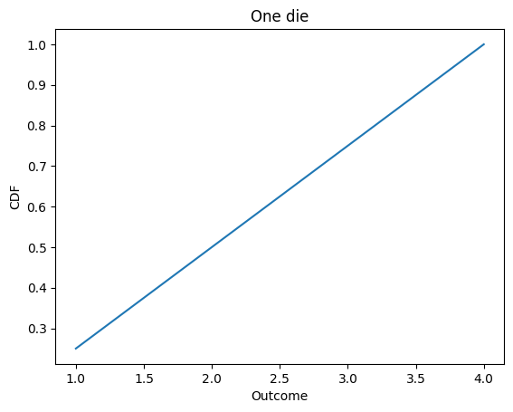
d4.plot()
decorate_dice('One die')
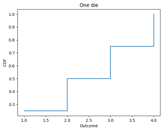
Cdf also provides step, which plots the Cdf as a step function.
psource(Cdf.step)
    def step(self, **options):
        """Plot the Cdf as a step function.

        Args:
        options: passed to pd.Series.plot
        """
        underride(options, drawstyle="steps-post")
        self.plot(**options)
d4.step()
decorate_dice('One die')
Make Cdf from sequence#
For comments or questions about this section, see this issue.
The following function makes a Cdf object from a sequence of values.
psource(Cdf.from_seq)
    @staticmethod
    def from_seq(seq, normalize=True, sort=True, **options):
        """Make a CDF from a sequence of values.

        Args:
        seq: iterable
        normalize: whether to normalize the Cdf, default True
        sort: whether to sort the Cdf by values, default True
        options: passed to the pd.Series constructor

        Returns: CDF object
        """
        # if normalize==True, normalize AFTER making the Cdf
        # so the last element is exactly 1.0
        pmf = Pmf.from_seq(seq, normalize=False, sort=sort, **options)
        return pmf.make_cdf(normalize=normalize)
cdf = Cdf.from_seq(list('allen'))
cdf
| probs | |
|---|---|
| a | 0.2 |
| e | 0.4 |
| l | 0.8 |
| n | 1.0 |
cdf = Cdf.from_seq(np.array([1, 2, 2, 3, 5]))
cdf
| probs | |
|---|---|
| 1 | 0.2 |
| 2 | 0.6 |
| 3 | 0.8 |
| 5 | 1.0 |
Selection#
For comments or questions about this section, see this issue.
Cdf inherits [] from Series, so you can look up a quantile and get its cumulative probability.
d4[1]
0.25
d4[4]
1.0
Cdf objects are mutable, but in general the result is not a valid Cdf.
d4[5] = 1.25
d4
| probs | |
|---|---|
| 1 | 0.25 |
| 2 | 0.50 |
| 3 | 0.75 |
| 4 | 1.00 |
| 5 | 1.25 |
d4.normalize()
d4
| probs | |
|---|---|
| 1 | 0.2 |
| 2 | 0.4 |
| 3 | 0.6 |
| 4 | 0.8 |
| 5 | 1.0 |
Evaluating CDFs#
For comments or questions about this section, see this issue.
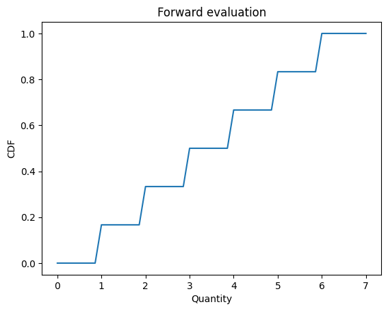
Evaluating a Cdf forward maps from a quantity to its cumulative probability.
d6 = Cdf.from_seq([1,2,3,4,5,6])
d6.forward(3)
array(0.5)
forward interpolates, so it works for quantities that are not in the distribution.
d6.forward(3.5)
array(0.5)
d6.forward(0)
array(0.)
d6.forward(7)
array(1.)
__call__ is a synonym for forward, so you can call the Cdf like a function (which it is).
d6(1.5)
array(0.16666667)
forward can take an array of quantities, too.
def decorate_cdf(title):
    """Labels the axes.

    title: string
    """
    plt.xlabel('Quantity')
    plt.ylabel('CDF')
    plt.title(title)
qs = np.linspace(0, 7)
ps = d6(qs)
plt.plot(qs, ps)
decorate_cdf('Forward evaluation')
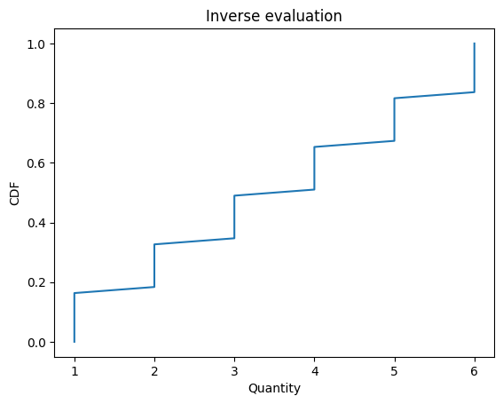
Cdf also provides inverse, which computes the inverse Cdf:
d6.inverse(0.5)
array(3.)
quantile is a synonym for inverse
d6.quantile(0.5)
array(3.)
inverse and quantile work with arrays
ps = np.linspace(0, 1)
qs = d6.quantile(ps)
plt.plot(qs, ps)
decorate_cdf('Inverse evaluation')
These functions provide a simple way to make a Q-Q plot.
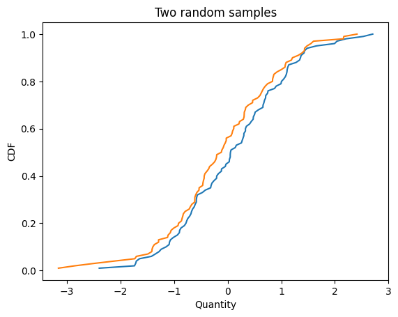
Here are two samples from the same distribution.
cdf1 = Cdf.from_seq(np.random.normal(size=100))
cdf2 = Cdf.from_seq(np.random.normal(size=100))

cdf1.plot()
cdf2.plot()
decorate_cdf('Two random samples')
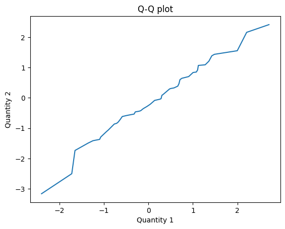
Here’s how we compute the Q-Q plot.
def qq_plot(cdf1, cdf2):
    """Compute results for a Q-Q plot.

    Evaluates the inverse Cdfs for a
    range of cumulative probabilities.

    cdf1: Cdf
    cdf2: Cdf

    Returns: tuple of arrays
    """
    ps = np.linspace(0, 1)
    q1 = cdf1.quantile(ps)
    q2 = cdf2.quantile(ps)
    return q1, q2
The result is near the identity line, which suggests that the samples are from the same distribution.
q1, q2 = qq_plot(cdf1, cdf2)
plt.plot(q1, q2)
plt.xlabel('Quantity 1')
plt.ylabel('Quantity 2')
plt.title('Q-Q plot');
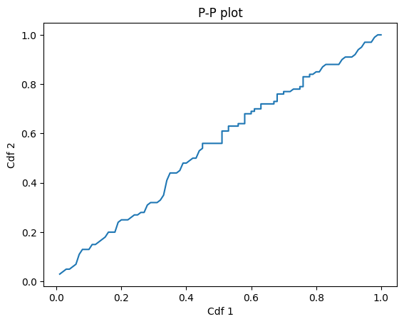
Here’s how we compute a P-P plot
def pp_plot(cdf1, cdf2):
    """Compute results for a P-P plot.

    Evaluates the Cdfs for all quantities in either Cdf.

    cdf1: Cdf
    cdf2: Cdf

    Returns: tuple of arrays
    """
    qs = cdf1.index.union(cdf2)
    p1 = cdf1(qs)
    p2 = cdf2(qs)
    return p1, p2
And here’s what it looks like.
p1, p2 = pp_plot(cdf1, cdf2)
plt.plot(p1, p2)
plt.xlabel('Cdf 1')
plt.ylabel('Cdf 2')
plt.title('P-P plot');
Statistics#
For comments or questions about this section, see this issue.
Cdf overrides the statistics methods to compute mean, median, etc.
psource(Cdf.mean)
    def mean(self):
        """Expected value.

        Returns: float
        """
        return self.make_pmf().mean()
d6.mean()
3.5
psource(Cdf.var)
    def var(self):
        """Variance.

        Returns: float
        """
        return self.make_pmf().var()
d6.var()
2.916666666666667
psource(Cdf.std)
    def std(self):
        """Standard deviation.

        Returns: float
        """
        return self.make_pmf().std()
d6.std()
1.7078251276599332
Sampling#
For comments or questions about this section, see this issue.
choice chooses a random values from the Cdf, following the API of np.random.choice
psource(Cdf.choice)
    def choice(self, *args, **kwargs):
        """Makes a random sample.

        Uses the probabilities as weights unless `p` is provided.

        Args:
        args: same as np.random.choice
        options: same as np.random.choice

        Returns: NumPy array
        """
        pmf = self.make_pmf()
        return pmf.choice(*args, **kwargs)
d6.choice(size=10)
array([6, 4, 4, 2, 5, 1, 5, 2, 6, 2])
sample chooses a random values from the Cdf, following the API of pd.Series.sample
psource(Cdf.sample)
    def sample(self, n=1):
        """Samples with replacement using probabilities as weights.

        Args:
        n: number of values

        Returns: NumPy array
        """
        ps = np.random.random(n)
        return self.inverse(ps)
d6.sample(n=10)
array([5., 3., 4., 5., 4., 6., 5., 3., 2., 5.])
Arithmetic#
For comments or questions about this section, see this issue.
Cdf provides add_dist, which computes the distribution of the sum.
The implementation uses outer products to compute the convolution of the two distributions.
psource(Cdf.add_dist)
    def add_dist(self, x):
        """Distribution of the sum of values drawn from self and x.

        Args:
        x: Distribution, scalar, or sequence

        Returns: new Distribution, same subtype as self
        """
        pmf = self.make_pmf()
        res = pmf.add_dist(x)
        return self.make_same(res)
psource(Cdf.make_same)
    def make_same(self, dist):
        """Convert the given dist to Cdf.

        Args:
        dist: Distribution

        Returns: Cdf
        """
        return dist.make_cdf()
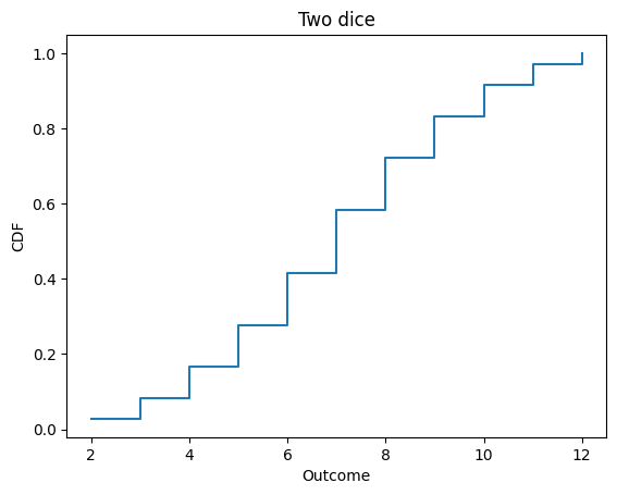
Here’s the distribution of the sum of two dice.
d6 = Cdf.from_seq([1,2,3,4,5,6])

twice = d6.add_dist(d6)
twice
| probs | |
|---|---|
| 2 | 0.027778 |
| 3 | 0.083333 |
| 4 | 0.166667 |
| 5 | 0.277778 |
| 6 | 0.416667 |
| 7 | 0.583333 |
| 8 | 0.722222 |
| 9 | 0.833333 |
| 10 | 0.916667 |
| 11 | 0.972222 |
| 12 | 1.000000 |
twice.step()
decorate_dice('Two dice')
twice.mean()
7.000000000000002
To add a constant to a distribution, you could construct a deterministic Pmf
const = Cdf.from_seq([1])
d6.add_dist(const)
| probs | |
|---|---|
| 2 | 0.166667 |
| 3 | 0.333333 |
| 4 | 0.500000 |
| 5 | 0.666667 |
| 6 | 0.833333 |
| 7 | 1.000000 |
But add_dist also handles constants as a special case:
d6.add_dist(1)
| probs | |
|---|---|
| 2 | 0.166667 |
| 3 | 0.333333 |
| 4 | 0.500000 |
| 5 | 0.666667 |
| 6 | 0.833333 |
| 7 | 1.000000 |
Other arithmetic operations are also implemented
d4 = Cdf.from_seq([1,2,3,4])
d6.sub_dist(d4)
| probs | |
|---|---|
| -3 | 0.041667 |
| -2 | 0.125000 |
| -1 | 0.250000 |
| 0 | 0.416667 |
| 1 | 0.583333 |
| 2 | 0.750000 |
| 3 | 0.875000 |
| 4 | 0.958333 |
| 5 | 1.000000 |
d4.mul_dist(d4)
| probs | |
|---|---|
| 1 | 0.0625 |
| 2 | 0.1875 |
| 3 | 0.3125 |
| 4 | 0.5000 |
| 6 | 0.6250 |
| 8 | 0.7500 |
| 9 | 0.8125 |
| 12 | 0.9375 |
| 16 | 1.0000 |
d4.div_dist(d4)
| probs | |
|---|---|
| 0.250000 | 0.0625 |
| 0.333333 | 0.1250 |
| 0.500000 | 0.2500 |
| 0.666667 | 0.3125 |
| 0.750000 | 0.3750 |
| 1.000000 | 0.6250 |
| 1.333333 | 0.6875 |
| 1.500000 | 0.7500 |
| 2.000000 | 0.8750 |
| 3.000000 | 0.9375 |
| 4.000000 | 1.0000 |
Comparison operators#
Pmf implements comparison operators that return probabilities.
You can compare a Pmf to a scalar:
d6.lt_dist(3)
0.3333333333333333
d4.ge_dist(2)
0.75
Or compare Pmf objects:
d4.gt_dist(d6)
0.25
d6.le_dist(d4)
0.41666666666666663
d4.eq_dist(d6)
0.16666666666666666
Interestingly, this way of comparing distributions is nontransitive.
A = Cdf.from_seq([2, 2, 4, 4, 9, 9])
B = Cdf.from_seq([1, 1, 6, 6, 8, 8])
C = Cdf.from_seq([3, 3, 5, 5, 7, 7])
A.gt_dist(B)
0.5555555555555556
B.gt_dist(C)
0.5555555555555556
C.gt_dist(A)
0.5555555555555556
Copyright 2019 Allen Downey
BSD 3-clause license: https://opensource.org/licenses/BSD-3-Clause