Think Linear Algebra is not for sale yet, but if you would like to support this project, you can buy me a coffee.
8. Least Squares Regression#
Least squares regression is a method for finding a best fit model, where “best” means that it minimizes the squared differences between the model and the data. We can compute a least squares fit with a conventional minimization algorithm, but linear algebra provides an efficient algorithm based on vector projection.
In this chapter, I’ll present two versions of this algorithm, one based on QR decomposition and the other based on orthogonality equations – and I’ll explain what both of those mean. We’ll start with a simple example where we can visualize the vector projection, and move on to an example with real data from the General Social Survey.
We’ll use this data to explore the relationship between political ideology – conservative, moderate, or liberal – and three predictors – time, age, and year of birth – to see whether people get more conservative as they get older. This example demonstrates a computation challenge for regression, multiple collinearity.
Click here to run this notebook on Colab.
Show code cell content
from os.path import basename, exists


def download(url, filename=None):
    if filename is None:
        filename = basename(url)

    if not exists(filename):
        from urllib.request import urlretrieve

        local, _ = urlretrieve(url, filename)
        print("Downloaded " + local)


download("https://github.com/AllenDowney/ThinkLinearAlgebra/raw/main/utils.py")
Show code cell content
import networkx as nx
import numpy as np
import pandas as pd
import matplotlib.pyplot as plt
import sympy as sp

from utils import decorate, underride
8.1. Regression as Minimization#
Before we think of regression as a linear algebra problem, let’s start with minimization. Specifically, we’ll start with least squares regression, which minimizes the sum of squared errors.
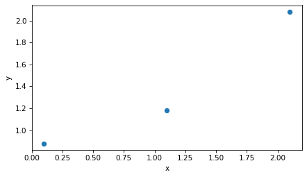
As the small example, I’ll construct a predictor, x, and a response variable, y, with only three elements.
x = np.array([2, 1, 0]) + 0.1
x
intercept, slope = 0.5, 0.8
errors = [-0.1, -0.2, 0.3]

y = intercept + slope * x + errors
y
array([2.1, 1.1, 0.1])
A natural way to visualize this dataset is to plot y versus x.
plt.plot(x, y, 'o')
decorate(xlabel='x', ylabel='y')
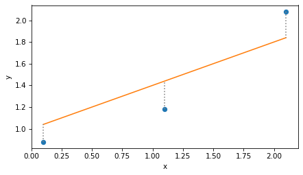
There’s no line that goes through all three points, so we’ll find a line of best fit. First we’ll construct the design matrix, so-called because it represents the design of the regression model – that is, the choice of predictors and response variable.
In this example, the fitted line has an intercept and a slope, so the design matrix has two columns: the first, which is all 1s, corresponds to the intercept; the second, which contains the values of x, corresponds to the slope.
from sympy import Matrix

X = np.column_stack((np.ones_like(x), x))
Matrix(X)
Now the goal is to find the vector of parameters, beta, that contains the intercept and slope of the line of best fit.
For this example, we’ll start with an arbitrary guess.
beta = np.array([1, 0.4])
To see how good that guess is, we can evaluate the fitted line at each location in x.
y_fit = X @ beta
Next we can compute the residuals, which are the vertical distances between the actual values, y, and the fitted line.
r = y - y_fit
r
array([ 0.24, -0.26, -0.16])
Here’s what that looks like. The dots are the actual values, the solid line is the not-very-good fit, and the vertical dotted lines show the residuals.
plt.plot(x, y, 'o')
plt.plot(x, y_fit)
plt.vlines(x, y, y_fit, ls=':', color='gray')
decorate(xlabel='x', ylabel='y')
To quantify the goodness of fit, can compute the residual sum of squares like this:
np.sum(r**2)
0.1508
Or equivalently, we can compute the dot product of the residuals.
r @ r
0.1508
Here’s a function that takes a hypothetical vector of coefficients, beta, and returns the residual sum of squares, rss.
def rss_func(beta, X, y):
    r = y - X @ beta
    return np.dot(r, r)
Here’s the result for the example.
rss_func(beta, X, y)
0.1508
Now we can use rss_func with the minimize function from SciPy to efficiently search for the value of beta that minimizes rss.
from scipy.optimize import minimize

result = minimize(rss_func, beta, args=(X, y))
result.message
'Optimization terminated successfully.'
The result is an OptimizeResult object; in this case, the message attribute indicates that the iterative search converged to a minimum.
And here’s the result, which we’ll call beta_hat because the conventional notation for this result is \(\hat{\beta}\), and the caret is almost universally called a “hat”.
beta_hat = result.x
beta_hat
array([0.72, 0.6 ])
We can confirm that this value of beta yields a lower rss than the initial guess.
rss_func(beta_hat, X, y)
0.0600
If we use beta_hat to compute fitted values, the result is called y_hat.
y_hat = X @ beta_hat
And here’s what the least squares fit looks like.
plt.plot(x, y, 'o')
plt.plot(x, y_hat)
plt.vlines(x, y, y_hat, ls=':', color='gray')
decorate(xlabel='x', ylabel='y')
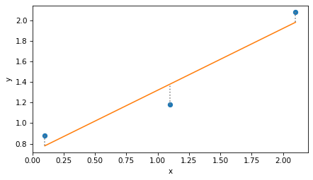
Again, the dotted lines represent the residuals, r, and the residual sum of squares is the dot product of r with itself.
r = y - y_hat
r @ r
0.0600
To be honest, minimization is not a bad way to solve regression problems, and it generalizes easily to other definitions of “best” and other kinds of regression. But there’s another way: if we write least squares regression as a matrix equation, linear algebra provides an elegant and efficient solution.
8.2. Projection#
The key to linear regression is projection.
To see what that means, we’ll pull out the columns of the design matrix, X, as three-dimensional vectors v1 and v2.
v1, v2 = np.transpose(X)
v1
array([1., 1., 1.])
v2
array([2.1, 1.1, 0.1])
The linear combinations of these vector span a two dimensional plane in three dimensions. The following figure shows this plane.
It also shows the response variable, y, which we can think of as a vector in three dimensions, as well as the vector of fitted values, y_hat – which looks like the shadow y casts onto the plane defined by v1 and v2.
Show code cell source
from utils import setup_3D, plot_vectors_3D, label_vectors_3D, plot_plane

setup_3D()
plot_plane(v1, v2, alpha=0.08)
plot_vectors_3D([v1, v2], color='C1')
label_vectors_3D(['v1', 'v2'], [v1, v2])

plot_vectors_3D([y], alpha=1)
label_vectors_3D(['y'], [y], offset=0.08)

plot_vectors_3D([y_hat], color='gray')

lim = [0, 2.7]
decorate(xlim=lim, ylim=lim, zlim=[0, 1], xlabel='i', ylabel='j', zlabel='k')
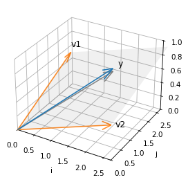
y does not fall in the plane, which means it cannot be expressed as a linear combination of the columns of X.
But y_hat does fall in the plane, because it is a combination of the columns of X – specifically, y_hat = X @ beta.
The difference between y and y_hat is the residual, r, which we can also think of as a vector in this space.
This vector has two important properties.
First, the length of r, squared, is the residual sum of squares.
from utils import norm

norm(r) ** 2
0.0600
Second, r is perpendicular to the columns of X, which we can confirm by showing that their dot product is close to zero.
X.T @ r
array([-7.9582e-09, -7.7054e-09])
This result means that y_hat, the fitted values that minimize RSS, is the projection of y onto the plane defined by v1 and v2 – that is, the vector in the plane that’s closest to y.
This insight is the key to an efficient way to compute y_hat, using QR decomposition.
8.3. QR Decomposition#
QR composition is similar to LU decomposition, which we used to solve systems of linear equations efficiently.
In LU decomposition, we express a matrix,
A, as the product of two matrices, one lower-diagonal and one upper-diagonal.In QR decomposition, we’ll express the design matrix,
X, as the product of two matrices, one orthonormal and one upper diagonal.
To explain what an orthonormal matrix is, and why it is useful, we’ll use the NumPy function qr to compute the decomposition.
In the next section we’ll see how this function works.
Q, R = np.linalg.qr(X)
The results are two matrices. Q is the same size as X.
Q
array([[-5.7735e-01,  7.0711e-01],
       [-5.7735e-01,  5.5511e-17],
       [-5.7735e-01, -7.0711e-01]])
And R has the same number of columns as X, but it’s square and upper triangular.
R
array([[-1.7321, -1.9053],
       [ 0.    ,  1.4142]])
First let’s confirm that \(Q R = X\).
np.allclose(Q @ R, X)
True
Now if Q is orthonormal, the “ortho” part means that the columns are perpendicular to each other, and the “normal” part means the norm of the columns is 1.
We can confirm both by computing the dot product of the columns with themselves.
Matrix(Q.T @ Q)
The off-diagonal elements are close to zero, which confirms that the columns are orthogonal to each other, and the diagonal elements are 1, which confirms that their norm is 1.
But also notice that the product of \(Q^T\) and \(Q\) is the identity matrix, \(I\), which means that \(Q^T\) is the inverse of \(Q\). That’s true in general: an orthonomal matrix is its own inverse.
And that’s useful because we can solve the equation
\(Q \beta' = y\)
by multiplying both sides by \(Q^T\), which yields
\(Q^T Q \beta' = Q^T y\),
which yields
\(\beta' = Q^T y\).
beta_prime = Q.T @ y
beta_prime
array([-2.3902, 0.8485])
And why would we want to solve \(Q \beta' = y\)? Because the result is the coordinates of \(\hat{y}\) in the span of \(Q\). We can confirm that by multiplying those coordinates by the columns of \(Q\).
y_hat = Q @ beta_prime
y_hat
array([1.98, 1.38, 0.78])
The result is the same as the y_hat we computed by minimizing RSS.
Combining the last two steps, we could have computed y_hat like this.
y_hat = Q @ Q.T @ y
y_hat
array([1.98, 1.38, 0.78])
Or, instead of multiplying y by Q.T first, we could multiply Q and Q.T first.
P = Q @ Q.T
P
array([[ 0.8333,  0.3333, -0.1667],
       [ 0.3333,  0.3333,  0.3333],
       [-0.1667,  0.3333,  0.8333]])
The result is a projection matrix that projects any vector into the span of Q.
y_hat = P @ y
y_hat
array([1.98, 1.38, 0.78])
Normally we would not compute P explicitly, but it is useful for confirming an important property of Q, which is that it has the same span as X.
We can show that by projecting the columns of X onto Q.
P @ X
array([[1. , 2.1],
       [1. , 1.1],
       [1. , 0.1]])
And confirming that the result is X.
np.allclose(P @ X, X)
True
Which shows that the plane spanned by Q is the same as the plane spanned by X.
The following diagram shows two views of
The columns of
X–v1andv2– and the plane they span;The columns of
Q–q1andq2– and the plane they span.
Show code cell content
def plot_orthogonal_basis(X, Q):
    v1, v2 = X.T
    q1, q2 = Q.T

    plot_plane(v1, v2, alpha=0.08)
    plot_plane(q1, q2, alpha=0.08)
    plot_vectors_3D([v1, v2], color='C1')
    label_vectors_3D(['v1', 'v2'], [v1, v2])

    plot_vectors_3D([q1, q2], color='C4', alpha=1)
    label_vectors_3D(['q1', 'q2'], [q1, q2])

    decorate(xlim=[0, 3], ylim=[-10, 4], zlim=[0, 1],
             xlabel='i', ylabel='j', zlabel='k')
Show code cell source
fig, axes = setup_3D(ncols=2)

azimuths = [-70, -30]

for ax, azim in zip(axes, azimuths):
    plt.sca(ax)
    ax.view_init(elev=30, azim=azim, roll=0)

    # flip the sign of q1 before plotting
    plot_orthogonal_basis(X, Q * [-1, 1])
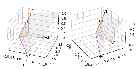
Because of the limitations of 3D visualization, it might not be obvious that the two shaded areas are in the same plane – but they are.
This property is important because it means that projecting y onto Q is the same as projecting y onto X, which minimizes RSS. So we are almost there!
The last step is to use beta_prime, which contains the coordinates of y_hat in terms of the columns of Q, to compute beta, which contains coordinates of y_hat in terms of the columns of X.
Let’s see how we do that.
So far we have found \(\beta'\) such that \(Q \beta' = \hat{y}\), and we want \(\beta\) such that \(X \beta = \hat{y}\). Setting the left sides equal, we get
\(X \beta = Q \beta'\)
Replacing \(X\) with \(QR\) we have
\(Q R \beta = Q \beta'\)
If we multiply through by \(Q^{-1}\), we can cancel \(Q\) on both sides, leaving
\(R \beta = \beta'\)
So we can find \(\beta\) by solving this equation.
Since R is upper triangular, we can use solve_triangular, which is more efficient that the more general solve function.
The argument lower=False indicates that R is upper triangular.
from scipy.linalg import solve_triangular

beta_qr = solve_triangular(R, beta_prime, lower=False)
beta_qr
array([0.72, 0.6 ])
And the result is the same as the beta we computed by minimization.
It took a few steps to get here, but now we can write the whole process in just two lines.
def lstsq(X, y):
    Q, R = np.linalg.qr(X)
    beta = solve_triangular(R, Q.T @ y, lower=False)
    return beta
And we get the same result.
lstsq(X, y)
array([0.72, 0.6 ])
SciPy provides a similar function with additional capabilities.
import scipy

beta, _, rank, _ = scipy.linalg.lstsq(X, y, lapack_driver='gelsy')
The argument lapack_driver='gelsy' specifies which function to use.
The “ge” part of the name indicates that the function works with general matrices – not necessarily symmetric, for example.
The “ls” part means it computes a least squares fit.
And “y” indicates the variant that uses QR decomposition.
The first return value is beta again.
beta
array([0.72, 0.6 ])
The second and fourth return values not used by gelsy, so we ignore them.
The third return value is the rank of the design matrix, which is usually the number of columns in X.
rank
2
If the columns are dependent – that is, if some are linear combinations of others – the rank might be lower. We’ll see an example of that soon, but first we have a loose end to tie up: how do we compute the QR decomposition?
8.4. Orthonormalization#
QR decomposition provides an efficient way to compute a least squares fit. Now let’s see how to do the decomposition. The process turns out to be simpler than you might expect.
We’ll start by unpacking the columns of X.
from utils import norm, normalize

v1, v2 = X.T
Now the goal is to find two orthogonal unit vectors, q1 and q2, that span the same plane as v1 and v2.
For q1 we’ll choose a unit vector with the same direction as v1.
q1 = normalize(v1)
q1
array([0.5774, 0.5774, 0.5774])
For q2, we’ll subtract from v2 the part of of v2 parallel to q1, leaving only the part of v2 perpendicular to q1 (which you might recognize as the vector rejection).
from utils import vector_projection

v2_perp = v2 - vector_projection(v2, q1)
Then we normalize the perpendicular part.
q2 = normalize(v2_perp)
q2
array([ 0.7071, 0. , -0.7071])
If we pack q1 and q2 into a matrix, we get the same Q computed by NumPy.
Q = np.column_stack([q1, q2])
Q
array([[ 0.5774,  0.7071],
       [ 0.5774,  0.    ],
       [ 0.5774, -0.7071]])
And we can confirm that Q.T @ Q = I, which means that Q is orthonormal.
Q.T @ Q
array([[ 1.0000e+00, -1.7796e-17],
       [-1.7796e-17,  1.0000e+00]])
The process we just followed is called Gram-Schmidt orthonormalization.
If there are more than two vectors we can repeat the process.
For the third vector, we subtract off the parts parallel to q1 and q2, and normalize what’s left.
The following function implements this process for a matrix with any number of columns.
def gram_schmidt(X):
    basis = []
    for v in X.T:
        for q in basis:
            v = v - vector_projection(v, q)
        basis.append(normalize(v))
    return np.transpose(basis)
And we can confirm it works for X.
gram_schmidt(X)
array([[ 0.5774,  0.7071],
       [ 0.5774,  0.    ],
       [ 0.5774, -0.7071]])
The previous function is meant to demonstrate the process clearly, but it only computes Q.
The following function also computes R, so it is a little more complicated.
def gram_schmidt(X):
    m, n = X.shape
    Q = np.zeros((m, n))
    R = np.zeros((n, n))

    for j in range(n):
        v = X[:, j]
        for i in range(j):
            R[i, j] = X[:, j] @ Q[:, i]
            v = v - R[i, j] * Q[:, i]

        R[j, j] = norm(v)
        Q[:, j] = v / R[j, j]

    return Q, R
In R, the off-diagonal element R[i, j] records the scalar projection of column j from X onto column i from Q.
And the diagonal element R[j, j] records the factor used to normalize column j from Q.
Q, R = gram_schmidt(X)
Let’s confirm that this function computes the same R we got from NumPy.
R
array([[1.7321, 1.9053],
       [0.    , 1.4142]])
And that Q R = X.
np.allclose(Q @ R, X)
True
That’s it! Computing the QR decomposition is efficient and not very complicated.
At this point, you might be tired of the small example we’ve been working with. So let’s see what we can do with real data.
8.5. Animation#
This section creates an animation intended to make it visually clearer that the columns of Q are in the same plane as the columns of X.
Show code cell content
fig, [ax] = setup_3D()

ax.view_init(elev=30, azim=-70, roll=0)
plot_orthogonal_basis(X, Q)

plt.close(fig)
Show code cell content
def pingpong_ease(t, start, end):
    """Easing function from start → end → start."""
    t = np.asarray(t)
    # Smooth cosine pulse: 0 → 1 → 0
    pulse = 0.5 * (1 - np.cos(2 * np.pi * t))
    return start + (end - start) * pulse
Show code cell content
num_frames = 30

def animate_frame(i):
    t = i / (num_frames - 1)
    azim = pingpong_ease(t, -80, 0)
    ax.view_init(elev=30, azim=azim)
    return ax,
Show code cell content
import matplotlib.animation as animation

interval = 150
anim = animation.FuncAnimation(fig, animate_frame, frames=num_frames, interval=interval)
Show code cell content
from IPython.display import HTML

HTML(anim.to_jshtml())
8.6. Multiple Regression#
Do people get more conservative as they get older? To find out, we’ll use data from the General Social Survey (GSS) to explore the relationship between political ideology and age, also considering changes over time and differences between generations.
We’ll use multiple regression, which involves more than one predictor, and we’ll see the problems that arise if the predictors are strongly correlated.
The following cell downloads the data.
download('https://github.com/AllenDowney/GssExtract/raw/main/data/interim/gss_extract_2024_1.hdf')
I have prepared an excerpt of GSS data collected between 1974 and 2024, which we can read into a Pandas DataFrame.
gss = pd.read_hdf('gss_extract_2024_1.hdf')
gss.shape
(75699, 62)
The DataFrame contains one row for each of the 75,699 respondents who have participated in the GSS, and one column for each of the variables in this excerpt.
We’ll select only the columns we need for this example and drop any rows with missing data in those columns.
columns = ['polviews', 'year', 'cohort']
subset = gss.dropna(subset=columns)[columns]
The year column records the year each respondent was interviewed, and the cohort column records their year of birth (sometimes called “birth cohort”).
So we can compute the age of each respondent when they were interviewed.
subset['age'] = subset['year'] - subset['cohort']
polviews records responses to this question
I’m going to show you a seven-point scale on which the political views that people might hold are arranged from extremely liberal–point 1–to extremely conservative–point 7. Where would you place yourself on this scale?
The responses are recorded with numbers from 1 to 7 that represent these categories:
Number |
Political Ideology |
|---|---|
1 |
Extremely liberal |
2 |
Liberal |
3 |
Slightly liberal |
4 |
Moderate, middle of the road |
5 |
Slightly conservative |
6 |
Conservative |
7 |
Extremely conservative |
The describe method computes summary statistics for these variables.
subset.describe()
| polviews | year | cohort | age | |
|---|---|---|---|---|
| count | 65239.0000 | 65239.0000 | 65239.0000 | 65239.0000 |
| mean | 4.1086 | 1999.9547 | 1954.8059 | 45.1488 |
| std | 1.4057 | 15.2522 | 21.9236 | 17.2269 |
| min | 1.0000 | 1974.0000 | 1885.0000 | 18.0000 |
| 25% | 3.0000 | 1987.0000 | 1941.0000 | 31.0000 |
| 50% | 4.0000 | 2000.0000 | 1956.0000 | 43.0000 |
| 75% | 5.0000 | 2014.0000 | 1969.0000 | 58.0000 |
| max | 7.0000 | 2024.0000 | 2006.0000 | 90.0000 |
The average of polviews is 4.1, which is close to “middle of the road”.
Higher numbers are more conservative, and lower numbers are more liberal.
The range of year is from 1974 to 2024.
The range of cohort is from 1885 to 2006.
The range of age is from 18 to 90.
Now we can use least squares regression to see how the responses are related to age and other variables.
First we’ll assign the values of the response variable to y.
response = 'polviews'
y = subset[response]
For the first version of the model we’ll use age as the only predictor.
predictor = 'age'
means_age = subset.groupby(predictor)[response].mean()
We can get a sense of the relationship between these variables by plotting the mean of the response variable in each age group.
means_age.plot(style='.')
decorate(xlabel=predictor, ylabel=response, title='polviews by age')
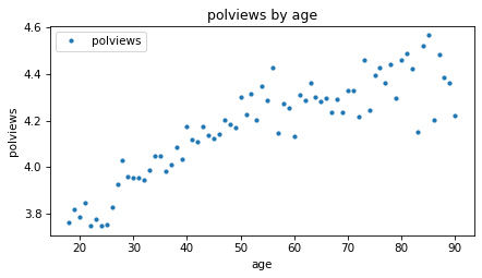
The average increases with age, which means that older people consider themselves more conservative. But the difference is not very big – the average among people in their 20s, when they were interviewed, is only slightly left of center, and people in their 90s are about halfway between “middle of the road” and “slightly conservative”, on average.
Let’s fit a line to this data.
We’ll use add_constant to make a design matrix, X, that contains the single predictor and a columns of ones.
from utils import add_constant

predictors = [predictor]
X = add_constant(subset[predictors])
X.shape
(65239, 2)
And we’ll use SciPy to compute the least squares fit.
beta, _, rank, _ = scipy.linalg.lstsq(X, y, lapack_driver='gelsy')
rank, beta
(2, array([3.6416, 0.0103]))
The rank is 2, which indicates that the two columns of X are independent.
We can interpret the elements of beta as an intercept and slope.
The slope is about 0.01, which means that a difference of one year in age is associated with a difference of 0.01 in the average response.
The intercept is the value of the fitted line when age=0.
In this example the intercept is hard to interpret because newborns don’t have political views. The model is more sensible if we evaluate the fitted line over the relevant range of ages, from 18 to 90.
fit_x = np.arange(18, 90)
fit_y = add_constant(fit_x) @ beta
Here’s what the line looks like compared to the data.
means_age.plot(style='.')
plt.plot(fit_x, fit_y)

decorate(xlabel=predictor, ylabel=response, title='polviews by age')
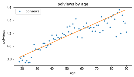
Based on these results, it seems like people might get more conservative as they get older, but let’s also see if there’s a relationship with year of birth – that is, cohort.
First, let’s put the steps we just followed into a function.
def fit_model(df, response, predictors, fit_x):
    # group means by the first predictor
    means = df.groupby(predictors[0])[response].mean()

    # response and design matrix
    y = df[response]
    X = add_constant(df[predictors])

    # least squares fit
    beta, _, rank, _ = scipy.linalg.lstsq(X, y, lapack_driver='gelsy')

    # fitted values for new X
    fit_y = add_constant(fit_x) @ beta

    # condition number of design matrix
    cond_number = np.linalg.cond(X)

    return RegressionResult(means, cond_number, rank, beta, fit_y)
fit_model takes as a parameters the DataFrame, the response variable, a list of predictors, and a range of x values where it should evaluate the fitted line.
It uses
groupbyto compute the average of the response variable as a function of the first predictor.Then it extracts
y, makes the design matrix,X, and computes the least squares fit.It evaluates the fitted line over the given range,
fit_x.It also computes the condition number of
X, which I’ll explain later.
Finally, it returns the results in a RegressionResult object.
RegressionResult is a dataclass, which is a Python object that contains a specified set of attributes.
Show code cell content
from dataclasses import dataclass

@dataclass
class RegressionResult:
    means: np.ndarray
    cond_number: float
    rank: int
    beta: np.ndarray
    fit_y: np.ndarray
Here’s how we can use this function to compute a least squares fit of polviews as a function of age, again, and save the results.
result_age = fit_model(subset, response, [predictor], fit_x)
result_age.beta
array([3.6416, 0.0103])
Now here’s a least squares fit of polviews as a function of cohort, evaluated over the range of birth years from 1880 to 2010.
predictor = 'cohort'
fit_x = np.arange(1880, 2010)
result_cohort = fit_model(subset, response, [predictor], fit_x)
result_cohort.beta
array([ 1.6354e+01, -6.2643e-03])
The following function takes the regression results and plots the fitted line along with the data.
Show code cell content
color_map = {
    'age': 'C0',
    'year': 'C2',
    'yearc': 'C2',
    'cohort': 'C4',
}

def plot_result(response, predictor, result, fit_x):
    result.means.plot(style='.', color=color_map[predictor])
    plt.plot(fit_x, result.fit_y, color='C1')

    decorate(xlabel=predictor,
             ylabel=response,
             title=f'{response} by {predictor}')
Here’s what the results look like for polviews as a function of cohort.
plot_result(response, predictor, result_cohort, fit_x)
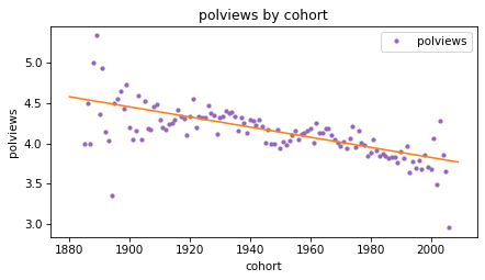
The slope of the line is negative, which means that people born earlier are more likely to say they are conservative, compared to people born later.
Based on the results so far, we can’t tell whether people get more conservative as they age, or whether older people are more conservative because they were born earlier.
We’ll come back to this question, but first let’s look at the third predictor, year.
8.7. A Quadratic Model#
So far we’ve computed least squares fits with age and cohort as predictors.
Now let’s do the same with year.
We’ll see that a straight line doesn’t fit the data well, so we’ll fit a parabola.
Here’s the least squares fit of polviews as a function of year.
predictor = 'year'
fit_x = np.arange(1974, 2025)
result_year = fit_model(subset, response, [predictor], fit_x)
result_year.beta
array([3.5988e+00, 2.5495e-04])
And here’s the fitted line along with the data.
plot_result(response, predictor, result_year, fit_x)
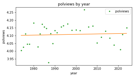
The fitted line is almost flat, which suggests that there is little or no change over time, but we can see that the line does not fit the data very well.
If there is a relationship between polviews and year, it seems to be nonlinear, increasing until some time between 1990 and 2000, and decreasing afterward.
Instead of fitting a straight line to the data, we can fit a parabola.
First we’ll compute a new column that contains the values of year squared.
subset['year2'] = subset['year'] ** 2
Next we’ll run a regression with year and year2 as predictors.
Because we have two predictors, we’ll need fit_X to be a matrix with two columns:
the first contains a range of dates from 1970 to 2024; the second contains those values squared.
fit_x0 = np.arange(1974, 2025)
fit_x1 = fit_x0 ** 2
fit_X = np.column_stack([fit_x0, fit_x1])
Now we can compute a least squares fit with two predictors.
predictors = ['year', 'year2']
result_year2 = fit_model(subset, response, predictors, fit_X)
result_year2.rank
3
The rank is 3 now, because the design matrix contains two predictors and a column of ones.
If we represent the columns of X symbolically as \(1\), \(x\), and \(x^2\),
and the elements of beta as \(\beta_0\), \(\beta_1\), and \(\beta_2\), we can express the dot product of X and beta like this.
import sympy as sp

beta = sp.symbols('beta_0 beta_1 beta_2')
x = sp.symbols('x')

np.dot([1, x, x**2], beta)
That is the equation of a parabola. Here are the estimated coefficients.
result_year2.beta
array([-5.6547e+02, 5.6937e-01, -1.4228e-04])
The third element (the coefficient of \(x^2\)) is negative, which indicates that the parabola curves downward. And if we plot the fitted curve, we can see that it does.
plot_result(response, predictors[0], result_year2, fit_x0)
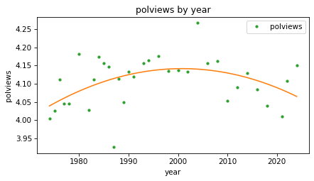
This model fits the data better than the straight line. It seems that people were a little more likely to consider themselves conservative in the 1990s and 2000s, but more recently that trend has reversed.
In the next section we’ll get back to the question we started with – as people get older, do they get more conservative?
8.8. Age, Period, Cohort#
So far we have modeled the response variable as a function of age, time period (year), and cohort (year of birth). Now let’s see how these predictors interact with each other. This kind of modeling is called age-period-cohort analysis.
First let’s try a model with age and cohort as predictors.
predictors = ['age', 'cohort']
fit_x0 = np.arange(18, 90)
fit_x1 = np.full_like(fit_x0, 2000)
fit_X = np.column_stack([fit_x0, fit_x1])

result_age_cohort = fit_model(subset, response, predictors, fit_X)
result_age_cohort.rank
3
The rank of this model is 3 because the design matrix has three columns and they are independent.
Because this model includes more than one predictor, it is a multiple regression, as opposed to a model with only one predictor, which is a simple regression.
To visualize the results, we’ll consider three cohorts, people born in 1920, 1960, and 2000. For each cohort, we’ll compute a fitted line over a range of ages.
cohorts = [1930, 1960, 1990]
fits = {}

for cohort in cohorts:
    fit_x1 = np.full_like(fit_x0, cohort)
    fit_X = np.column_stack([fit_x0, fit_x1])

    result = fit_model(subset, response, predictors, fit_X)
    fits[cohort] = result.fit_y
Here’s what the lines look like for the three cohorts.
means_age.plot(style='.', color='C0')
style_map = dict(zip(cohorts, ['-', '--', ':']))

for cohort, fit_y in fits.items():
    plt.plot(fit_x0, fit_y, style_map[cohort], color='C1', label=f'cohort {cohort}')

decorate(xlabel=predictors[0], ylabel=response)
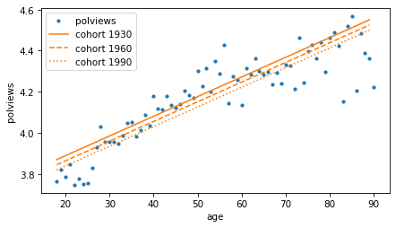
In each cohort, it looks like older people are more conservative than younger people (or at least more likely to say they are). But reading the lines from top to bottom, each cohort is a little less conservative than the previous one.
We can see the second effect more clearly if we make a model with year, year2, and cohort as predictors.
predictors = ['year', 'year2', 'cohort']
fit_x0 = np.arange(1974, 2025)

fits = {}
for cohort in cohorts:
    fit_x1 = fit_x0 ** 2
    fit_x2 = np.full_like(fit_x0, cohort)
    fit_X = np.column_stack([fit_x0, fit_x1, fit_x2])

    result = fit_model(subset, response, predictors, fit_X)
    fits[cohort] = result.fit_y

result.rank
4
The rank of the design matrix is 4 because it contains three predictors and a column of ones.
Because it includes both year and year2, the fitted curves are parabolas when we plot them as a function of time.
for cohort, fit_y in fits.items():
    plt.plot(fit_x0, fit_y, style_map[cohort], color='C1', label=f'cohort {cohort}')

decorate(xlabel=predictors[0], ylabel=response)
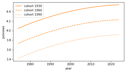
Again, as people get older, they are more likely to say they are conservative. And each cohort is less conservative than the previous. But we should interpret this graph with caution, because it extrapolates beyond the data we have – people born in 1990 were not included in the survey until they were 18 years old in 2018.
Nevertheless, we can conclude that there are two trends happening at the same time:
Between cohorts, people born earlier are more conservative, and
As they get older, each cohort is more likely to say they are conservative, on average.
If you are curious about this topic, I explored it more deeply in Chapter 12 of Probably Overthinking it.
But before we go on, I have a warning about a common problem with regression models.
8.9. Collinearity#
When people learn about age-period-cohort analysis, they often attempt something impossible – a model that includes age, period, and cohort. To see why it’s impossible, let’s do it.
predictors = ['age', 'cohort', 'year']
fit_x0 = np.arange(18, 90)
fit_x1 = np.full_like(fit_x0, 2000)
fit_x2 = np.full_like(fit_x0, 2018)
fit_X = np.column_stack([fit_x0, fit_x1, fit_x2])

result_colinear = fit_model(subset, response, predictors, fit_X)
It’s not obvious that something has gone wrong. The coefficients are similar to the ones we saw in previous models.
result_colinear.beta
array([ 5.3109e+00, 6.6641e-03, -3.7502e-03, 2.9139e-03])
But the rank is only 3.
result_colinear.rank
3
The design matrix has four columns – three predictors and a column of ones – but they are not independent.
That’s because age = year - cohort.
And that’s a problem.
To see why, recall that fit_model uses the SciPy function lstsq, which uses QR factorization.
And QR factorization uses the Gram-Schmitt process.
So let’s see what happens when we try to orthogonalize a matrix with dependent columns.
y = subset[response]
X = add_constant(subset[predictors])
Q, R = gram_schmidt(X)
Remember that the columns of Q are suppose to be orthogonal, so Q.T @ Q should be the identity matrix.
(Q.T @ Q).round(4)
array([[ 1.    ,  0.    , -0.    , -0.007 ],
       [ 0.    ,  1.    , -0.    , -0.0019],
       [-0.    , -0.    ,  1.    ,  1.    ],
       [-0.007 , -0.0019,  1.    ,  1.    ]])
The first three columns are orthogonal to each other, but in the last row and column, the off diagonal elements are not zero, as they should be – which means that the last column is not orthogonal to the others. In fact, the last two columns are almost identical, and their dot product is close to one.
This problem is called collinearity because these columns in Q are co-linear – that is, they fall on the same line.
When the columns of X are collinear, the least squares coefficients are unreliable, because it’s impossible for the model to distinguish the effect of one predictor from another.
This is also a problem when the columns are almost collinear, as we’ll see in the next section.
8.10. Condition Number#
When we computed the least squares fits, we also computed the condition number of the design matrix, which indicates how close the columns are to collinear. The following table shows the results for the models we’ve computed so far.
Show code cell content
def condition_number_table(results, index):
    kappas = [result.cond_number for result in results]

    table = pd.DataFrame({r'$\kappa$': kappas,
                         r'$\log_{10} \kappa $': np.log10(kappas)},
                        index=index)
    return table
Show code cell source
results = [result_age, result_cohort, result_year,
           result_age_cohort, result_year2, result_colinear]
index = ['age', 'cohort', 'year', 'age + cohort', 'year + year2', 'age + cohort + year']
condition_number_table(results, index)
| $\kappa$ | $\log_{10} \kappa $ | |
|---|---|---|
| age | 135.6059 | 2.1323 |
| cohort | 174322.2522 | 5.2414 |
| year | 262262.0771 | 5.4187 |
| age + cohort | 257102.2685 | 5.4101 |
| year + year2 | 77917685753.1958 | 10.8916 |
| age + cohort + year | 9887806182996954.0000 | 15.9951 |
For the first model, the condition number, denoted \(\kappa\), is small, which means the columns are close to orthogonal. As the columns are closer to colinear, the condition number increases until, for a model where the columns are dependent, it is infinite.
The condition number determines how precisely we can compute the least squares coefficients. As a rule of thumb, \(\log_{10} \kappa\) is the number of digits of precision lost in computation. In double-precision floating-point arithmetic, we start with about 16 digits, so losing five or six of them is usually not a concern.
Even losing 10 digits can be acceptable – in that case, the results still have 6 digits, which is more precision than we have for most things we measure in the world.
But in the last example, where the columns are colinear, we lose all 16 digits, which means that in the computed coefficients, we can’t even be sure that the first digit is correct.
In the next section, we’ll see one way to compute condition numbers.
8.11. Orthogonality Equation#
So far we’ve computed least squares coefficients with QR decomposition, which is an efficient and precise algorithm. There is another way to derive and compute a least squares fit, by writing and solving the orthogonality equation. This method is not often used in practice because it is less efficient and the results are less precise. But it provides another view of how linear regression works and a way to compute condition numbers.
To review, the goal of a least squares fit is to find a vector of coefficients, \(\beta\), that minimizes the residuals, \(y - X \beta\). We have shown that we can minimize this residual by computing the projection the projection of \(y\) onto the space spanned by the columns of \(X\) – which means that the residual vector is orthogonal to the columns of \(X\).
Let’s check whether that’s true for one of the regressions we ran in a previous section, polviews as a function of age and cohort.
predictors = ['age', 'cohort']
y = subset[response]
X = add_constant(subset[predictors])
beta, _, rank, _ = scipy.linalg.lstsq(X, y, lapack_driver='gelsy')
Here are the coefficients computed by QR decomposition.
beta
array([ 5.3109e+00, 9.5780e-03, -8.3626e-04])
Here are the residuals.
r = y - X @ beta
And here are the dot products of the residuals with the columns of X.
X.T @ r
array([-1.7548e-10, -7.9385e-09, -3.4235e-07])
They are close to zero – within the precision we expect.
So we can use the orthogonality equation, \(X^T (y - X \beta) = 0\), to check a given value of \(\beta\). We can also use it to solve for \(\beta\). Matrix multiplication is distributive, so we can write the equation
Or, if we rearrange terms:
We can solve this equation by computing the normal matrix, \(X^T X\).
A = X.T @ X
A
array([[6.5239e+04, 2.9455e+06, 1.2753e+08],
       [2.9455e+06, 1.5234e+08, 5.7400e+09],
       [1.2753e+08, 5.7400e+09, 2.4933e+11]])
And the right hand side of the matrix equation, \(X^T y\)
b = X.T @ y
b
array([2.6804e+05, 1.2302e+07, 5.2378e+08])
Then we can solve the matrix equation for \(\beta\).
beta2 = np.linalg.solve(A, b)
beta2
array([ 5.3109e+00, 9.5780e-03, -8.3626e-04])
The result is the same as what we got from QR decomposition.
np.allclose(beta, beta2)
True
In general, the coefficients we get from QR decomposition are more precise than the ones we get by solving the orthogonality equation. That’s because the condition number of the normal matrix, \(X^T X\) is the condition number of \(X\) squared!
Here are the logarithms of the condition numbers of X and A.
np.log10(np.linalg.cond(X)), np.log10(np.linalg.cond(A))
(5.4101, 10.8202)
Solving the orthogonality equation roughly doubles the loss of precision, compared to QR decomposition.
Now we are just one step away from computing the condition number, which is the ratio of the largest and smallest eigenvalues of A.
from scipy.linalg import eig

vals, vecs = eig(A)
vals
array([2.4946e+11+0.j, 3.7739e+00+0.j, 2.0186e+07+0.j])
Here is the condition number of A.
cond2 = max(np.abs(vals)) / min(np.abs(vals))
cond2
66101576611.7772
It’s square root is the condition number of X.
cond = np.sqrt(cond2)
cond
257102.2688
Another way to find the condition number is to compute the singular values of X, but that’s a topic for another chapter.
8.12. Fuzzy Lines#
The orthogonality equations provide another way to think about what we’re doing when we compute the coefficients of a least squares fit.
To demonstrate, let’s go back to the simple example from the beginning of the chapter, with these values of x and y.
x = np.array([2, 1, 0]) + 0.1
intercept, slope = 0.5, 0.8
errors = [-0.1, -0.2, 0.3]
y = intercept + slope * x + errors
We’ll compute the design matrix, X, and the normal matrix, A.
X = add_constant(x)
A = X.T @ X
A
array([[3.  , 3.3 ],
       [3.3 , 5.63]])
And here’s the right side of the orthogonality equation, b.
b = X.T @ y
b
array([4.14 , 5.754])
As we’ve seen, we can find the coefficients, beta, by solving the orthogonality equation.
beta = np.linalg.solve(A, b)
beta
array([0.72, 0.6 ])
We can think of a matrix equation as a system of linear equations, one for each row. Using symbols for \(\beta_0\) and \(\beta_1\), we make a symbolic version of the matrix equation.
beta0, beta1 = sp.symbols("beta_0 beta_1")
beta_sym = sp.Matrix([beta0, beta1])

A_sym = sp.Matrix(A)
b_sym = sp.Matrix(b)

lhs = A_sym * beta_sym
rhs = b_sym

sp.Eq(lhs, rhs)
From there, we can extract one equation for each row.
eqns = [sp.Eq(l, r) for l, r in zip(lhs, rhs)]
display(eqns[0])
display(eqns[1])
And solve each equation for \(\beta_1\) as a function of \(\beta_0\).
solns = [sp.solve(eq, beta1)[0] for eq in eqns]
display(sp.Eq(beta1, solns[0]))
display(sp.Eq(beta1, solns[1]))
So each row of the matrix equation represents a linear relationship between \(\beta_0\) and \(\beta_1\). Here’s what those lines look like.
Show code cell source
beta0_vals = np.linspace(-10, 10, 11)

for i, soln in enumerate(solns):
    f = sp.lambdify(beta0, soln, modules="numpy")
    beta1_vals = f(beta0_vals)
    plt.plot(beta0_vals, beta1_vals, color='black', lw=1)
    plt.plot(beta0_vals, beta1_vals, label=f'eqn{i}', lw=10, alpha=0.4)

options = dict(ls=':', color='gray')
for x in [-2.9, 4.65]:
    plt.axvline(x, **options)

for y in [-2.2, 3.45]:
    plt.axhline(y, **options)

decorate(xlabel=r'$\beta_0$', ylabel=r'$\beta_1$')
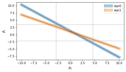
I’ve plotted each equation with a thin black line and a thick shaded area.
The thin lines represent the mathematical ideal of the equations, which intersect at a single point, which is the precise value of the coefficients.
The thick areas represent the imprecision of numerical computation, which includes floating-point approximation as well as possible uncertainty about the data, if it came from imperfect measurements.
The width of the shaded areas is exaggerated in the figure to show the loss of precision when we compute the coefficients. The result we get could fall anywhere in the range where the shaded area overlap – the dotted lines show the range of possible values.
In this example, the range of uncertainty in the results is wider than the width of the shaded areas. If the lines were perpendicular, the range of uncertainty would be narrower; if they were closer to parallel, the range would be even wider.
The condition number of the normal matrix indicates how close to parallel these lines are. When they are nearly orthogonal, the condition number and loss of precision are small. When they are nearly parallel, the condition number and loss of precision are large.
8.13. Exercises#
8.13.1. Exercise#
In the examples in this chapter, you might have noticed that the condition number is higher in models that include cohort or year, and even larger for models that include year2.
That’s because the values of those variables are so much larger than age and the column of ones.
When some columns in the design matrix are much bigger than others, the condition number gets bigger.
That’s why it can be beneficial to shift the predictors so their mean is close to zero, or scale them so they fall in a narrower range, or both.
Add new columns to subset, called age_centered and cohort_centered, that contain the age and cohort values with their means subtracted away.
Use these centered predictors to construct a design matrix, and compute its condition number.
It should be substantially smaller than the one we got with age and cohort.
Compute the coefficients of a least squares model with these predictors. The intercept will be different from the one in the uncentered model, but the slopes should be the same.
Try dividing the centered predictors by 10. What effect does it have on the condition number? What about the slopes?
Copyright 2025 Allen B. Downey
Code license: MIT License
Text license: Creative Commons Attribution-NonCommercial-ShareAlike 4.0 International