Printed copies of Elements of Data Science are available now, with a full color interior, from Lulu.com.
13. Hypothesis Testing#
Click here to run this notebook on Colab.
This chapter introduces statistical hypothesis testing, which is such a contentious topic in the history of statistics, it’s hard to provide a simple definition. Instead, I’ll start with an example, present the problem hypothesis testing is intended to solve, and then show a solution.
The solution I’ll show is different from what you might find in a statistics book. Instead of mathematical analysis, we will use computational simulations. This approach has two advantages and one disadvantage:
Advantage: The standard statistics curriculum includes many different tests, and many people find it hard to remember which one to use. In my opinion, simulation makes it clearer that there is only one testing framework.
Advantage: Simulations make modeling decision explicit. All statistical methods are based on models, but when we use mathematical methods, it is easy to forget the assumptions they are based on. With computation, the assumptions are more visible, and it is easier to try different models.
Disadvantage: Simulation uses a lot of computation. Some of the examples in this notebook take several seconds to run; for some of them, there are analytic methods that are much faster.
The examples in this chapter include results from a clinical trial related to peanut allergies, and survey data from the National Survey of Family Growth (NSFG) and the Behavioral Risk Factor Surveillance System (BRFSS).
13.1. Testing Medical Treatments#
The LEAP study was a randomized trial that tested the effect of eating peanut snacks on the development of peanut allergies. The subjects were infants who were at high risk of developing peanut allergies because they had been diagnosed with other food allergies. Over a period of several years, half of the subjects were periodically given a snack containing peanuts; the other half were given no peanuts at all.
The conclusion of the study, reported in 2015 is:
Of the children who avoided peanut, 17% developed peanut allergy by the age of 5 years. Remarkably, only 3% of the children who were randomized to eating the peanut snack developed allergy by age 5. Therefore, in high-risk infants, sustained consumption of peanut beginning in the first 11 months of life was highly effective in preventing the development of peanut allergy.
Read more about the study at http://www.leapstudy.co.uk/leap-0#.YEJax3VKikA and https://www.nejm.org/doi/full/10.1056/NEJMoa1414850.
Detailed results of the study are reported in the New England Journal of Medicine. In that article, Figure 1 shows the number of subjects in the treatment and control groups, which happened to be equal.
n_control = 314
n_treatment = 314
And from Figure 2 we can extract the number of subjects who developed peanut allergies in each group. Specifically, we’ll use the numbers from the “intention to treat analysis for both cohorts”.
k_control = 54
k_treatment = 10
Using these numbers, we can compute the risk in each group as a percentage.
risk_control = k_control / n_control * 100
risk_control
17.197452229299362
risk_treatment = k_treatment / n_treatment * 100
risk_treatment
3.1847133757961785
These are consistent with the percentages reported in the paper. To quantify the difference between the groups, we’ll use relative risk, which is the ratio of the risks in the two groups.
relative_risk_actual = risk_treatment / risk_control
relative_risk_actual
0.1851851851851852
The risk in the treatment group is about 18% of the risk in the control group, which means the treatment might prevent 82% of cases.
These results seem impressive, but as skeptical data scientists we should wonder whether it is possible that we are getting fooled by randomness. Maybe the apparent difference between the groups is due to chance, not the effectiveness of the treatment. To see whether this is likely, we will simulate the experiment using a model where the treatment has no effect, and see how often we see such a big difference between the groups.
Let’s imagine a world where the treatment is completely ineffective, so the risk is actually the same in both groups, and the difference we saw is due to chance. If that’s true, we can estimate the hypothetical risk by combining the two groups.
n_all = n_control + n_treatment
k_all = k_control + k_treatment
risk_all = k_all / n_all
risk_all
0.10191082802547771
If the risk is the same for both groups, it is close to 10%.
Now we can use this hypothetical risk to simulate the experiment.
The following function takes as parameters the size of the group, n, and the risk, p.
It simulates the experiment and returns the number of cases as a percentage of the group, which is the observed risk.
from scipy.stats import bernoulli

def simulate_group_percent(n, p):
    k = bernoulli.rvs(p, size=n).sum()
    risk = k / n * 100
    return risk
If we call this function many times, the result is a list of observed risks, one for each simulated experiment. Here’s the list for the treatment group.
t1 = [simulate_group_percent(n_treatment, risk_all)
      for i in range(1001)]
And the control group.
t2 = [simulate_group_percent(n_control, risk_all)
      for i in range(1001)]
If we divide these lists elementwise, the result is a list of relative risks, one for each simulated experiment.
relative_risks = np.divide(t2, t1)
We can use a KDE plot to visualize the distribution of these results.
import matplotlib.pyplot as plt
import seaborn as sns

sns.kdeplot(relative_risks)

plt.xlabel('Relative risk')
plt.ylabel('Probability density')
plt.title('Relative risks from simulation');
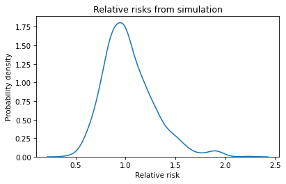
Remember that these simulations are based on the assumption that the risk is the same for both groups, so we expect the relative risk to be near 1 most of the time. And it is.
In some simulated experiments, the relative risk is as low as 0.5 or as high as 2, which means it is plausible we could see results like that by chance, even if there is no difference between groups.
But the relative risk in the actual experiment was 0.18, and we never see a result as small as that in the simulated experiments. We can conclude that the relative risk we saw is unlikely if the risk is actually the same in both groups.
13.2. Computing p-values#
Now suppose that in addition to the treatment and control groups, the experiment included a placebo group that was given a snack that contained no peanuts. Suppose this group was the same size as the others, and 42 of the subjects developed peanut allergies.
To be clear, there was no third group, and I made up these numbers, but let’s see how this hypothetical example works out. Here’s the risk in the placebo group.
n_placebo = 314
k_placebo = 42

risk_placebo = k_placebo / n_placebo * 100
risk_placebo
13.375796178343949
And here’s the relative risk compared to the control group.
relative_risk_placebo = risk_placebo / risk_control
relative_risk_placebo
0.7777777777777778
The relative risk is less than 1, which means the risk in the placebo group is a bit lower than in the control group. So we might wonder whether the placebo was actually effective. To answer that question, at least partially, we can go back to the results from the simulated experiments.
Under the assumption that there is actually no difference between the groups, it would not be unusual to see a relative risk as low as 0.78 by chance.
In fact, we can compute the probability of seeing a relative risk as low or lower than relative_risk_placebo, even if the two groups are the same, like this:
p_value = (relative_risks <= relative_risk_placebo).mean()
p_value
0.12887112887112886
This probability is called a p-value. In this case, it is about 13%, which means that even if the two groups are the same, we expect to see a relative risk as low as 0.78 about 13% of the time. So, for this imagined experiment, we can’t rule out the possibility that the apparent difference is due to chance.
13.3. Are First Babies More Likely To Be Late?#
In the previous example, we computed relative risk, which is a ratio of two proportions. As a second example, let’s consider a difference between two means.
When my wife and I were expecting our first child, we heard that first babies are more likely to be born late. But we also heard that first babies are more likely to be born early. So which is it? As a data scientist with too much time on my hands, I decided to find out. I used data from the National Survey of Family Growth (NSFG), the same survey we used in Chapter 7. At the end of that chapter, we stored a subset of the data in an HDF file. Now we can read it back.
import pandas as pd

nsfg = pd.read_hdf('nsfg.hdf', 'nsfg')
nsfg.head()
| CASEID | PREGORDR | HOWPREG_N | HOWPREG_P | MOSCURRP | NOWPRGDK | PREGEND1 | |
|---|---|---|---|---|---|---|---|
| 0 | 70627 | 1 | NaN | NaN | NaN | NaN | 6.0 |
| 1 | 70627 | 2 | NaN | NaN | NaN | NaN | 1.0 |
| 2 | 70627 | 3 | NaN | NaN | NaN | NaN | 6.0 |
| 3 | 70628 | 1 | NaN | NaN | NaN | NaN | 6.0 |
| 4 | 70628 | 2 | NaN | NaN | NaN | NaN | 6.0 |
We’ll use the OUTCOME column to select pregnancies that ended with a live birth.
live = (nsfg['OUTCOME'] == 1)
live.sum()
6693
And we’ll use PRGLNGTH to select babies that were born full term, that is, during or after the 37th week of pregnancy.
fullterm = (nsfg['PRGLNGTH'] >= 37) & (nsfg['PRGLNGTH'] < 48)
This dataset includes data from 2724 first babies.
first = live & fullterm & (nsfg['BIRTHORD'] == 1)
n_first = first.sum()
n_first
2724
And 3115 other (not first) babies.
other = live & fullterm & (nsfg['BIRTHORD'] > 1)
n_other = other.sum()
n_other
3115
Now we can select pregnancy lengths for the first babies and others.
length = nsfg['PRGLNGTH']
length_first = length[first]
length_other = length[other]
Here are the mean pregnancy lengths for the two groups, in weeks.
length_first.mean(), length_other.mean()
(39.39647577092511, 39.19775280898877)
In this dataset, first babies are born a little later on average. The difference is about 0.2 weeks, or 33 hours.
diff_actual = length_first.mean() - length_other.mean()
diff_actual, diff_actual * 7 * 24
(0.19872296193634043, 33.38545760530519)
Relative to an average length of 39 weeks, that’s not a very big difference. We might wonder if a difference as big as this would be likely, even if the two groups are the same. To answer that question, let’s imagine a world where there is no difference in pregnancy length between first babies and others. How should we model a world like that? As always with modeling decisions, there are many options. A simple one is to combine the two groups and compute the mean and standard deviation of pregnancy length, like this.
length_live_full = length[live&fullterm]
mean = length_live_full.mean()
std = length_live_full.std()
mean, std
(39.29046069532454, 1.1864094701037655)
Now we can use simulate_sample_mean from Chapter 11 to draw a random sample from a normal distribution with the given parameters and return the mean.
def simulate_sample_mean(n, mu, sigma):
    sample = np.random.normal(mu, sigma, size=n)
    return sample.mean()
If we run it 1001 times, it runs the sampling and measurement process and returns a list of results from 1001 simulated experiments.
Here are the results with sample size n_first:
t_first = [simulate_sample_mean(n_first, mean, std)
           for i in range(1001)]
And with sample size n_other.
t_other = [simulate_sample_mean(n_other, mean, std)
           for i in range(1001)]
If we subtract the simulated means elementwise, the result is a list of observed differences from simulated experiments where the distribution is the same for both groups.
diffs = np.subtract(t_first, t_other)
We can use a KDE plot to visualize the distribution of these values.
sns.kdeplot(diffs)

plt.xlabel('Difference in pregnancy length (weeks)')
plt.ylabel('Probability density')
plt.title('Distribution of differences');
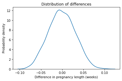
The center of this distribution is near zero, which makes sense if the distribution in both group is the same. Just by chance, we sometimes see differences as big as 0.1 weeks, but in 1001 simulations, we never see a difference as big as the observed difference in the data, which is almost 0.2 weeks.
Based on this result, we can pretty much rule out the possibility that the difference we saw is due to random sampling. But we should remember that there are other possible sources of error. For one, pregnancy lengths in the NSFG are self-reported. When the respondents are interviewed, their recollection of first babies might be less accurate than their recollection of more recent babies. Or the estimation of pregnancy length might be less accurate with less experienced mothers.
A correspondent of mine, who knows more than me about giving birth, suggested yet another possibility. If a first baby is born by Caesarean section, it is more likely that subsequent deliveries will be scheduled, and less likely that they will go much past 39 weeks. So that could bring the average down for non-first babies.
In summary, the results in this section suggest that the observed difference is unlikely to be due to chance, but there are other possible explanations.
13.4. The Hypothesis Testing Framework#
The examples we’ve done so far fit into the framework shown in this diagram:

Using data from an experiment, we compute the observed test statistic, denoted \(\delta^*\) in the diagram, which quantifies the size of the observed effect. In the peanut allergy example, the test statistic is relative risk. In the pregnancy length example, it is the difference in the means.
Then we build a model of a world where the effect does not exist. This model is called the null hypothesis and denoted \(H_0\). In the peanut allergy example, the model assumes that the risk is the same in both groups. In the pregnancy example, it assumes that the lengths are drawn from the same normal distribution.
Next we use the model to simulate the experiment many times. Each simulation generates a dataset which we use to compute a test statistic, \(\delta\). Finally, we collect the test statistics from the simulations and compute a p-value, which is the probability under the null hypothesis of seeing a test statistic as big as the observed effect, \(\delta*\).
If the p-value is small, we can usually rule out the possibility that the observed effect is due to random variation. But often there are other explanations we can’t rule out, including measurement error and unrepresentative sampling.
I emphasize the role of the model in this framework because for a given experiment there might be several possible models, each including some elements of the real world and ignoring others. For example, we used a normal distribution to model variation in pregnancy length. If we don’t want to make this assumption, an alternative is to simulate the null hypothesis by shuffling the pregnancy lengths.
The following function takes two sequences representing the pregnancy lengths for the two groups. It appends them into a single sequence, shuffles it, and then splits it again into groups with the same size as the originals. The return value is the difference in means between the groups.
def simulate_two_groups(data1, data2):
    n, m = len(data1), len(data2)
    data = np.append(data1, data2)
    np.random.shuffle(data)
    group1 = data[:n]
    group2 = data[n:]
    return group1.mean() - group2.mean()
If we call this function once, we get a random difference in means from a simulated world where the distribution of pregnancy lengths is the same in both groups.
simulate_two_groups(length_first, length_other)
0.008109710250479907
Exercise: Use this function to run 1001 simulations of the null hypothesis and save the results as diff2. Make a KDE plot to compare the distribution of diff2 to the results from the normal model, diff.
Compute the probability of seeing a difference as big as diff_actual. Is this p-value consistent with the results we got with the normal model?
Exercise: Are first babies more likely to be light? To find out, we can use the birth weight data from the NSFG. The variables we need use special codes to represent missing data, so let’s replace them with NaN.
nsfg['BIRTHWGT_LB1'] = nsfg['BIRTHWGT_LB1'].replace([0, 98, 99], np.nan)
nsfg['BIRTHWGT_OZ1'] = nsfg['BIRTHWGT_OZ1'].replace([0, 98, 99], np.nan)
And combine pounds and ounces into a single variable.
birthwgt = nsfg['BIRTHWGT_LB1'] + nsfg['BIRTHWGT_OZ1'] / 16
We can use first and other to select birth weights for first babies and others, dropping the NaN values.
birthwgt_first = birthwgt[first].dropna()
birthwgt_other = birthwgt[other].dropna()
In this dataset, it looks like first babies are a little lighter, on average.
print(birthwgt_first.mean(), birthwgt_other.mean())
7.3370276162790695 7.507115749525616
But as usual, we should wonder whether we are being fooled by randomness.
To find out, compute the actual difference between the means.
Then use simulate_two_groups to simulate a world where birth weights for both groups are drawn from the same distribution.
Under the null hypothesis, how often does the difference in means exceed the actual difference in the dataset? What conclusion can you draw from this result?
13.5. Testing Correlation#
The method we used in the previous section is called a permutation test because we shuffled the pregnancy lengths before splitting them into groups (“permute” is another word for shuffle). In this section we’ll use a permutation test to check whether an observed correlation might be due to chance.
Let’s look again at the correlations we computed in Chapter 9, using data from the Behavioral Risk Factor Surveillance System (BRFSS). The following cell reads the data.
import pandas as pd

brfss = pd.read_hdf('brfss.hdf', 'brfss')
brfss.shape
(418268, 10)
The correlations we computed were between height, weight and age.
columns = ['HTM4', 'WTKG3', 'AGE']
subset = brfss[columns]
corr_actual = subset.corr()
corr_actual
| HTM4 | WTKG3 | AGE | |
|---|---|---|---|
| HTM4 | 1.000000 | 0.477151 | -0.135980 |
| WTKG3 | 0.477151 | 1.000000 | -0.064951 |
| AGE | -0.135980 | -0.064951 | 1.000000 |
The correlation between height and weight is about 0.48, which is moderately strong – if you know someone’s height, you can make a better guess about their weight. The other correlations are weaker – for example, knowing someone’s age would not substantially improve your guesses about their height or weight.
Because these correlations are so small, we might wonder whether they are due to chance. To answer this question, we can use permutation to simulate a world where there is actually no correlation between two variables.
But first we have to take a detour to figure out how to shuffle a Pandas Series.
As an example, I’ll extract the height data.
series = brfss['HTM4']
series.head()
0    157.0
1    163.0
2    165.0
3    165.0
4    152.0
Name: HTM4, dtype: float64
The idiomatic way to shuffle a Series is to use sample with the argument frac=1, which means that the fraction of the elements we want is 1, that is, all of them.
By default, sample chooses elements without replacement, so the result contains all of the elements in a random order.
shuffled = series.sample(frac=1)
shuffled.head()
130148    157.0
396516    175.0
367273    155.0
59956     170.0
269497      NaN
Name: HTM4, dtype: float64
If we check the first few elements, it seems like a random sample, so that’s good.
But let’s see what happens if we use the shuffled Series to compute a correlation.
corr = shuffled.corr(brfss['WTKG3'])
corr
0.477151462838814
That result looks familiar: it is the correlation of the unshuffled columns.
The problem is that when we shuffle a Series, the index gets shuffled along with it.
When we compute a correlation, Pandas uses the index to line up the elements from the first Series with the elements of the second Series.
For many operations, that’s the behavior we want, but in this case it defeats the purpose of shuffling!
The solution is to use reset_index, which gives the Series a new index, with the argument drop=True, which drops the old one.
So we have to shuffle series like this.
shuffled = series.sample(frac=1).reset_index(drop=True)
Now we can compute a correlation with the shuffled Series.
corr = shuffled.corr(brfss['WTKG3'])
corr
0.0008229516424471632
The result is small, as we expect it to be when the elements are aligned at random. Rather than repeat this awful idiom, let’s put it in a function and never speak of it again.
def shuffle(series):
    return series.sample(frac=1).reset_index(drop=True)
The following function takes a DataFrame and two column names, makes a shuffled copy of one column, and computes its correlation with the other.
def simulate_correlation(df, var1, var2):
    corr = shuffle(df[var1]).corr(df[var2])
    return corr
We only have to shuffle one of the columns – it doesn’t get any more random if we shuffle both. Now we can use this function to generate a sample of correlations with shuffled columns.
corrs = [simulate_correlation(brfss, 'HTM4', 'WTKG3')
         for i in range(201)]
Here’s the distribution of the correlations.
sns.kdeplot(corrs)

plt.xlabel('Correlation')
plt.ylabel('Probability density')
plt.title('Correlation from simulations with permutation');
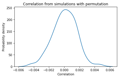
The center of the distribution is near 0, and the largest values (positive or negative) are around 0.005. If we compute the same distribution with different columns, the results are pretty much the same. With samples this big, the correlation between shuffled columns is generally small.
How do these values compare to the observed correlations?
The correlation of height and weight is about 0.48, so it’s extremely unlikely we would see a correlation as big as that by chance.
The correlation of height and age is smaller, around -0.14, but even that value would be unlikely by chance.
And the correlation of weight and age is even smaller, about -0.06, but that’s still 10 times bigger than the biggest correlation in the simulations.
We can conclude that these correlations are probably not due to chance. And that’s useful in the sense that it rules out one possible explanation. But this example also demonstrates a limitation of this kind of hypothesis testing. With large sample sizes, variability due to randomness tends to be small, so it seldom explains the effects we see in real data.
And hypothesis testing can be a distraction from more important questions. In Chapter 9, we saw that the relationship between weight and age is nonlinear. But the coefficient of correlation only measures linear relationships, so it does not capture the real strength of the relationship. So testing a correlation might not be the most useful thing to do in the first place. We can do better by testing a regression model.
13.6. Testing Regression Models#
In the previous sections we used permutation to simulate a world where there is no correlation between two variables. In this section we’ll apply the same method to regression models. As an example, we’ll use NSFG data to explore the relationship between a mother’s age and her baby’s birth weight.
In previous sections we computed birth weight and a Boolean variable that identifies first babies.
Now we’ll store them as columns in nsfg, so we can use them with StatsModels.
nsfg['BIRTHWGT'] = birthwgt
nsfg['FIRST'] = first
Next we’ll select the subset of the rows that represent live, full-term births, and make a copy so we can modify the subset without affecting the original.
data = nsfg[live & fullterm].copy()
n = len(subset)
n
418268
To visualize the relationship between mother’s age and birth weight, we’ll use a box plot with mother’s age grouped into 3-year bins.
We’ll use np.arange to make the bin boundaries, and pd.cut to put the values from AGECON into bins.
bins = np.arange(15, 40, 3)
data['AGEGRP'] = pd.cut(data['AGECON'], bins)
The label for each bin is the midpoint of the range. Now here’s the box plot.
sns.boxplot(x='AGEGRP', y='BIRTHWGT', data=data, whis=10)

plt.xlabel("Mother's age (years)")
plt.ylabel('Birthweight (pounds)')
plt.xticks(rotation=30);
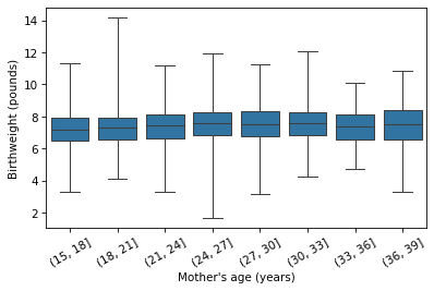
It looks like the average birth weight is highest if the mother is 24-30 years old, and slightly lower if she is younger or older. So the relationship might be nonlinear. Nevertheless, let’s start with a linear model and work our way up. Here’s a simple regression of birth weight as a function of the mother’s age at conception.
import statsmodels.formula.api as smf

results = smf.ols('BIRTHWGT ~ AGECON', data=data).fit()
results.params
Intercept    7.025486
AGECON       0.016407
dtype: float64
The slope of the regression line is 0.016 pounds per year, which means that if one mother is a year older than another, we expect her baby to be about 0.016 pounds heavier (about a quarter of an ounce).
This parameter is small, so we might wonder whether the apparent effect is due to chance. To answer that question, we’ll use permutation to simulate a world where there is no relationship between mother’s age and birth weight.
The following function takes a DataFrame, shuffles the AGECON column, computes a linear regression model, and returns the estimated slope.
def simulate_slope(data):
    data['SHUFFLED'] = shuffle(data['AGECON'])
    formula = 'BIRTHWGT ~ SHUFFLED'
    results = smf.ols(formula, data=data).fit()
    return results.params['SHUFFLED']
If we call it many times, we get a sample from the distribution of slopes under the null hypothesis.
slopes_null = [simulate_slope(data) for i in range(201)]
After 201 attempts, the largest slope is about 0.010, which is smaller than the observed slope, about 0.016. We conclude that the observed effect is bigger than we would expect to see by chance.
print(np.max(slopes_null), results.params['AGECON'])
0.009536120931481635 0.01640747818656365
13.7. Controlling for Age#
In a previous exercise, you computed the difference in birth weight between first babies and others, which is about 0.17 pounds, and you checked whether we are likely to see a difference as big as that by chance. If things went according to plan, you found that it is very unlikely.
But that doesn’t necessarily mean that there is anything special about first babies that makes them lighter than others. Rather, knowing a baby’s birth order might provide information about some other factor that is related to birth weight.
The mother’s age could be that factor.
First babies are likely to have younger mothers than other babies, and younger mothers tend to have lighter babies.
The difference we see in first babies might be explained by their mothers’ ages.
So let’s see what happens if we control for age.
Here’s a simple regression of birth weight as a function of the Boolean variable FIRST.
formula = 'BIRTHWGT ~ FIRST'
results = smf.ols(formula, data=data).fit()
results.params
Intercept        7.507116
FIRST[T.True]   -0.170088
dtype: float64
The parameter associated with FIRST is -0.17 pounds, which is the same as the difference in means we computed.
But now we can add AGECON as a control variable.
formula = 'BIRTHWGT ~ FIRST + AGECON'
results = smf.ols(formula, data=data).fit()
results.params
Intercept        7.163240
FIRST[T.True]   -0.121771
AGECON           0.013145
dtype: float64
The age effect accounts for some of the difference between first babies and others. After controlling for age, the remaining difference is about 0.12 pounds.
Since the age effect is nonlinear, we can can control for age more effectively by adding AGECON2.
data['AGECON2'] = data['AGECON'] ** 2
formula = 'BIRTHWGT ~ FIRST + AGECON + AGECON2'
results = smf.ols(formula, data=data).fit()
results.params
Intercept        6.128590
FIRST[T.True]   -0.099338
AGECON           0.096781
AGECON2         -0.001615
dtype: float64
slope_actual = results.params['FIRST[T.True]']
slope_actual
-0.09933806121560428
When we use a quadratic model to control for the age effect, the remaining difference between first babies and others is smaller again, about 0.099 pounds.
One of the warning signs of a spurious relationship between two variables is that the effect gradually disappears as you add control variables.
So we should wonder whether the remaining effect might be due to chance.
To find out, we’ll use the following function, which simulates a world where there is no difference in weight between first babies and others.
It takes a DataFrame as a parameter, shuffles the FIRST column, runs the regression model with AGECON and AGECON2, and returns the estimated difference.
def simulate_slope2(data):
    data['SHUFFLED'] = shuffle(data['FIRST'])
    formula = 'BIRTHWGT ~ AGECON + AGECON2 + C(SHUFFLED)'
    results = smf.ols(formula, data=data).fit()
    return results.params['C(SHUFFLED)[T.True]']
If we run it many times, we get a sample from the distribution of the test statistic under the null hypothesis.
slopes_null = [simulate_slope2(data) for i in range(201)]
The range of values is wide enough that it occasionally exceeds the observed effect size.
print(min(slopes_null), max(slopes_null))
-0.09842209405975708 0.11993351438646496
The p-value is about 2%.
p_value = (np.abs(slopes_null) > np.abs(slope_actual)).mean()
p_value
0.01990049751243781
This result indicates that an observed difference of 0.1 pounds is possible, but not likely, if the actual difference between the groups is zero.
So how should we interpret a result like this? In the tradition of statistical hypothesis testing, it is common to use 5% as the threshold between results that are considered “statistically significant” or not. By that standard, the weight difference between first babies and others is statistically significant.
However, there are several problems with this practice:
First, the choice of the threshold should depend on the context. For a life-and-death decision, we might choose a more stringent threshold. For a topic of idle curiosity, like this one, we could be more relaxed.
But it might not be useful to apply a threshold at all. An alternative (which is common in practice) is to report the p-value and let it speak for itself. It provides no additional value to declare that the result is significant or not.
Finally, the use of the word “significant” is dangerously misleading, because it implies that the result is important in practice. But a small p-value only means that an observed effect would be unlikely to happen by chance. It doesn’t mean it is important.
This last point is particularly problematic with large datasets, because very small effects can be statistically significant. We saw an example with the BRFSS dataset, where the correlations we tested were all statistically significant, even the ones that are too small to matter in practice.
13.8. Summary#
Let’s review the examples in this chapter:
We started with data from LEAP, which studied the effect of eating peanuts on the development of peanut allergies. The test statistic was relative risk, and the null hypothesis was that the treatment was ineffective.
Then we looked at the difference in pregnancy length for first babies and others. We used the difference in means as the test statistic, and two models of the null hypothesis: one based on a normal model and the other based on permutation of the data. As an exercise, you tested the difference in weight between first babies and others.
Next we used permutation to test correlations, using height, weight, and age data from the BRFSS. This example shows that with large sample sizes, observed effects are often “statistically significant”, even if they are too small to matter in practice.
We used regression models to explore the effect of maternal age on birth weight. To see whether the effect might be due to chance, we used the slope of the regression line as the test statistic, and permutation to model the null hypothesis.
Finally, we explored the possibility that the first baby effect is actually an indirect maternal age effect. After controlling for the mother’s age, we tested whether the remaining difference between first babies and others might happen by chance. We used permutation to model the null hypothesis and the estimated slope as a test statistic.
As a final exercise, below, you can use the same methods to explore the effect of paternal age on birth weight.
Exercise: A paternal age effect is a relationship between the age of a father and a variety of outcomes for his children.
There is some evidence that young fathers and old fathers have lighter babies, on average, than fathers in the middle range of ages.
Let’s see if that’s true for the babies in the NSFG dataset.
The HPAGELB column encodes the father’s age.
See here for more about the paternal age effect
Here are the values, after replacing the codes for missing data with NaN.
data['HPAGELB'] = data['HPAGELB'].replace([98, 99], np.nan)
data['HPAGELB'].value_counts().sort_index()
HPAGELB
1.0     478
2.0    1391
3.0    1650
4.0    1225
5.0     592
6.0     411
Name: count, dtype: int64
And here’s what the codes mean:
Code |
Age |
|---|---|
1 |
Under 20 years |
2 |
20-24 years |
3 |
25-29 years |
4 |
30-34 years |
5 |
35-39 years |
6 |
40 years or older |
Let’s create a new column that’s true for the fathers in the youngest and oldest groups.
The isin method checks whether the values in a Series are in the given list.
The values 1 and 6 indicate fathers under 20 years of age or over 40.
data['YO_DAD'] = data['HPAGELB'].isin([1, 6])
We can use the result in a regression model to compute the difference in birth weight for young and old fathers compared to the others.
formula = 'BIRTHWGT ~ YO_DAD'
results = smf.ols(formula, data=data).fit()
results.params
Intercept         7.447477
YO_DAD[T.True]   -0.140045
dtype: float64
The difference is negative, which is consistent with the theory, and about 0.14 pounds, which is comparable in size to the (apparent) first baby effect.
But there is a strong correlation between father’s age and mother’s age.
So what seems like a paternal effect might actually be an indirect maternal effect.
To find out, let’s see what happens if we control for the mother’s age.
Run this model again with AGECON and AGECON2 as predictors. Does the observed effect of paternal age get smaller?
To see if the remaining effect could be due to randomness, write a function that shuffles YO_DAD, runs the regression model, and returns the parameter associated with the shuffled column.
How often does this parameter exceed the observed value?
What conclusion can we draw from the results?