Plotting#
Click here to run this notebook on Colab.
Show code cell content
from os.path import basename, exists

def download(url):
    filename = basename(url)
    if not exists(filename):
        from urllib.request import urlretrieve

        local, _ = urlretrieve(url, filename)
        print("Downloaded " + str(local))
    return filename

download('https://raw.githubusercontent.com/AllenDowney/ElementsOfDataScience/v1/utils.py')

import utils
This chapter presents ways to create figures and graphs, more generally called data visualizations. As examples, we’ll generate three figures:
We’ll replicate a figure from the Pew Research Center that shows changes in religious affiliation in the United States over time.
We’ll replicate a figure from The Economist that shows the prices of sandwiches in Boston and London (we saw this data back in Chapter 3).
We’ll make a plot to test Zipf’s law, which describes the relationship between word frequencies and their ranks.
With the tools in this chapter, you can generate a variety of simple graphs. We will see more visualization tools in later chapters. But before we get started with plotting, we need a new feature: keyword arguments.
Keyword Arguments#
When you call most functions, you have to provide values.
For example, when you call np.exp, you provide a number.
import numpy as np

np.exp(1)
2.718281828459045
When you call np.power, you provide two numbers.
np.power(10, 6)
1000000
The values you provide are called arguments.
Specifically, the values in these examples are positional arguments because their position determines how they are used.
In the second example, power computes 10 to the sixth power, not 6 to the tenth power – because of the order of the arguments.
Many functions also take keyword arguments, which are identified by name.
For example, we have previously used int to convert a string to an integer.
Here’s how we use it with a string as a positional argument:
int('21')
21
By default, int assumes that the number is in base 10. But you can provide a keyword argument that specifies a different base.
For example, the string '21', interpreted in base 8, represents the number 2 * 8 + 1 = 17. Here’s how we do this conversion using int.
int('21', base=8)
17
The integer value 8 is a keyword argument, with the keyword base.
Specifying a keyword argument looks like an assignment statement, but it does not create a new variable.
And when you provide a keyword argument, you don’t choose the variable name – it is specified by the function.
If you provide a name that is not specified by the function, you get an error.
%%expect TypeError

int('123', bass=11)
TypeError: 'bass' is an invalid keyword argument for int()
Exercise: The print function takes a keyword argument called end that specifies the character it prints at the end of the line.
By default, end is the newline character, \n.
So if you call print more than once, the outputs normally appear on separate lines, like this:
for x in [1, 2, 3]:
    print(x)
1
2
3
Modify the previous example so the outputs appear on one line with spaces between them. Then modify it to print an open bracket at the beginning and a close bracket and newline at the end.
Graphing Religious Affiliation#
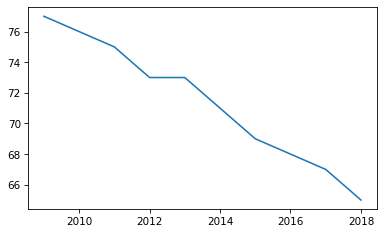
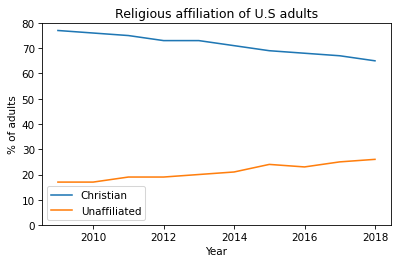
Now we’re ready to make some graphs. In October 2019 the Pew Research Center published “In U.S., Decline of Christianity Continues at Rapid Pace”. It includes this figure, which shows changes in religious affiliation among adults in the U.S. over the previous 10 years.

You can read the article at https://www.pewresearch.org/religion/2019/10/17/in-u-s-decline-of-christianity-continues-at-rapid-pace/. The data are from a table in this PDF document.
As an exercise, we’ll replicate this figure. It shows results from two sources, Religious Landscape Studies and Pew Research Political Surveys. The political surveys provide data from more years, so we’ll focus on that.
The data from the figure are available from Pew Research, but they are in a PDF document. It is sometimes possible to extract data from PDF documents, but for now we’ll enter the data by hand.
You can download the data from https://www.pewforum.org/wp-content/uploads/sites/7/2019/10/Detailed-Tables-v1-FOR-WEB.pdf.
year = [2009, 2010, 2011, 2012, 2013, 2014, 2015, 2016, 2017, 2018]
christian = [77, 76, 75, 73, 73, 71, 69, 68, 67, 65]
unaffiliated = [17, 17, 19, 19, 20, 21, 24, 23, 25, 26]
The library we’ll use for plotting is Matplotlib – more specifically, we’ll use a part of it called Pyplot, which we’ll import with the shortened name plt.
import matplotlib.pyplot as plt
Pyplot provides a function called plot that makes a line plot. It takes two sequences as arguments, the x values and the y values. The sequences can be tuples, lists, or arrays.
plt.plot(year, christian);
The semi-colon at the end of the line prevents the return value from plot, which is an object representing the line, from being displayed.
If you plot multiple lines in a single cell, they appear on the same axes.
plt.plot(year, christian)
plt.plot(year, unaffiliated);
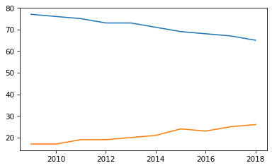
Plotting them on the same axes makes it possible to compare them directly. However, notice that Pyplot chooses the range for the axes automatically. In this example the y-axis starts around 15, not zero.
As a result, it provides a misleading picture, making the ratio of the two lines look bigger than it really is.
We can set the limits of the y-axis using the function plt.ylim – the arguments are the lower bound and the upper bounds.
plt.plot(year, christian)
plt.plot(year, unaffiliated)

plt.ylim(0, 80);
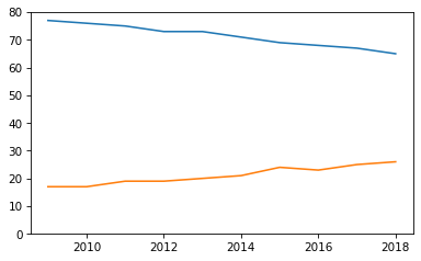
That’s better, but this graph is missing some important elements: labels for the axes, a title, and a legend.
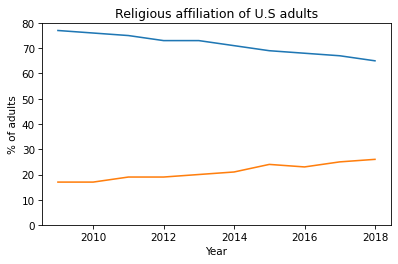
Decorating the Axes#
To label the axes and add a title, we’ll use Pyplot functions xlabel, ylabel, and title. All of them take strings as arguments.
plt.plot(year, christian)
plt.plot(year, unaffiliated)

plt.ylim(0, 80)
plt.xlabel('Year')
plt.ylabel('% of adults')
plt.title('Religious affiliation of U.S adults');
To add a legend, first we add a label to each line, using the keyword argument label.
Then we call plt.legend to create the legend.
plt.plot(year, christian, label='Christian')
plt.plot(year, unaffiliated, label='Unaffiliated')

plt.ylim(0, 80)
plt.xlabel('Year')
plt.ylabel('% of adults')
plt.title('Religious affiliation of U.S adults')
plt.legend();
The legend shows the labels we provided when we created the lines.
Exercise: The original figure plots lines between the data points, but it also plots markers showing the location of each data point. It is good practice to include these markers, especially if data are not available for every year.
Modify the previous example to include a keyword argument marker with the string value '.', which indicates that you want to plot small circles as markers.
Exercise: In the original figure, the line labeled 'Christian' is red and the line labeled 'Unaffiliated' is gray.
Find the online documentation of plt.plot, or ask a virtual assistant like ChatGPT, and figure out how to use keyword arguments to specify colors.
Choose colors to (roughly) match the original figure.
The legend function takes a keyword argument that specifies the location of the legend. Read the documentation of this function and move the legend to the center left of the figure.
Plotting Sandwich Prices#
In Chapter 3 we used data from an article in The Economist comparing sandwich prices in Boston and London: “Why Americans pay more for lunch than Britons do”.
You can read the article at https://www.economist.com/finance-and-economics/2019/09/07/why-americans-pay-more-for-lunch-than-britons-do.
The article includes this graph showing prices of several sandwiches in the two cities:

As an exercise, let’s see if we can replicate this figure. Here’s the data from the article again.
name_list = [
    'Lobster roll',
    'Chicken caesar',
    'Bang bang chicken',
    'Ham and cheese',
    'Tuna and cucumber',
    'Egg'
]
boston_price_list = [9.99, 7.99, 7.49, 7, 6.29, 4.99]
london_price_list = [7.5, 5, 4.4, 5, 3.75, 2.25]
In the previous section we plotted percentages on the y-axis versus time on the x-axis. Now we want to plot the sandwich names on the y-axis and the prices on the x-axis. Here’s how:
plt.plot(boston_price_list, name_list)
plt.xlabel('Price in USD');
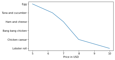
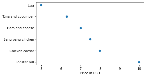
By default Pyplot connects the points with lines, but in this example the lines don’t make sense because the sandwich names are discrete – that is, there are no intermediate points between an egg sandwich and a tuna sandwich.
We can remove the lines and add markers with the keywords linestyle and marker.
plt.plot(boston_price_list, name_list, linestyle='', marker='o')
plt.xlabel('Price in USD');
Or we can do the same thing more concisely by providing a format string as a positional argument.
In the following examples, 'o' indicates a circle marker and 's' indicates a square.
You can read the documentation of plt.plot to learn more about format strings.
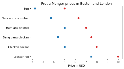
plt.plot(boston_price_list, name_list, 'o')
plt.plot(london_price_list, name_list, 's')

plt.xlabel('Price in USD')
plt.title('Pret a Manger prices in Boston and London');
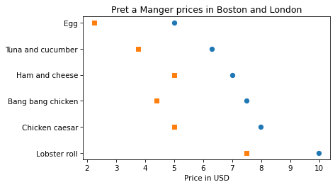
Now, to approximate the colors in the original figure, we can use the strings 'C3' and 'C0', which specify colors from the default color sequence.
plt.plot(boston_price_list, name_list, 'o', color='C3')
plt.plot(london_price_list, name_list, 's', color='C0')

plt.xlabel('Price in USD')
plt.title('Pret a Manger prices in Boston and London');
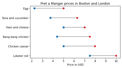
To connect the dots with lines, we’ll use plt.hlines, which draws horizontal lines. It takes three arguments: a sequence of values on the y-axis, which are the sandwich names in this example, and two sequences of values on the x-axis, which are the London prices and Boston prices.
plt.hlines(name_list, london_price_list, boston_price_list, color='gray')

plt.plot(boston_price_list, name_list, 'o', color='C3')
plt.plot(london_price_list, name_list, 's', color='C0')

plt.xlabel('Price in USD')
plt.title('Pret a Manger prices in Boston and London');
Exercise: To finish off this example, add a legend that identifies the London and Boston prices. Remember that you have to add a label keyword each time you call plt.plot, and then call plt.legend.
Notice that the sandwiches in our figure are in the opposite order of the sandwiches in the original figure. There is a Pyplot function that inverts the y-axis; see if you can find it and use it to reverse the order of the sandwich list.
Zipf’s Law#
In almost any book, in almost any language, if you count the number of unique words and the number of times each word appears, you will find a remarkable pattern: the most common word appears twice as often as the second most common – at least approximately – three times as often as the third most common, and so on.
In general, if we sort the words in descending order of frequency, there is an inverse relationship between the rank of the words – first, second, third, etc. – and the number of times they appear. This observation was most famously made by George Kingsley Zipf, so it is called Zipf’s law.
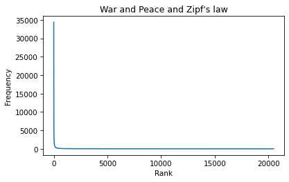
To see if this law holds for the words in War and Peace, we’ll make a Zipf plot, which shows:
The frequency of each word on the y-axis, and
The rank of each word on the x-axis, starting from 1.
In the previous chapter, we looped through the book and made a string that contains all punctuation characters. Here are the results, which we will need again.
all_punctuation = ',.-:[#]*/“’—‘!?”;()%@'
The following program reads through the book and makes a dictionary that maps from each word to the number of times it appears.
fp = open('2600-0.txt')
for line in fp:
    if line.startswith('***'):
        break

unique_words = {}
for line in fp:
    if line.startswith('***'):
        break

    for word in line.split():
        word = word.lower()
        word = word.strip(all_punctuation)
        if word in unique_words:
            unique_words[word] += 1
        else:
            unique_words[word] = 1
In unique_words, the keys are words and the values are their frequencies. We can use the values function to get the values from the dictionary. The result has the type dict_values:
freqs = unique_words.values()
type(freqs)
dict_values
Before we plot them, we have to sort them, but the sort function doesn’t work with dict_values.
%%expect AttributeError

freqs.sort()
AttributeError: 'dict_values' object has no attribute 'sort'
We can use list to make a list of frequencies:
freq_list = list(unique_words.values())
type(freq_list)
list
And now we can use sort. By default it sorts in ascending order, but we can pass a keyword argument to reverse the order.
freq_list.sort(reverse=True)
Now, for the ranks, we need a sequence that counts from 1 to n, where n is the number of elements in freq_list. We can use the range function, which returns a value with type range.
As a small example, here’s the range from 1 to 5.
range(1, 5)
range(1, 5)
However, there’s a catch. If we use the range to make a list, we see that “the range from 1 to 5” includes 1, but it doesn’t include 5.
list(range(1, 5))
[1, 2, 3, 4]
That might seem strange, but it is often more convenient to use range when it is defined this way, rather than what might seem like the more natural way.
Anyway, we can get what we want by increasing the second argument by one:
Read about the different ways to define range, and their pros and cons, at https://www.cs.utexas.edu/users/EWD/transcriptions/EWD08xx/EWD831.html.
list(range(1, 6))
[1, 2, 3, 4, 5]
So, finally, we can make a range that represents the ranks from 1 to n:
n = len(freq_list)
ranks = range(1, n+1)
ranks
range(1, 20484)
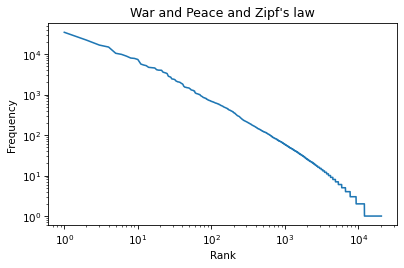
And now we can plot the frequencies versus the ranks:
plt.plot(ranks, freq_list)

plt.xlabel('Rank')
plt.ylabel('Frequency')
plt.title("War and Peace and Zipf's law");
According to Zipf’s law, these frequencies should be inversely proportional to the ranks. If that’s true, we can write:
\(f = k / r\)
where \(r\) is the rank of a word, \(f\) is its frequency, and \(k\) is an unknown constant of proportionality. If we take the logarithm of both sides, we get
\(\log f = \log k - \log r\)
This equation implies that if we plot \(f\) versus \(r\) on a log-log scale, we expect to see a straight line with intercept at \(\log k\) and slope \(-1\).
Logarithmic Scales#
We can use plt.xscale to plot the x-axis on a log scale.
plt.plot(ranks, freq_list)

plt.xlabel('Rank')
plt.ylabel('Frequency')
plt.title("War and Peace and Zipf's law")
plt.xscale('log')
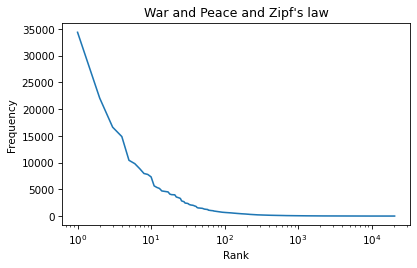
And plt.yscale to plot the y-axis on a log scale.
plt.plot(ranks, freq_list)

plt.xlabel('Rank')
plt.ylabel('Frequency')
plt.title("War and Peace and Zipf's law")
plt.xscale('log')
plt.yscale('log')
The result is not quite a straight line, but it is close. We can get a sense of the slope by connecting the end points with a line.
First, we’ll select the first and last elements from xs.
xs = ranks[0], ranks[-1]
xs
(1, 20483)
And the first and last elements from ys.
ys = freq_list[0], freq_list[-1]
ys
(34389, 1)
And plot a line between them.
plt.plot(xs, ys, color='gray')
plt.plot(ranks, freq_list)

plt.xlabel('Rank')
plt.ylabel('Frequency')
plt.title("War and Peace and Zipf's law")
plt.xscale('log')
plt.yscale('log')
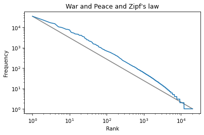
The slope of this line is the “rise over run”, that is, the difference on the y-axis divided by the difference on the x-axis.
We can compute the rise using np.log10 to compute the log base 10 of the first and last values:
np.log10(ys)
array([4.53641955, 0. ])
Then we can use np.diff to compute the difference between the elements:
rise = np.diff(np.log10(ys))
rise
array([-4.53641955])
Exercise: Use log10 and diff to compute the run, that is, the difference on the x-axis. Then divide the rise by the run to get the slope of the grey line.
Is it close to \(-1\), as Zipf’s law predicts?
Summary#
This chapter introduces Pyplot, which is part of the Matplotlib library. We used to replicate two figures and make a Zipf plot. These examples demonstrate the most common elements of data visualization, including lines and markers, values and labels on the axes, a legend and a title. The Zipf plot also shows the power of plotting data on logarithmic scales.